The big end of year Digital Content wrap up [Part 1]
It’s been a bit quiet from much of the Digital Content side of Digital Publishing division over the past few months, but to rectify this (and in true end-of-year style) here we take a look at the year’s highs and lows from our team – it’ll be a bit like those TV shows where they invite a load of b-list celebrities to pass comment on the nation’s favourite kids tv shows or favourite toys – apart from the fact that we couldn’t afford any celebrities, not even c-list, so you’ll have to put up with me instead!
The launch of Visual.ONS
This year’s single biggest highlight for the team has been the launch of Visual.ONS. The site’s motto has been official data, new light. But what does that mean? This launch post goes into more detail but if I had to sum it up in one slightly cheesy, blue-skies thinking type word, it would be insight.
In October 2014 the UK Statistics Authority launched the 2015-20 Strategy for UK Statistics – titled Better Statistics, Better Decisions [bear with me, it gets more interesting than this]. The strongest element of this strategy centres on making statistics helpful for people – to inform decision making, support democratic debate, improve communication, and to challenge the misuse of statistics.
Visual.ONS is at the heart of ONS’s efforts to meet this challenge, but very much focused on the inquiring citizen user – essentially the engaged public – those interested in the types of topics ONS produces data on – the economy, population, labour market, health etc.
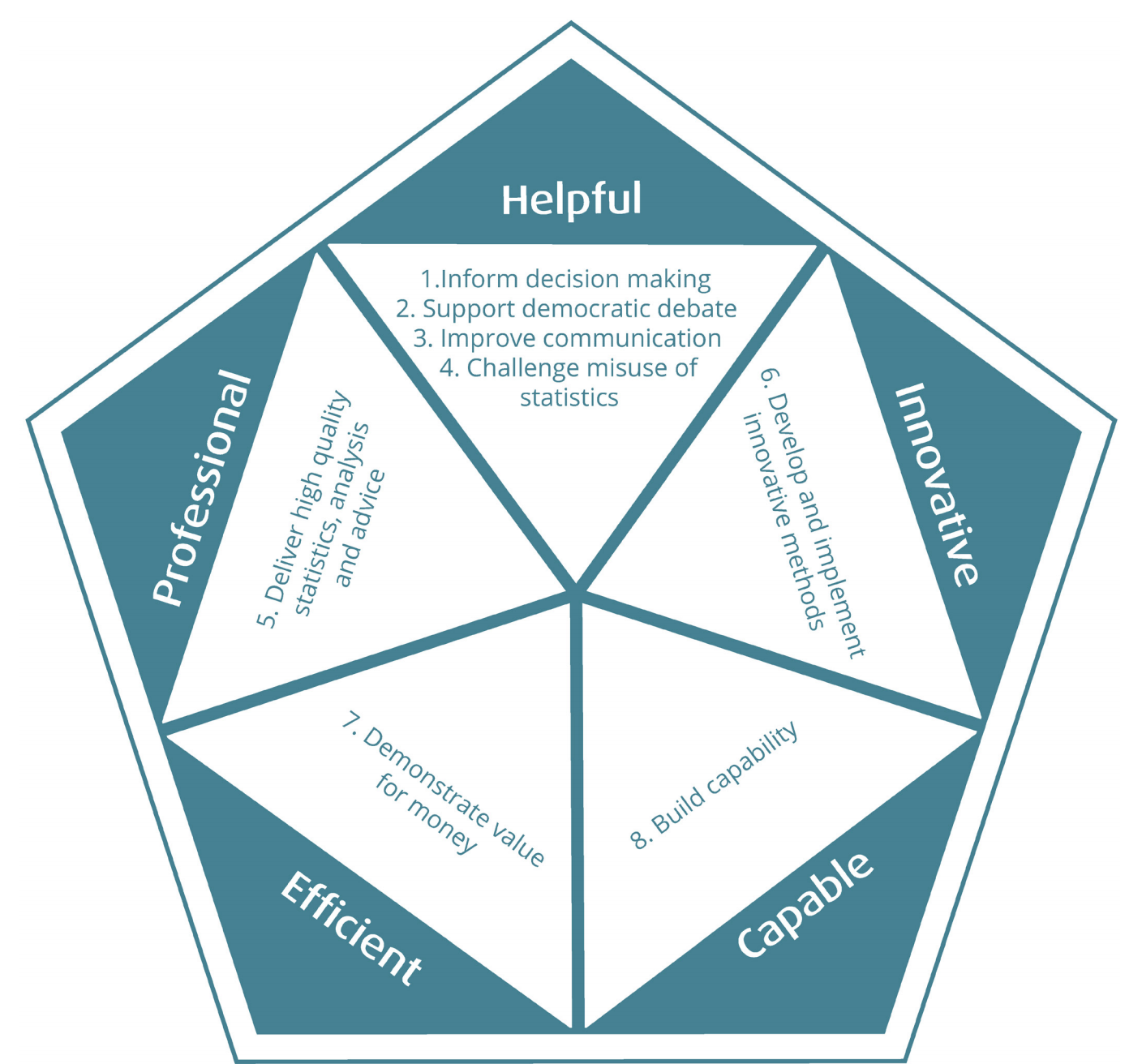
Better Statistics, Better Decisions
So how have we met this challenge? Let’s take a look at some of my favourite posts from the course of the year.
Perception challenging formats
Some of our most successful content items have been those that challenge people’s [often poor] understanding of statistics. This type of thinking builds on earlier perception which challenges work such as the How well do you know your area quiz.
One of my favourites from this year [and I might be biased] was a small interactive graphic and short analysis looking at what the Government spends the welfare budget on. Any ideas? Have a guess.
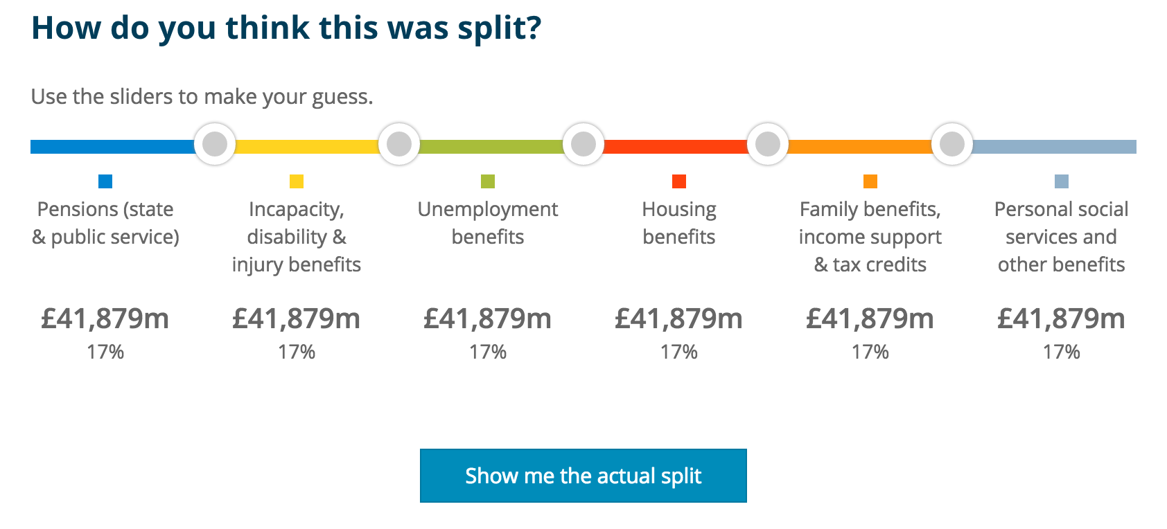
How do you think the welfare budget is spent?
The format of this piece was to ask people to guess how they thought the budget was split and then once the guess is made reveal how wrong they were [or in some cases provide a sense of smugness]!
The ‘blank canvas’ approach (compared, for example, to a multiple choice format) drives people to really consider their answer and reinforces their feelings of shock or satisfaction upon reveal.
This experience should also provide people with something more memorable than just a table or written text, which in turn should help put any future coverage of the welfare budget into better context. In fact we’ve seen evidence of this in action on twitter…people challenging how others use statistics.
https://twitter.com/vaughansalway/status/659675997982343169
https://twitter.com/Tim_Kimber/status/650961371765567488
Opening up large datasets
Catchy format title huh? There’s been a big global push to open up data for all. But the challenge doesn’t end there; interpreting the data and making use of it can be difficult and often interactive data visualisation techniques can make this easier for people, especially those not used to dealing with spreadsheets or APIs. These formats can help inform decisions they need to make in life.
Some of you might remember that back in April the Government gave people approaching retirement greater freedom as to how they could spend their pension. Life expectancy data could be one important factor in someone deciding how to use their pension – How long do I need to make this money last? So, in conjunction with Pensionwise, we developed a life expectancy calculator to help support this decision-making.
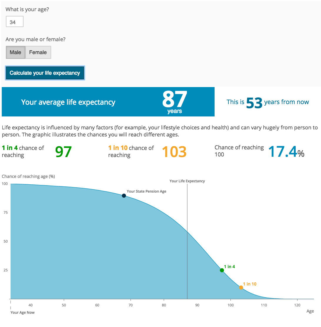
What’s your life expectancy?
Importantly we didn’t stick to just one big number as many life expectancy calculators do – we wanted to show the uncertainty within the data. How would your finances cope if you lived to 100?
It’s also ‘fun’ for anyone else who might be wondering how long they might live for. I’m always surprised that I have a one in four chance of making it to 97! Again it has links with those perception challenging formats. During user testing it was clear that many people compare themselves to their parent’s or grandparent’s generations, but that doesn’t take into account improvements to health care etc.
This has been one of the site’s top performers over the course of the year gaining around 120,000 page views (excluding syndication elsewhere) since its launch back in March. Part of the reason for its success has been that many websites have referred people to our content to use in their decision making. This includes newspapers, retirement providers and financial planners.
Focused articles
Part of the site’s aims has been to uncover insight locked away either in minds of our statisticians and economists or in the depths of a 120 page statistical bulletin. Taking a more focused look at issues the public care about and/or is topically relevant.
One example of this was a piece where we worked with one of ONS’s top economists Philip Wales looking at how the distribution of income has changed since the introduction of the minimum wage. This analysis was drawn from a larger monthly economic review which is aimed at a more expert audience, and put into a format which was more accessible for our intended user group.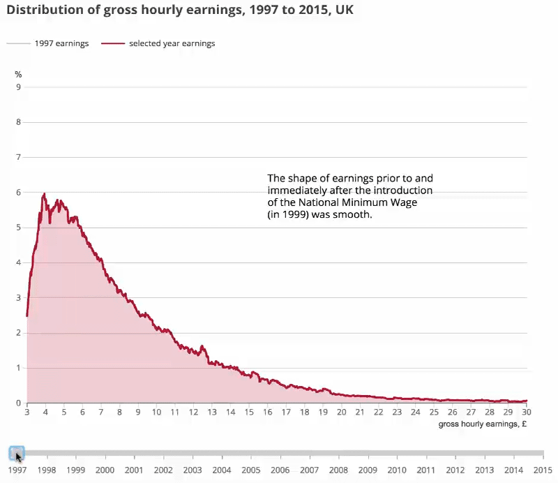
Another example came from a much larger report that looked at many aspects of the living wage, a topic that is often in the news. Here we decided to focus on the geographical spread of jobs being paid less than the living wage . We looked at the data at this level because it can be easier for people to connect on a more personal level asking themselves questions such as how might the living wage affect my area or how does my area compare?
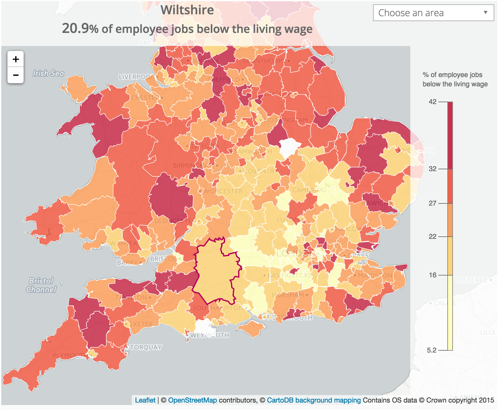
How many jobs are paid less than the minimum wage in your area?
Both of these articles are good examples of a direction we’d like to go in – working closely with ONS statisticians and economists to uncover topical and relevant insight.
Join me for part 2 after the break [when we’ll recap where we got to for a couple of minutes, and then carry on in much the same fashion].
One comment on “The big end of year Digital Content wrap up [Part 1]”
Comments are closed.