Enabling users to customise datasets
We are now in full swing with the Data Discovery alpha project. You can read a bit more about how our inception stage went and get an intro to the project by reading my blog post Getting started with Data Discovery.
We need to do the hard work for users
One of the main reasons that people visit the ONS (Office for National Statistics) website is to get data.
Often, this means users will navigate to a dataset and download the entire thing as a large spreadsheet. This meets the needs of some of our expert users. However, we know from user research that some users are uncomfortable with complex spreadsheets and they want our website to do more of the hard work for them.
Enable users to customise a dataset
We have a group of users that we call information foragers. These are people who work in places like government departments, local government, media and business. They use data from our website as part of their job, but they aren’t expert data analysts. They have a need to customise a dataset before they download it.
A typical dataset might include multiple dimensions such as age, sex, date range and location. We want to enable users to select only the dimensions they are interested in. So, for example, they could refine the dataset to only include people who are age 35 to 49 and located in Cardiff.
Emerging patterns
We have designed a range of dimension selector patterns that allow users to make these choices on screen. Some are very simple, others are more complex:
- short list with a few options (for example, sex)
- time range (for example, month and year)
- long list with multiple layers (for example, location)
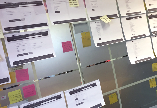
Working together with our team (that includes designers, product people, a researcher, front end developers and a business analyst) we have produced a range of prototypes that allow us to test these patterns out with users.
Iterating the designs
It’s definitely been tricky to get the balance right between giving the user all the information they need to make a decision and keeping the screen simple enough so that the options don’t become overwhelming.
I’ve been advocating for the One thing per page approach as recommended by Tim Paul and the interaction designers at GDS (Government Digital Service).
These simple designs do seem to be working well with users so far, but as we add more complex datasets into the mix, it’s not always immediately clear how well these simple design patterns will cope.
Heading for alpha assessment
We will continue to test these patterns with users as we head towards our alpha assessment in March. Each sprint we are getting closer to a simple end-to-end process that will act as our proof of concept.
If you have any feedback, or you’re working on something similar, please get in touch with me on Twitter or via email.
Comments are closed.