The humble pie chart
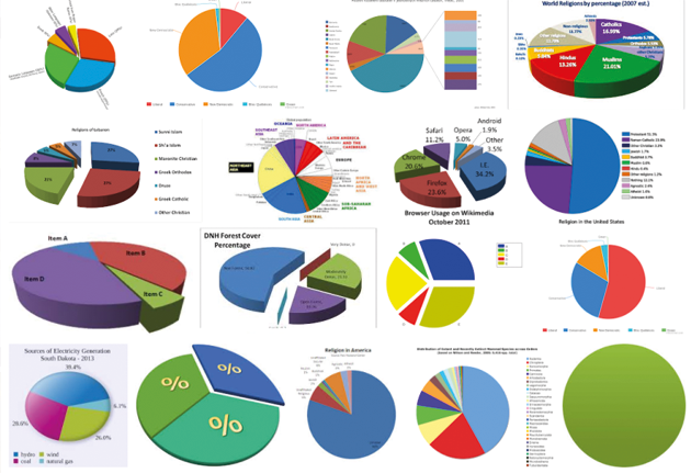
A blog on pie charts? surely everyone knows how to use them. Just googling “pie charts” and hitting the “images tab” in a browser gives us a fair indication… people in general don’t, and the results are worryingly bad.
Many of us, like me, were possibly taught them at school from a perspective of slicing up a pie, so we find the concept so easy that we think they can start working right away without learning more. Then it can all get a bit messy with garish colours, exploded segments everywhere and, dare I say, 3D… so no wonder they get bad press.
Having said all this the pie charts can be aesthetically pleasing and used properly they are easy to interpret with a fair degree of precision. So they’re still a really good chart if applied using some basic guidelines.
Very briefly, where did they originate from?
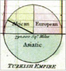
The invention of the pie chart is usually credited to William Playfair. His publication “The Statistical Breviary(1801)” included a few pie charts. This chart shows the division of the land area of the Turkish Empire.
For those of you who wish to read further on the origins then have a read of this paper describing the history of the pie graph by Ian Spence of the University of Toronto; it has all you will need to know about pie charts.
Basic guidelines for pie charts
- Firstly, using our graphical vocabulary introduced in an earlier blogpost, the data must represent parts of a whole, and add up to 100%.
- Largely, but not exclusively, pie charts are useful for displaying data that is classified into nominal or ordinal categories.
- Pie categories for nominal data (distinct categories with no order) are often best ranked in order of size; clockwise from 12 o’clock.
- For ordinal (distinct categories with a natural order) they must follow the order, be it low to high or very satisfied to unsatisfied.
- It is good practice to have no more than 5 or 6 categories as it can start to become harder for the eye to distinguish the size between some of the sections.
- A pie chart only really works well when you use one set of data. A cluster or a strip/column of pies isn’t a good choice it’s too hard to compare them without a common reference point like the axis of a bar or line chart.
- You can’t use negative or zero values, as they cannot be represented. So if they’re in your data choose something else.
- Oh and never, ever use 3D as it distorts the proportions, which is exactly what we’re comparing and judging.

One of the best times to use a pie chart is when one of the categories is much bigger than the others.

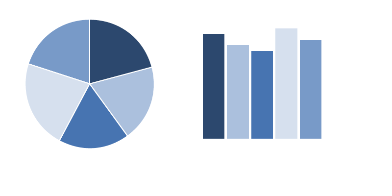
On the other hand if the categories are fairly similar it’s probable that a bar chart would be a better choice, especially if you want your readers to compare the values. Bar charts work better in this instance because our ability to determine differences in height or length is a primary skill. Below you’ll see that we are able to see the differences much easier with the bars.
In the second part to this blog I’ll show more alternatives to the pie chart; but I’m not saying don’t use them! It’s a case of what is best for the data given.
Labeling
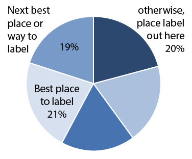
This is very hard to me to be prescriptive, but in short always try to directly label the segments. If this is not possible, usually due to space restrictions, label outside the chart and use lines to point to narrow segments if necessary. If all else fails use a key. I say this because the eye has to constantly dart back and forth between the two, so requiring a good working memory.
Sometimes the label is accompanied by the actual figure, try and put these in the chart, but to be honest we’re now in the grounds where we’re trying to keep it neat and simple. Remember numbers are best viewed in columns or tables for comparison, so to see them orbiting a pie chart leaves them disparate and reduces the ability to compare.
Colour
Colour plays an important role in identifying different segments, so if a pie chart uses similar colours, possibly because there are too many segments, it becomes very difficult for users to correctly identify different segments of the pie chart. Many designers use the colour model HSL (Hue is the colour, Saturation is the amount and Luminance how bright it is). The appeal of HSL is that it makes more intuitive sense what changing the saturation and luminance will do to the hue.
If you’ve never heard of HSL, this example demonstrates it well. The top slider changes hue and the bottom one the alpha (Opacity/Transparency). The alpha is an extension on the HSL model so slide this to the right for fully transparent. Okay then, going left to right shows change in luminance and top to bottom shows change in saturation.
Below are 2 pie charts with a single hue (I chose 213). The first pie chart uses the middle row going left to right and second the middle column (bottom to top). You’ll see the changes in luminance are much more distinguishable.

Ordinal data which has a rank is best shown using one hue with even steps in the luminance as with our first pie chart.
Nominal data can use one hue with steps in luminance, though more commonly they uses a selection of different hues for the categories. But don’t go all out and make them too garish like some of those googled at the start of this blog, just keeping the saturation down will help.
Our ons.style guide on colour provides further reading, including assistance in accessibility for colour blindness.
To round-up briefly
To use a pie chart the data must be 100%, don’t use too many categories, avoid 3D and be careful using pie charts to compare.
Next time we’ll look at alternatives to the pie chart and have a look at how people read pie charts including; do bigger slices work and which pie types, such as donut or angle are the best.