Pattern recognition
This week we started a new, and important, piece of work with the help of CX Partners in Bristol to produce a ‘pattern library’ for the ONS website. What is a ‘pattern library’ I hear you ask? Well according to Paul Boag a ‘pattern library is;
“Essentially a pattern library is a collection of design elements that appear multiple times across a site.”
It can be seen as a web native style guide which not only includes examples of what the various elements look like but also the HTML and CSS to create them. They also regularly include examples of complete pages built up from the elements to give an idea of how everything fits together and also a level of documentation giving context to the thinking behind the elements.
The idea is that the ‘library’ can be picked up by different design and development teams and ensure that the site design and interactions remain consistent. This is especially important for a site the size of ours and also because there are numerous other ONS websites out there that also need to remain in line with the corporate site.
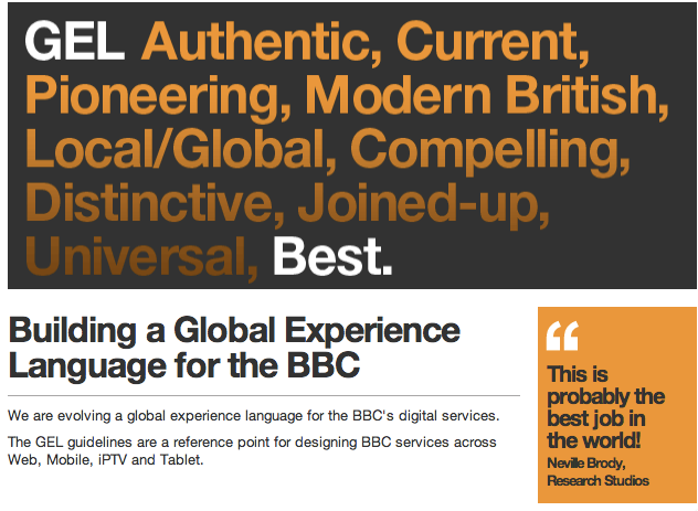
The first example of this sort of thing I came across was the ‘Global Experience Language’ for the BBC website. This was very influential because while this sort of undertaking wasn’t unusual necessarily amongst web studios and agencies and their clients it was pretty rare (if not unique at the time) for it to be be published openly.
The BBC ‘GEL’ is well worth looking at if you have any interest in large scale websites as the BBC had to tackle a massive sprawl of a site that had evolved in a pretty organic manner with variable levels of consistency and this project was a major factor in corralling it into the more coherent site it is today.
While I was aware of the BBC work I always shelved it under the category ‘Bully for the BBC’ as it always seemed like too big an undertaking or maybe even something of a luxury when you have a small team & budget and are constantly firefighting.
Then in the course of just a few weeks earlier this year I came across pattern libraries for University College London, Code for America and Bristol City Council. With the Government Digital Service releasing one soon after. I also purchased the ‘pocket guide’ ebook ‘Front-end Styleguides’ by Anna Debenham which really explained the benefits of this approach and also introduced me to ui-patterns.com where there are dozens of examples.
I became convinced this would be approach that would fit in with our plans for web development in general and would also provide a resource that would assist other digital projects over time.
It is easy to dismiss front-end aspects of web projects as the superficial part. The ‘colouring in’. Especially when there are as many knotty problems to fix as we currently face but I think working with a respected user experience company in CX will help us to remain focused on ensuring that everything about the design is focused on doing the very best job in meeting our user needs.
As we start to get outputs from this work we’ll share here and eventually it will all be openly available.

4 comments on “Pattern recognition”
Comments are closed.