Glanceable and data intense design
From the very start of this project one of the things we wanted to do is make the statistics themselves the very heart of the design. The idea was to get away from stock photography and other distractions and let the numbers speak for themselves. Now as it turns out this wasn’t quite as straightforward as we thought but nevertheless it is something we stuck with and the feedback has been positive to date – fingers crossed.
Over the years I was a big fan of the work of the team at BERG, especially the early stuff they did with the BBC and 4iP (though they might have still been Schulze & Webb for some of that). One of the things they talked and blogged about quite a bit back then was the idea of ‘glanceable interfaces’. The idea, as I interpreted it, was that the interface was simple and clear enough that you could gather enough information and context with a simple glance at the screen so that you could decide if you wanted more. In particular I remember the Schooloscope project that attempted to present schools data (Ofsted, Local Authority etc) in this manner. It is something you see more and more of these days as design for tablet and smartphone screens becomes dominant.
It is not a million miles from our approach to infographics in recent times and the approach certainly influenced the steer I gave the team in the early days of the project.
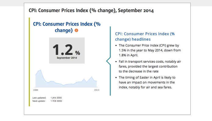
As it turned out though it is all very well surfacing numbers everywhere but without some kind of context they don’t really mean much. This is where we added a missing part of the jigsaw and implemented what data visualisation guru Edward Tufte calls “data-intense, design-simple, word-sized graphics” i.e. sparklines. These simple, succinct line charts perfectly fitted in with the wider design thinking and added that much needed context. They also allowed us to maintain our data-driven approach as we were able to generate them on the fly from the related data sources.
The goal is web pages that are clear and simple but present significant amounts of data – enough that users can use this as their ‘information scent’ and make decisions.
Please let us know what you think about the design and anything else to do with the prototype.
One comment on “Glanceable and data intense design”
Comments are closed.