Visual.ONS – the first 6 weeks on social
The following blog post is written by Gareth Pryce.
Visual.ONS was launched on 15 January with the start of the UK Perspectives series. The aim – to present official data in a new light.
http://digitalpublishing.ons.gov.uk/2015/01/15/official-data-new-light-introducing-visual-ons/
From a Social Media point of view, we’ve been tracking its progress over this first few weeks to measure the impact that the new platform has had.
How has the site been received by users? Any thoughts for improvement? Which releases have drawn the most success?
Let’s have a look…
Social Media Activity

The first week saw big spikes of interest as the first content went live….”The Changing UK Population” and “International Migration: A Recent History”.
So what caused the spike on the day? Was it one of the two releases generating the majority of interest, or was it the general reaction to the launch of the Visual site as a whole?

Looking at a 3 day period during the launch, from 15-17 January, we can see that the hashtag #ONSVisual was used close to 500 times.
Digging in to these mentions, the most popular keywords within these mentions were: “number of UK residents aged 90” which had nearly 300 mentions in conjunction with the hashtag, highlighting the popularity of the Population content.
UK Migration, as illustrated in the above word cloud was a much smaller share of the conversation, generating around 100 mentions in conjunction with #ONSVisual.
The term “new light” highlighting the launch of ONS visual as a platform totalled 160 mentions, accounting for the 500.

So this initial trend suggests that the Population content drew the majority of interest, and the platform launch also generated some good chat.
Not a bad start, but was this conversation all good news? Initial evidence appeared to suggest so.
Brandwatch identified over 30 positive statements (including retweets) within the first 3 days of launch – this doesn’t sound like a lot but when we appreciate that Analytics tools aren’t able to tag everything correctly, and that there were no negatives to speak of this is pretty promising.
Here’s a few examples…
So overall a pretty promising start, so how has the site fared since?

Since that initial 3 day period, #ONSVisual has amassed near 1000 mentions.
Again, exploring within this, there are 3 key pieces that have been most talked about.
- The Changing UK Population – 200 mentions
- Housing and Home Ownership in the UK – 160 mentions.
- The UK in a European context – 100 mentions
And how has the response been in this period?
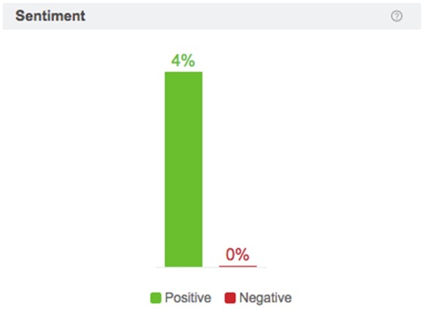
117 positive mentions (4%) were identified by Brandwatch in this period, including these hugely positive examples:
Trends in the UK economy
General site feedback
Monopoly Infographic
How We Travel
Census Singles Map
Housing & Home Ownership in the UK
It’s encouraging to see positive comments coming from across various content, and not limited to the UK perspectives series.
The Regional House Prices associated content in particular performed well, second only to the most shared of the UK Perspectives series. The content had nearly 400 mentions alone on its publication date, and over 100 link shares, with 700 click throughs directly associated with our posts from the ONS Twitter account.
Wider Discussion
Comments aside, there is also evidence to suggest that our content can spark a wider discussion in and beyond the social space.
When we published the Singles Interactive on Visual.ONS on 13 February, the BBC generated an article titled “Are 51% of people really ‘single’”, exploring the definition of “single” and including links to 3 pieces of ONS content, one of which being the Singles interactive on Visual.ONS.
Our tools show that Twitter and Facebook traffic generated over 2,000 views of the interactive on Visual. However the BBC’s article generated over 110,000 of an overall 150,000 views, simply by inserting a hyperlink reference to the site as a whole. Interestingly, nearly 15,000 of these visits were from mobile, suggesting that there could be a wider social media impact overall.
Users
What’s even more interesting is when we take a look at the persona types that are behind these comments.

In this very small sample there are no users classified as data experts, and only 1 journalist within information foragers.
This final example in particular is perhaps an indication that the Visual site is connecting with the intended audience.
https://twitter.com/zakmensah/statuses/555950051210838016
Time will tell on this, but early indications are that Visual.ONS is certainly doing the right things for its users, and is making data accessible to those who would not perhaps call themselves data experts.