Introducing our new performance dashboard
Our last sprint saw the long-awaited arrival of our performance dashboard. It’s been a bit of a journey to get to this stage. Most performance platforms are based on transactional services: those with a, largely, fixed start and end point. For me, the challenge was working out how we measure our non-transactional service.
Measuring the (seemingly) unmeasurable
Government performance dashboards for transactional services measure things like “cost per transaction”, “completion rates” and “digital take-up”. But it gets a bit trickier when your service isn’t linear. For a transactional service, for example, something like ordering a pizza, there is a clear starting point: you enter your details, add your order to a basket, checkout, pay, and then wait for your margherita to arrive. This makes it easy to see who started the journey but didn’t complete it and, for example, how many people are now ordering online rather than placing orders by telephone.
Our website is a different proposition altogether. Users can enter the site from numerous points and their journeys and actions can be unpredictable, based on their various needs. This meant that the more traditional measures weren’t going to work for us.
GDS to the rescue
My starting point for solving this problem was to reach out to the Government Digital Service (GDS) for advice. I was put in touch with Sean Craddock. By strange coincidence, Sean had just come out of a show and tell about a key performance indicator (KPI) framework he had created for GDS’s non-transactional Service Design Manual when he got my email asking for advice. Sean’s design identified 5 categories:
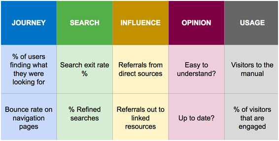
This proved to be an excellent starting point. We stuck with Sean’s 5 categories – journey, search, influence, opinion and usage, and many of the sub-measures – but altered some of them to better fit our product.
Starter for 10
Using Sean’s framework as a base for our thinking, we decided upon 10 measures:

We launched the dashboard with 6 of our proposed 10 KPIs. In the “search” category we have “% search exits”, which represents the percentage of users who left the site from a search page, and “% refined search”, which reflects the percentage of users who refined their initial search. In “influence” we have “% accessing site directly”, to show the percentage of users directly accessing a page on the site, and “% referrals out to linked resources”, which gives the percentage of users who followed links from our site to other websites. For “usage” we have “number of visits” to the site and “% of users who are engaged”. This last measure is represented by the percentage of users who spent over 30 seconds looking at a statistical bulletin.
There are still 4 of our initial 10 measures to tackle, captured in the “journey” and “opinion” categories. These have proved a little more troublesome. “% of downloads from dataset pages” wasn’t as straightforward as we’d first thought. Initially, we took the number of visits to dataset pages and tried to divide that by the number of download events from those pages. This formula quickly unravelled when we needed to factor in that many of the dataset pages have multi downloads on them. Our new approach will be to use the 20 most visited dataset pages with single downloads on them as a sample for this KPI. The “% bounce on navigation pages” has also been solved with some simple changes to analytics tagging on the relevant pages.
The “opinion” category is our final hurdle. We are still working out how to capture balanced feedback from our users without annoying them with pop-ups or placing feedback buttons on the site that might get misused. We currently conduct a twice-yearly website survey that captures, amongst other things, our 2 opinion measures: “% of users who find the website easy to understand” and “% of users who would recommend the website to others”. We plan to add in these 2 extra KPIs using our recent survey data, although the measures will remain a static snapshot in time until we work out how to create a continuous user feedback feed.
Iterate, iterate and iterate again
One of the biggest things I’ve learnt through this process is that website KPIs aren’t always an exact science; often more indicative or representative of a trend. In the New Year we’ll continue to work on getting the remaining 4 measures added to the dashboard and from there we’ll explore additional measures that we can add. What would you like to see on the performance platform?