Bet your bottom dollar, you’ll lose the blues in Chicago

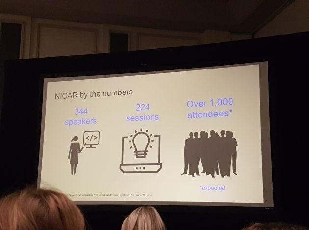
In March I was fortunate enough to travel with a colleague to Chicago to participate in the annual NICAR (National Institute for Computer-Assisted Reporting) conference. It’s a five-day conference for data journalists (CAR is essentially a predecessor of what we know as data journalism today) and every year hundreds of journalists and editors go to a city in the US to teach and learn and share experiences of working in newsrooms.
As one of just four data journalists at ONS, doing this role is quite a lonely business. While Digital Publishing perhaps has the most diverse multi-disciplinary team in ONS (we work alongside designers, developers, and other publishing professionals) it can sometimes be difficult when there are so few people in your specialism. So branching out and going to events where you can meet people from across the world doing similar things to you – that’s pretty cool and inspiring. I’ve been a journalist for seven years now, in various roles, and I have always felt a sense of belonging to the journalistic community. At NICAR, I really felt like I had found “my people”, and I was reminded why I’m at ONS and what my goals are.
I saw going to NICAR as a fantastic opportunity to learn about what other people in the industry are doing and how they do it, to make sure we aren’t missing out on any new technologies or approaches. And also I was obviously interested in upskilling and bringing back new ideas and skills to my team.
So, enough waffle – what sessions did I go to and what did I actually learn?
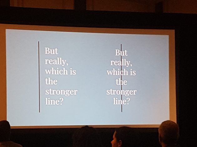
One of the most impressive talks I saw was called “Design for non-designers”. I had supposed it would cover things I already knew about, vaguely, but it was really genuinely informative and interesting, covering a lot of ground in a short space of time. My main takeaways were: Good design is invisible, not all about looks, but all about the details – changing one seemingly tiny thing can really throw people off. The user is the most important person (we try very hard to do this at ONS digital), accessibility is vital, and “just because you can, doesn’t mean you should”. While I know my colleagues who work in design will already know this, it just made me that much more aware of what good design should strive to be, and more appreciative of the challenges in design. In future I want to use this to be a more supportive member of the team when it comes to design decisions.

A great illustration of why alignment shouldn’t always be in the ‘center’!
Another highlight for me was learning how to do data analysis using Python. I’ve long been interested in and dabbled around with Python but I have struggled to really focus and put it to practical use, because I get stuck and frustrated. The session was based around using Jupyter Notebook, which was another bonus for me – I had heard so much about how great JN is, and I wanted to try it out. A huge barrier to learning coding – for me, anyway – is that I don’t always understand quite how to set up different packages, or what dependencies I need. Ben Welsh, Editor of the LA Times data desk, wrote and taught this class and he started from the very beginning, which is just what I needed. His enthusiasm and charisma really helped make the session engaging and useful. Moving forward, I am moving my coding projects to JN, and I’m going to be experimenting with data analysis on it.
While most of the sessions were really useful and interesting, there’s one more I will expand on that I think is so important and relevant to the work we’re doing at ONS digital. There was a panel discussion on the “nerd box”, which I think is an Americanism for methodology boxes – the bit of the site in an article where you plonk all the “this is how we did this story, here’s how you replicate it” stuff. Publishing methodology papers and processes is really important – it cultivates transparency and strengthens the relationship between publisher and user. We publish methodology papers all the time at ONS, but we don’t always make it accessible to the lowest common denominator.
I think there is an assumption that only experts would want to read about how statistics are made, and to an extent that’s true, but I also think that broadening those papers out so they speak to inquiring citizens is really important. Even if most people don’t want to read it, it’s important that it’s there, and accessible – it says to people that we are trustworthy and rigorous. It’s crucial that statistics and their production are open to the public to check, scrutinise, and understand – these statistics belong to the public, after all! There were some fantastic examples of nerd boxes done well – they don’t need to sit in a box at the end of the article, they can be entire github repositories, or a whole other page, which explains how data was collected and how it was analysed. I’ve already spoken to my team about this briefly and I also want to use it as part of ongoing bulletin work that’s being carried out this year.
As for everything else I did over those five days… I learned about:
• choosing and editing satellite imagery
• the existence of a database of illegal imports to the US (tiger heads, elephant feet and all)
• how to make a platform-agnostic chatbot
• how to scrape tweets
• creating interactive maps
• suggestions and ideas for archiving data and interactive journalism
It is not often that people are given the opportunity at work to do something like this, and I am so grateful that my line manager was supportive of me going. I had an incredible time, and I met so many fascinating people who are pioneers in their own newsrooms and inspirational in so many ways. I learned a year’s worth of information in five days, and the experience was invaluable. I hope I have already brought back some of the enthusiasm and zest from the conference, and I’m looking forward to using my new-found knowledge to helping the team do better in future.
By Senior Data Journalist Sophie Warnes

Sophie at NICAR