Understanding what questionnaire experts call ‘things’ that make up a questionnaire.
The following blog post is written by Ben Cubbon.
In developing an eQ product that will allow questionnaire experts to Author questionnaires we have exposed ourselves to a whole new dictionary of words that are used when describing what elements make up a questionnaire when it is being created. Early on in our usability testing we identified that, like every other websites and applications before us, content was an issue for us.
What did we do?
We ran a mixed card sort methodology that compromised of two research stages. First, we wanted to know what things do Authors of questionnaire actually consider when they create a questionnaire, what language do they use? We conducted a truly open card sort by running four group sessions that included 20 Authors in total that came from different questionnaire backgrounds (at ONS we conduct a lot of questionnaires that cover all parts of the population, so we wanted to know if there was a difference if the Author was an expert in a certain type of questionnaire). In these sessions the groups of Authors were asked one question, ‘What elements/things make up a questionnaire?’, Authors were asked to write these things on post its as individuals and then convene as a group to collate their cards (elements of a questionnaire), group them, and define these groups.
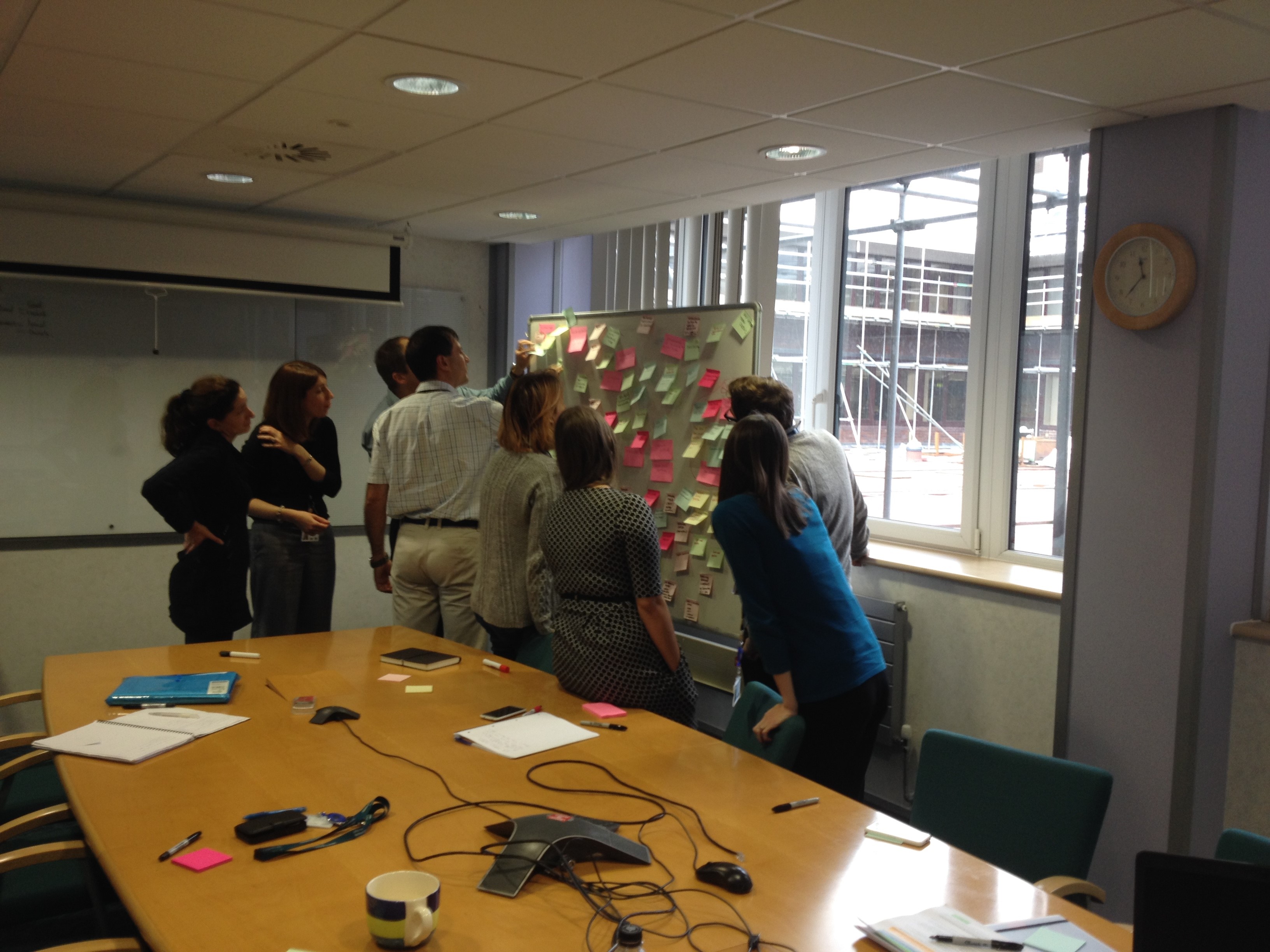
Authors discuss the cards and begin to group them
The findings from these open card sort sessions were analysed, common cards were extracted and grouped into themes, the groups were described using the same language as used by the Authors.
From this analysis 33 cards (elements of questionnaires) were created. It was time to test these via a conventional open card sort. Using Optimalsort, a new set of Authors, 23 of them, were tasked with grouping the cards into meaningful groups for them. They could create as many groups as they wanted, and call these groups what they wanted. The matrix below, a product of Optimalsort, demonstrates what cards authors deemed to be similar.

A thematic analysis delved deeper into how these cards were being associated and what language was used to associate them by analysing what names users gave to the groups they created. This was achieved by looking at each card individually to see what groups they were placed in, what language was used in naming the groups and comparing the names of the group against each other to extract a common theme.

The image above illustrates similarity between the pre-defined cards (blue post its) by space, the green post its then define the themes of each space on the board.
What next?
More testing. Conducting this research has provided two things, one a better understanding of the language our Authors use about the elements that make up a questionnaire which we can test and refine. Secondly, the above analysis illustrates how users organise these elements, and what the similarities are between elements, which will shape how our functions within our tool are defined. This card sort was not like a traditional website based card sort that will help define a menu and page structure, but what it does do is help define at what points in the process certain functions are visible to Authors. As noted by Jared Spool, ‘Content and Design are Inseparable Work Partners’.
One comment on “Understanding what questionnaire experts call ‘things’ that make up a questionnaire.”
Comments are closed.