Making your Twitter profile accessible
Last year, we published the accessibility guidelines in the GDS Social Media Playbook. These guidelines, along with a recent accessibility post on this blog, focus on how to make social media content more accessible.
The following blog post will consider how to make your Twitter profile more accessible.
Bio
The bio section of a Twitter profile should include a bit about you or what you tweet about. This will give people an indication of whether you are the person they want to follow or engage with.
Try to use plain English in your bio and add one or two hashtags about what you talk about to give context to users (and a link to discover more people interested in the same subjects).
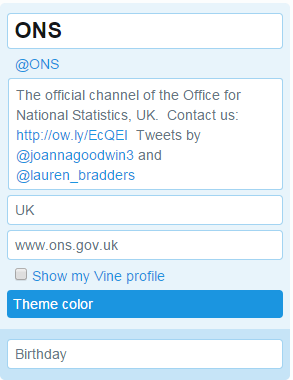
Edit Twitter bio
Links
Always include a hyperlink to your website, blog or online publication. This gives people a way to find out more or read your work in a HTML website as some users find Twitter difficult with some assistive technologies.
Username
Stick to words and numbers for your username. You can only use letters and numbers but be aware, using numbers as letters in your account will not be read out or understood by people using assistive technologies such as screen readers (so 4vo1d mix1ng th3m up!)
Text in images
Lots of accounts, including the @ONS twitter account, have words in header images or logos. Be aware not everyone will be able to read or see this.
If you do use text in profile images, remember to check the contrast of the text on background (see below) and always place text on a solid colour background, not a picture or pattern.
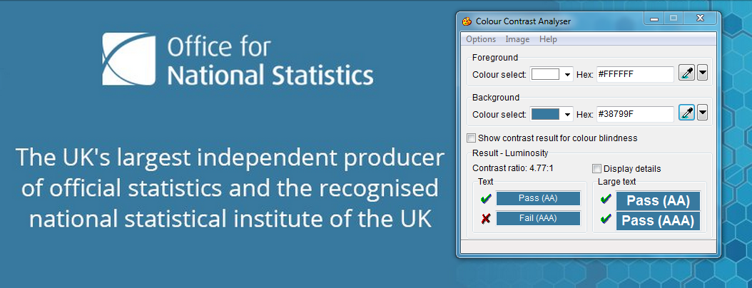
Colour contrast on @ONS header image
Colours
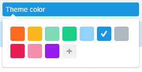
Choosing the theme colour for your Twitter profile is a nice way to coordinate the platform with your brand. You can chose one of the standard colours on Twitter.com or add your own hex colour code.
Twitter theme colours
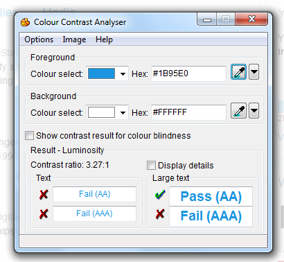
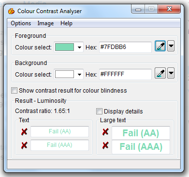
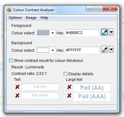
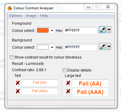
We tested the colours Twitter offer and found only two of these colours meet the colour contrast standards.
Colours that are accessible
Colours that are not accessible

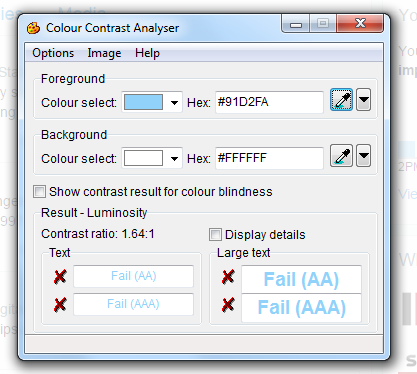
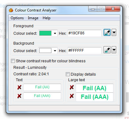
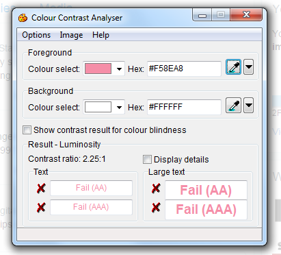
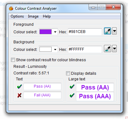
To check the colour contrasts for your profile, the following tools may be useful:
- Colorsafe helps you to find accessible colours
- Color Oracle tests your content for colour blindness
- the eyedropper tool we used above for checking color contrasts in existing website, we used the Colour Contrast Analyser
- if you know the hex colour codes for your brand, Snook is a good tool to try different colour combinations