In a relationship – it’s complicated

A strategy for choosing the right chart.
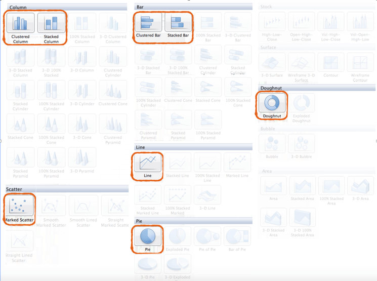
So far we’ve covered a lot of charting tips about using your axes properly [axes on bars, axes on lines & and, scaling appropriately]… but let’s take a step back – are you using the right chart? If you looked at the latest versions of Excel, Tableau, SAS, R or any other charting package you’d be excused for feeling a little overwhelmed at the variety of charting options on offer. In reality you’ll probably only want to use a small selection of these, but how do you choose?
First of all it helps to introduce a bit of language. If I asked you to name all the statistical relationships you might have in your data you may well look at me blankly, or give me a Facebook style answer – “it’s complicated”. But have a think about the charts you use or create on a regular basis – if you had to put it into words, what are they designed to convey?
[Go on, have a think before I give you the answers. For example, why would you use a scatterplot?]
OK – well here’s a list of all the common statistical relationships we can think of…
Magnitude – How big is a value, and how does it compare to another?
Change over time – How do values change over time? What are the trends?
Part-to-whole – How is an overall or total value broken down?
Distribution – How is a set of values spread?
Difference – How do values differ from, say, an average or from each other?
Correlation – How are values related?
Rank – Is there a way to order the data?
Spatial – Are there geographical patterns in your data?
So step 1 is to identify the relationships that are in your data, and decide, usually through analysis, which relationships you need to portray to the reader. You now have a language to justify the chart choices you make.
Sometimes it’s really simple to think about what you’ll need to illustrate your data and your message – it might be a simple line chart to illustrate how a series has changed over time or a bar chart to show how a range of values compare. However, there are other times when we need to think about the variety of relationships that might be present, and consider a different approach.
Let’s look at an example. We were working on a project before the EU referendum to give a picture of our trade with the world and Europe. One section of this analysis was looking at our trade relationship with countries, in particular our top 10 trading partners. This was the first chart we started with. Here you can see that magnitude is the primary relationship we are showing – how do the values compare to each other? You might also have noticed that we’ve ranked the data according to the value of exports to help the reader make that comparison more easily. Can you notice anything you would improve?
Top 10 trading partners in goods and services, current prices, 2014

Even though we ranked by the value of exports to help comparison, it’s not so easy to compare the value of imports. And if I asked you to tell me which trade partnerships we benefited from the most or the least that would be even harder. The balance of trade would be 1 example of a difference relationship.
So one option we tried was to emphasise this difference, using a lollipop chart
Top 10 trading partners in goods and services, current prices, 2014

What do you think? The aim was to prioritise the difference relationship, that is, the difference between exports and imports. We ranked from positive to negative. We still wanted to maintain the ability to compare magnitude, which you can, but it’s not easy. It feels obscured, and making this comparison was important in the context of the article. Also, comparing the balance was somewhat difficult because of the colour switch. If it was only the balance we wanted to compare we could have used a simple bar chart.
So this didn’t work, but we shouldn’t be afraid to experiment. Often we look at a number of different options before coming to an agreement.
If you read the article you’ll see from the final option that we opted for the slope chart.
Top 10 trading partners in goods and services, current prices, 2014
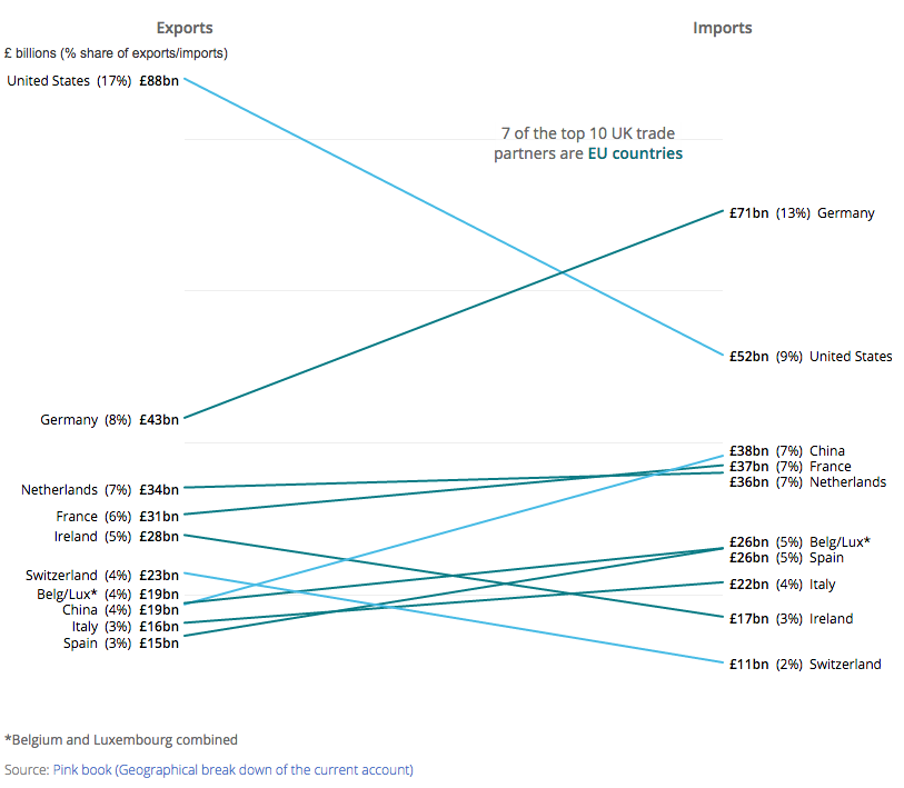
So here you can see there are a few statistical relationships present. On either side we can compare the magnitude of our exports and imports. You can also see that we’ve ranked either side, making it easy to see who we import from and export to the most. The final relationship is the balance of trade for each country – the angle and steepness of the line illustrating how different exports and imports are.
While this isn’t a chart option everyone will be familiar with, it should only take a few moments to interpret. It’s worth introducing our users to new chart forms if, like in this case, it illustrates the relationships in our data better.
So to recap … choosing the right chart type is a 2-step process.
Step 1 – ask yourself what statistical relationships are in your data and, more importantly, what statistical relationships do you want to portray?
Step 2 – make a chart choice which emphasises this relationship. Experiment with different options if necessary.
One note of caution though, sometimes you might have lots of statistical relationships to convey – it might often be better to split out into several charts to share the messages more clearly.
Have a look at what relationships you have in the reports you’ve written or read recently and ask yourself, does it match the message you want to tell? Could you make it better? Are you expecting your reader to see something that is hidden or obscured in your chart? If you’re really enthusiastic, have a go at a Makeover Monday.
One comment on “In a relationship – it’s complicated”
Comments are closed.