We’ve updated Build a custom area profile
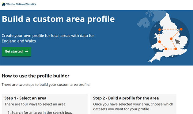
One of the tools we launched for census was Build a custom area profile. This tool was designed to help…
Read more on We’ve updated Build a custom area profile One of the tools we launched for census was Build a custom area profile. This tool was designed to help…
Read more on We’ve updated Build a custom area profileWorking at the Office for National Statistics (ONS), our role is to provide data and insights on what matters most…
Read more on Making milestones visual: how graphics make content approachable and engagingBuild a custom area profile is a simple tool that allows you to create a Census 2021 data profile covering…
Read more on How to make a Census 2021 data profile for your local areaHere’s a simple guide to embedding our interactive maps and charts and making them responsive, so they look their best…
Read more on Embedding ONS interactives in your websiteTL; DR? Our scrollytelling articles are built with Svelte, Layer Cake and Mapbox GL JS (v1). You can view our…
Read more on How we build scrollytelling articlesScrollytelling is a new format for the digital content team, and one we are developing in the run up to…
Read more on What makes for a good scrollytelling article?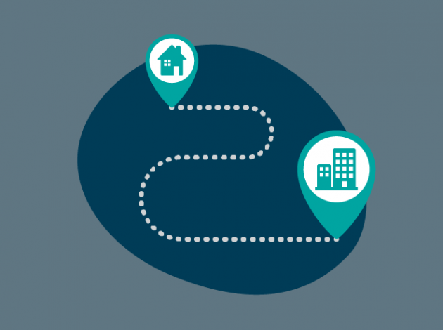
Commuting: most people do it, most people hate it. We know men do more of the longer commutes, and our…
Read more on Commuting: a case study on collaborating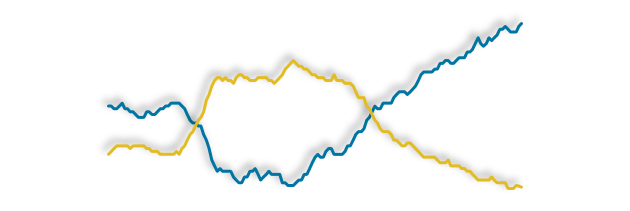
Charts with two different y-axis are often used in the reporting of statistics. They can display two or more related…
Read more on Dueling with axis: the problems with dual axis charts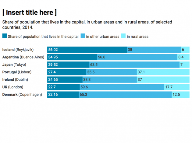
What’s the idea? Currently, most of the chart titles used across the ONS are purely statistical, signposting the data within…
Read more on Say what you see – the way we write chart titles is changing
“Who wants to be a millionaire” is the name of a popular ITV quiz show being reintroduced to our screens…
Read more on Who wants to be a millionaire?