Dueling with axis: the problems with dual axis charts
Charts with two different y-axis are often used in the reporting of statistics. They can display two or more related variables together that may use different units, or where one series is orders of magnitude higher or lower than another. But dual axis charts come with a host of problems that make them confusing, and even misleading.
It’s important to remember that saying something with a chart is not so different to saying it in text – we’re just using a different vocabulary. We would see it as a glaring mistake to say “10 is bigger than 100” in writing, yet with dual axis charts we often say this visually. It should set the same alarm bells ringing in our minds.
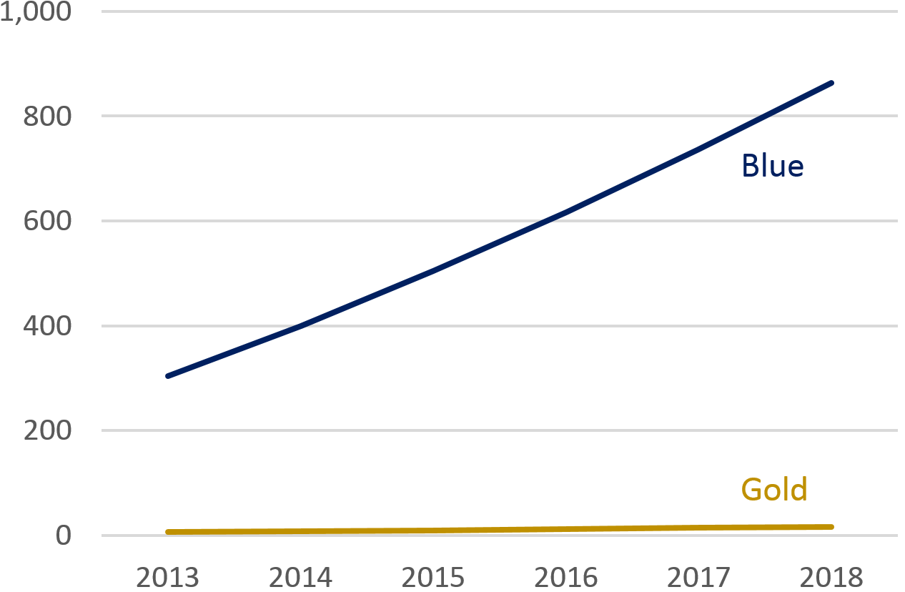
Take the following chart. “Gold” has a small amount of growth, but it’s tricky to see. We decided that we need to show “Gold” more effectively despite the tiny change relative to “Blue”.
Blue compared with Gold: single axis
We often resort to dual axis charts to bring out both of these messages. Here’s a reworked version done in a way we often see applied in statistical publications.
Blue compared with Gold: dual axis
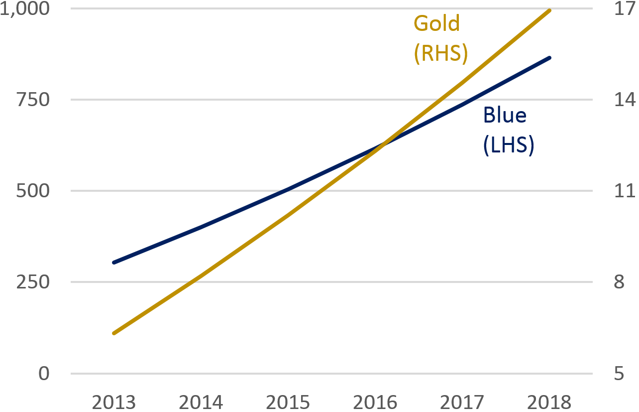
By putting several lines or bars on the same canvas we are inviting the user to make comparisons – as they might intuitively do with a regular line chart. Consider the following statements about our Blue compared with Gold dual axis chart:
- “Gold grew faster than Blue”
- “Gold started lower than Blue in 2013, but was higher in 2018”
- “Gold overtook Blue around 2016”
They are all incorrect, but can we blame a less statistically literate user, or even an expert short on time for making them? After all, without studying the axis, the visual elements of the chart do suggest these to be true.
Now let’s break down a real life example.
The following chart suffers from a similar problem as our first chart. Both lines are very different in magnitude, but both exhibit subtle and important trends we need to describe. Again, the chart is a very faithful representation of the data, but just looks like two, broadly flat lines. It’s fairly uninspiring.
Employment and unemployment rates
UK, seasonally adjusted, January to March 2006 to September to November 2018
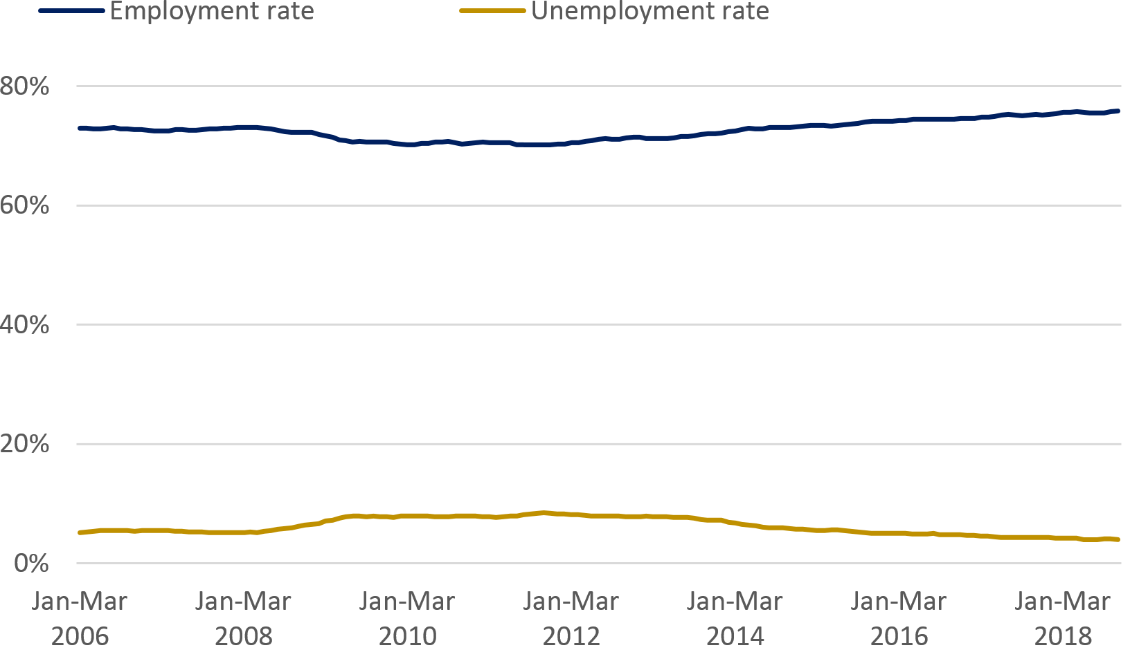
Source: Labour market economic commentary: January 2019, ONS
Manipulating the axis on a line chart can be a reasonable thing to do. Sometimes it can be misleading to present our trends as flat lines when tiny ups and downs are significant. This is arguably the case here, so let’s use a dual axis chart to draw attention to the small changes.
Employment and unemployment rates
UK, seasonally adjusted, January to March 2006 to September to November 2018
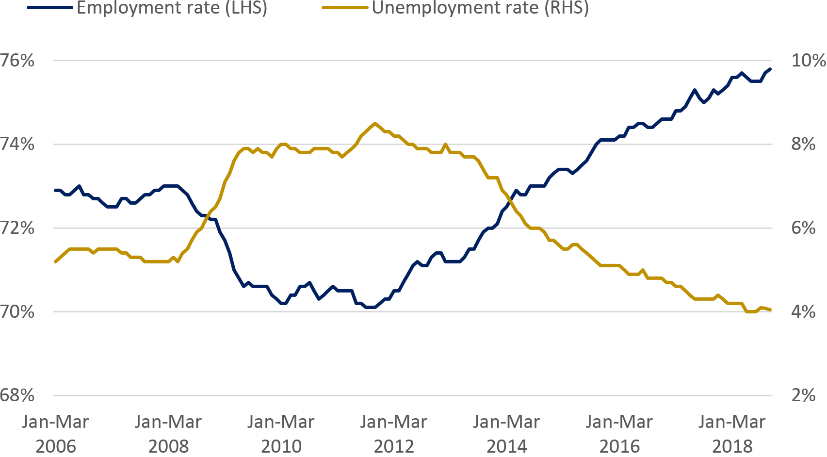
Source: Labour market economic commentary: January 2019, ONS
We’ve certainly succeeded in emphasising the hump in unemployment along with its subsequent dip. We’ve also done the same with employment, showing the slump and subsequent rise. But in doing so, we’ve compromised the user’s ability to interpret relative differences and left ourselves open to misinterpretation.
Let’s see the chart again without the axis. This can help us appreciate what a less statistically literate user or an expert just looking at a glance might take away.
Employment and unemployment rates
UK, seasonally adjusted, January to March 2006 to September to November 2018
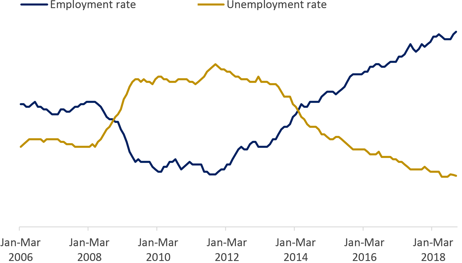
Source: Labour market economic commentary: January 2019, ONS
Again, we should forgive people for arriving at the following incorrect conclusions:
- “The unemployment rate exceeded the employment rate around 2008”
- “Unemployment was higher than employment between 2008 and 2014”
- “The employment rate is now about three times higher than the unemployment rate”
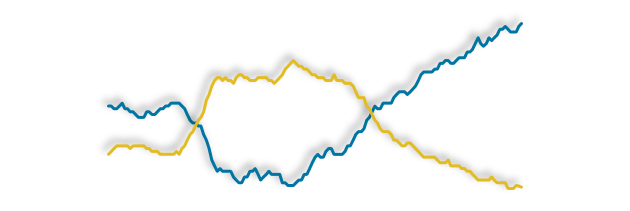
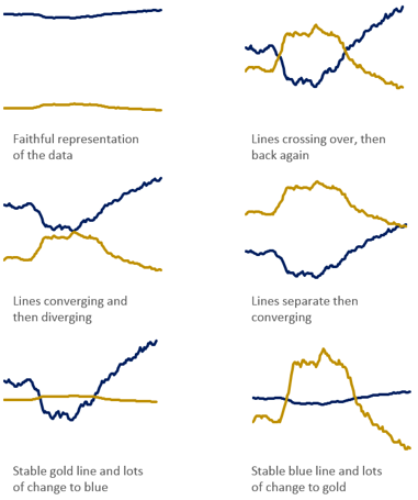
The following charts have all taken the same set of data, but I’ve deliberately manipulated the axis to tell different stories. They demonstrate the power that dual axis charts have to misrepresent data, even if our intentions are good.
This is an idea I’ve taken from Lisa Charlotte Rost in her blog post critiquing dual axis charts, which I wanted to apply to this example.
So what can we do instead?
First we could go with our original chart, but make attempts to breathe life into it with annotation. This can help draw attention to trends that may otherwise be missed or seen as meaningless. We can also bring out some social context, in this case, the 2008 recession, to add to the story.
Employment and unemployment rates
UK, seasonally adjusted, January to March 2006 to September to November 2018
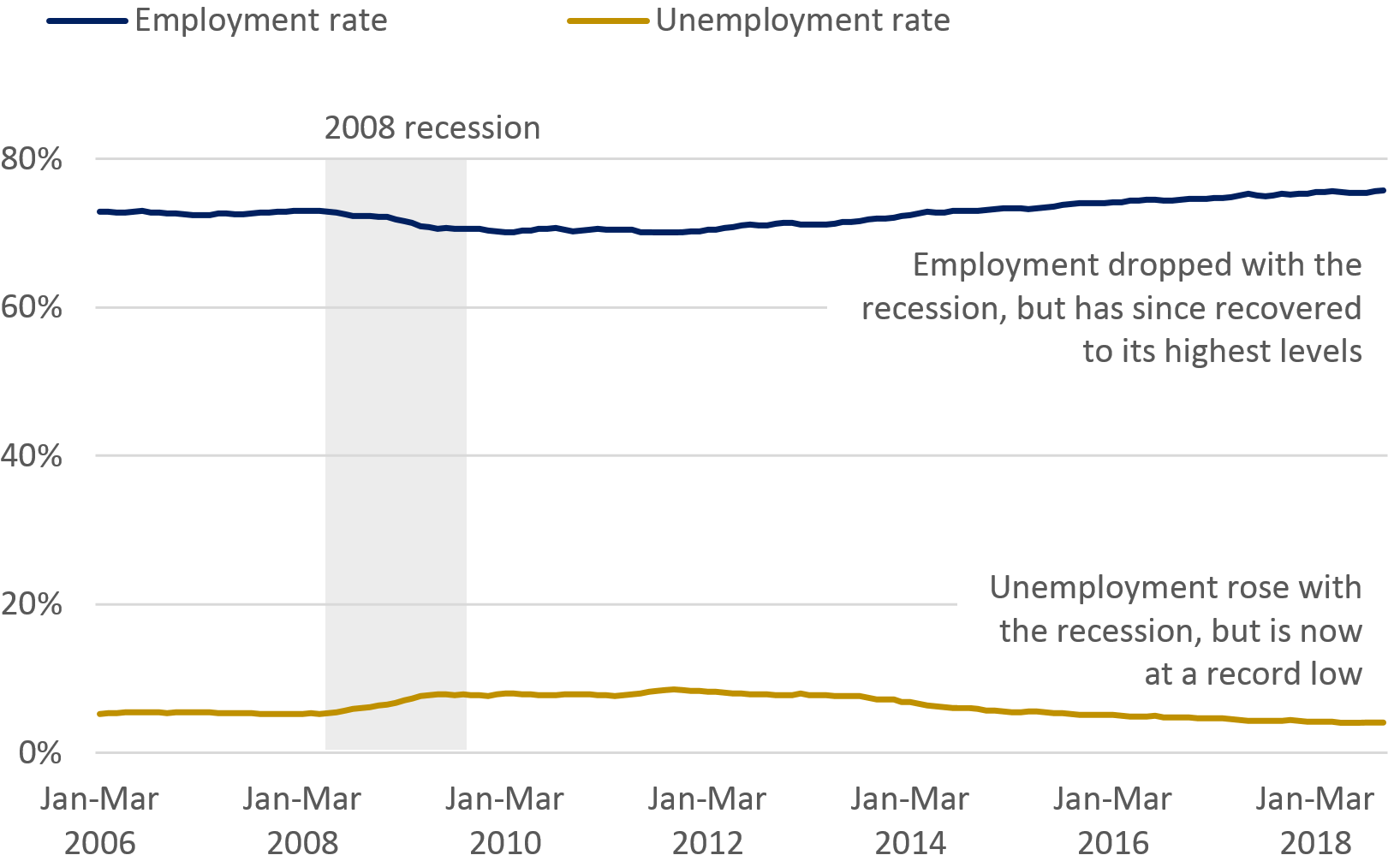
Source: Labour market economic commentary: January 2019, ONS
Alternatively, we can separate the chart into two. Both will have different scales to highlight trends, but without inviting users to make erroneous conclusions. We can now present and discuss them as part of the same figure as they are related.
Employment and unemployment rates
UK, seasonally adjusted, January to March 2006 to September to November 2018
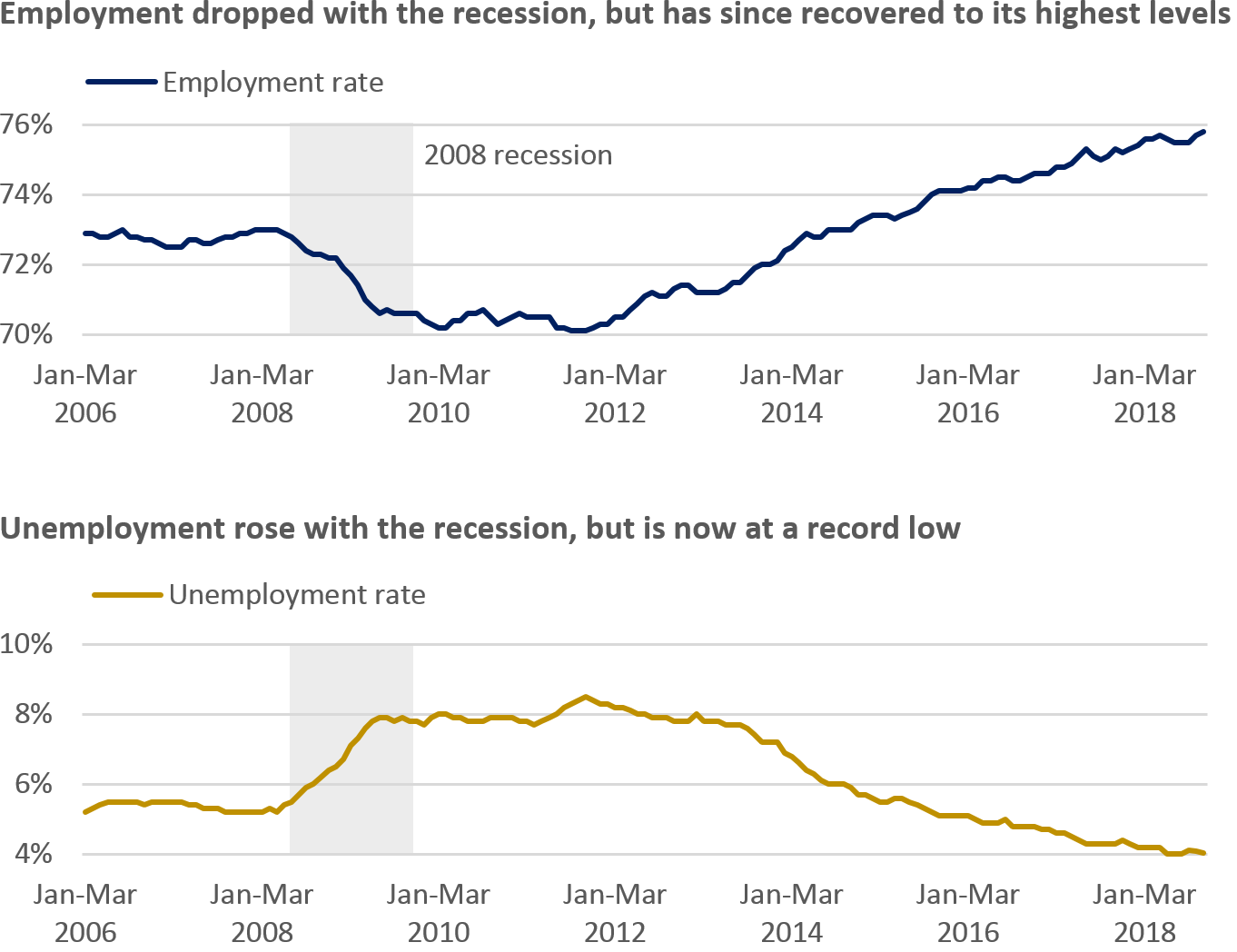
Source: Labour market economic commentary: January 2019, ONS
Next time you make a dual axis chart, consider the problems we’ve identified here and think about using a different approach. Using annotation and/or splitting the chart up are easy things to do to help users understand the data faster, and could even prevent decisions being made based on a simple misunderstanding.