How we build scrollytelling articles
TL; DR? Our scrollytelling articles are built with Svelte, Layer Cake and Mapbox GL JS (v1). You can view our template code here, and the full code of our most recent article here.
This blog post is intended to give a brief overview of how some of our recent interactive “scrollytelling” articles were made on a technical level. It is a follow-up to this previous post by my colleague Erin Vickery on what scrollytelling is and how and why we’re exploring this format in our data visualisation and data journalism work at the ONS.
If you’re interested to read the articles described here, you can find them below:
- Which jobs are most likely to have seen a drop in pay during the pandemic?, 5 March 2021
- What are the regional differences in income and productivity?, 17 May 2021
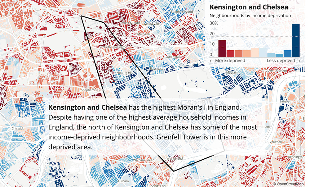
- Exploring local income deprivation, 24 May 2021
So… How does this scrollytelling business work?
The three scrollytelling articles above were all built with Svelte, a Javascript framework that makes it easier to build and maintain web pages/apps with a lot of interactivity and complex visual elements like charts and maps.
Svelte apps are built up from a number of smaller components (charts, tables, buttons, form elements etc) which allow you to construct complex interfaces from smaller building blocks, and which can easily be reused and adapted from project to project. The Svelte project was started by Rich Harris who works in the New York Times graphics team, so it’s very much built with the needs of data visualisation and visual journalism in mind.
If you know Javascript but haven’t tried Svelte, it’s worth exploring their interactive tutorial pages. If you don’t know Javascript (or HTML or CSS for that matter), Mozilla’s MDN is a great place to start learning.
What “components” have we built?
Firstly, we have built an underlying scrollytelling article template with a series of simple (and on-brand) layout components that we intend to keep reusing and developing over time. This includes headers and footers, navigational/UI elements, and various columns and grids for organising text and visual elements.
Our two most recent map-based scrollytelling articles rely on a number of other Javascript libraries, in particular Layer Cake for the charts, and Mapbox GL JS for the maps.
Layer Cake is an easy-to-use library built on Svelte that allows you to create charts out of “layers” of SVG, HTML and Canvas elements, and for these charts to be responsive (ie. automatically resize) across different screen sizes
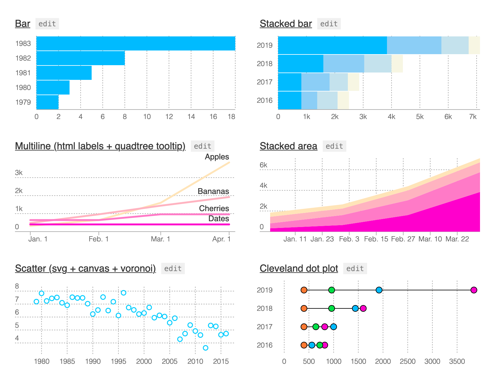 Layer Cake’s creator, Michael Keller — also of the New York Times — has put together a bunch of hackable chart templates with a series of shared components like axes and labels, which makes it really easy to extend with your own custom charts.
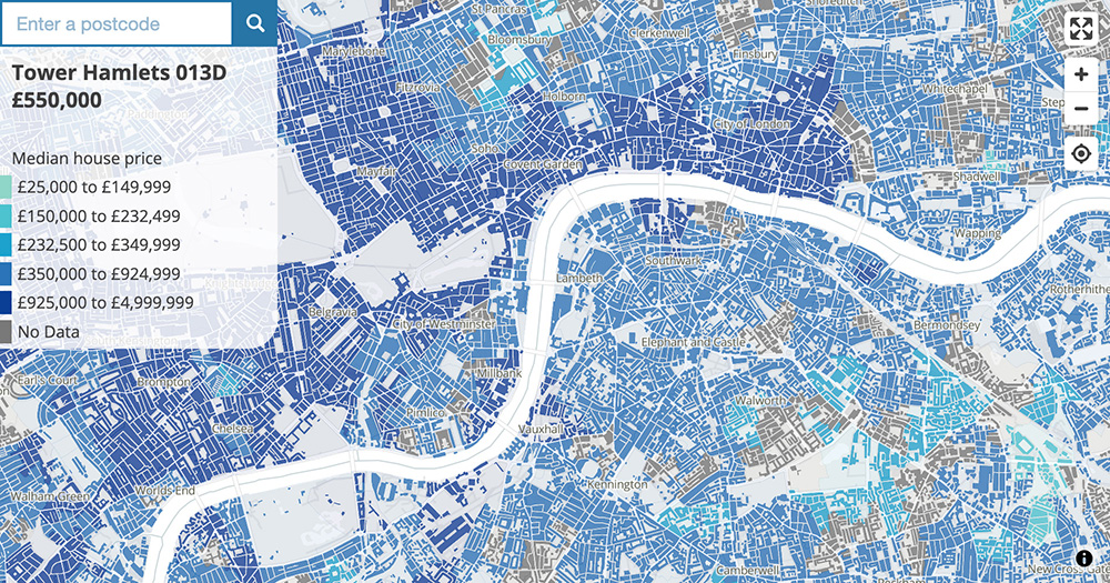
Mapbox GL JS is a powerful mapping library built on WebGL, using hardware acceleration to render complex and data-heavy visualisations. We have built a handful of components to allow Svelte to interact with Mapbox so that we can build choropleth and dasymetric maps that are synchronised with other elements in the article, such as charts and tables.
The building-level dasymetric-style maps in the articles rely on our own custom-built vector map tiles, which are derived from building geometries from the Ordnance Survey Open Zoomstack and geographic boundaries from the ONS Open Geography Portal. The geometry files were processed with QGIS and the vector tiles were generated using Tippecanoe.
Note that we also have a simpler Javascript-only template (without Svelte) for displaying dasymetric-style maps, which can be seen here (with code here).
*Note that we are using Mapbox GL JS v1, since v2 has moved to a pay-per-use model, making it inappropriate for apps that rely on self-hosted map tiles rather than Mapbox’s tile service. We are investigating moving over to MapLibre GL, an open source and community supported fork of Mapbox GL JS v1.
What about accessibility and compatibility?
For us, the scrollytelling format is still experimental, and we haven’t necessarily got everything right. However, we have tried to follow best practices both for how scroll interactions work, and for A11y guidelines for web accessibility in general. (We have also made use of Chrome’s Lighthouse, axe DevTools and Svelte’s built-in A11y guidance).
In terms of cross-browser compatibility, the code should work in any “modern” web browser, and on Internet Explorer 11. It is also responsive across a wide range of screen sizes.
Have a play with our code
We have made available both our general scrollytelling template and the code from our most recent (and most technically complex) article “Exploring local income deprivation”. Feel free to play with/hack this code, create your own forks, or even to share your improvements to it. We’re know there are things we can do better, talking of which…
What’s next?
Firstly, we’re aiming to build up our Svelte component library, to create consistent and accessible charts, maps and UI elements that can be used across projects.
Secondly, we’re aiming to pre-render the HTML code for the pages (rather than generating it via Javascript). This will allow the articles to be viewed on a wider range of browsers, including where Javascript is disabled, and will also improve SEO (“search engine optimisation”).
As part of this, we’re also looking at ways to use the new capabilities of Svelte Kit to pre-render localised variants of some of our articles, allowing people to read and share stories focused on their own areas (eg. example.com/article-url/my-area).
Thirdly, and lastly for now, we are looking at ways to better integrate these interactive standalone articles with our main ONS publishing system.
We’d be really interested in how others are solving these challenges (especially the last one!), and would love to hear from you in the comments, and via social media.