What makes for a good scrollytelling article?
Scrollytelling is a new format for the digital content team, and one we are developing in the run up to Census. Our prototype scrollytelling projects include ‘Which jobs are most likely to have seen a drop in pay during the pandemic?’, ‘Exploring disparities in local income deprivation‘ and ‘What are the regional differences in income and productivity?’.
This format has some key strengths, especially in publications with graphics that have considerable depth to them; lots of findings to explore which might be best explained a little at a time. If the concept is difficult to explain, linking charts and texts more closely will better guide people’s understanding. In traditional format articles, the reader may have to shift their attention back and forth between the graphics and the supporting text multiple times to fully understand what’s being presented. The scrollytelling format takes this burden away from the reader, making the information more easily digestible.
Step-by-step storytelling
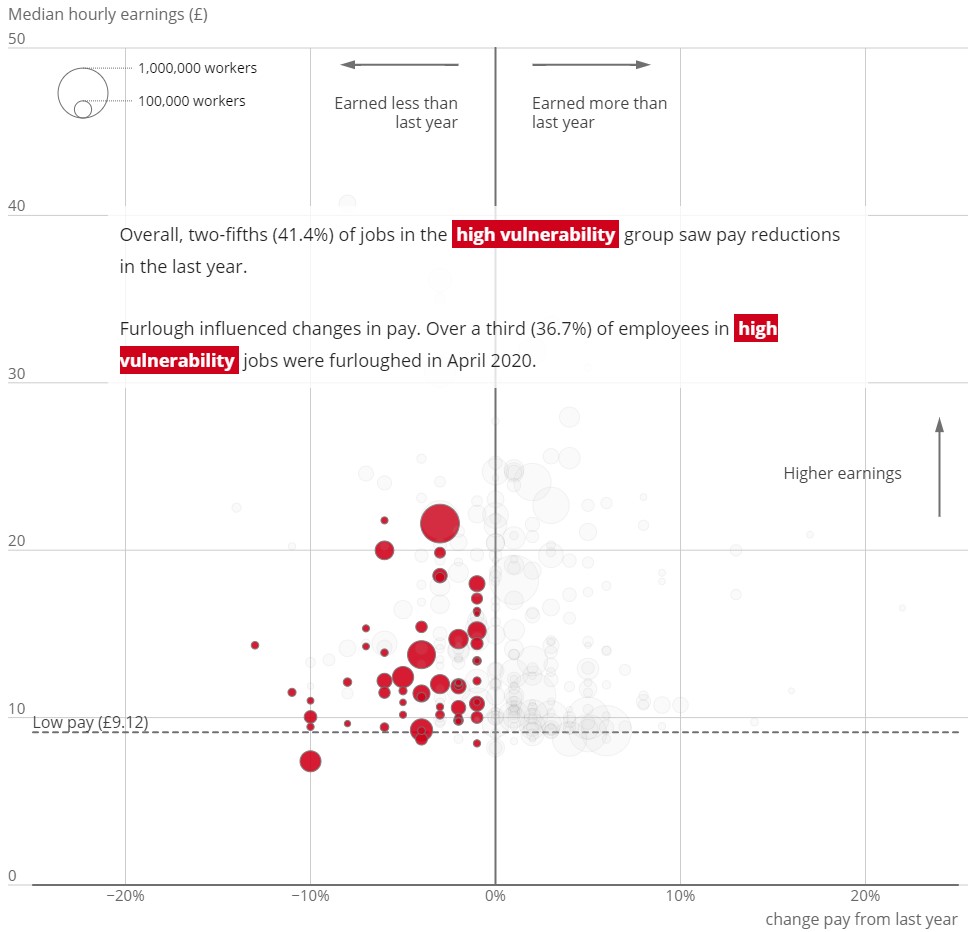
The data used in ‘Which jobs are most likely to have seen a drop in pay during the pandemic?’, is from a large survey of occupations with pay details from April 2020, the height of the pandemic. Each occupation has multiple data points with its own story to tell and there are over 300 occupations to focus on. The data is drawn on one scatter plot to see the overall shape of the findings, so you get an immediate feel for how many occupations earned less than in the previous year. The scrollytelling format then helps to answer the headline question by highlighting key occupations with each scroll, whilst also displaying the rest of the data as context. Our readers likely wouldn’t be interested in analysing the full dataset themselves, but there are plenty of findings to present.
The analysis for these scrollytelling prototypes is based on extensive data sets, cut down to some key highlights and aimed at the citizen audience. This type of audience may not be as familiar with statistical data and so scrollytelling offers an effective way of guiding the reader through findings in a step-by-step format.
Explaining tricky concepts
Scrollytelling formats often use text to accompany the graphics. This is particularly helpful for those who are not familiar with reading charts, as the text can explain how to read the data. However, one constraint to this approach is that the text needs to be short and precise, working most effectively when you only present one point at a time. In cases where the concept is tricky to understand, this can still be a useful method, as the charts can support understanding of the written text instead. This two-fold approach is particularly important for the citizen audience to facilitate understanding, as they might have limited time to read the article.
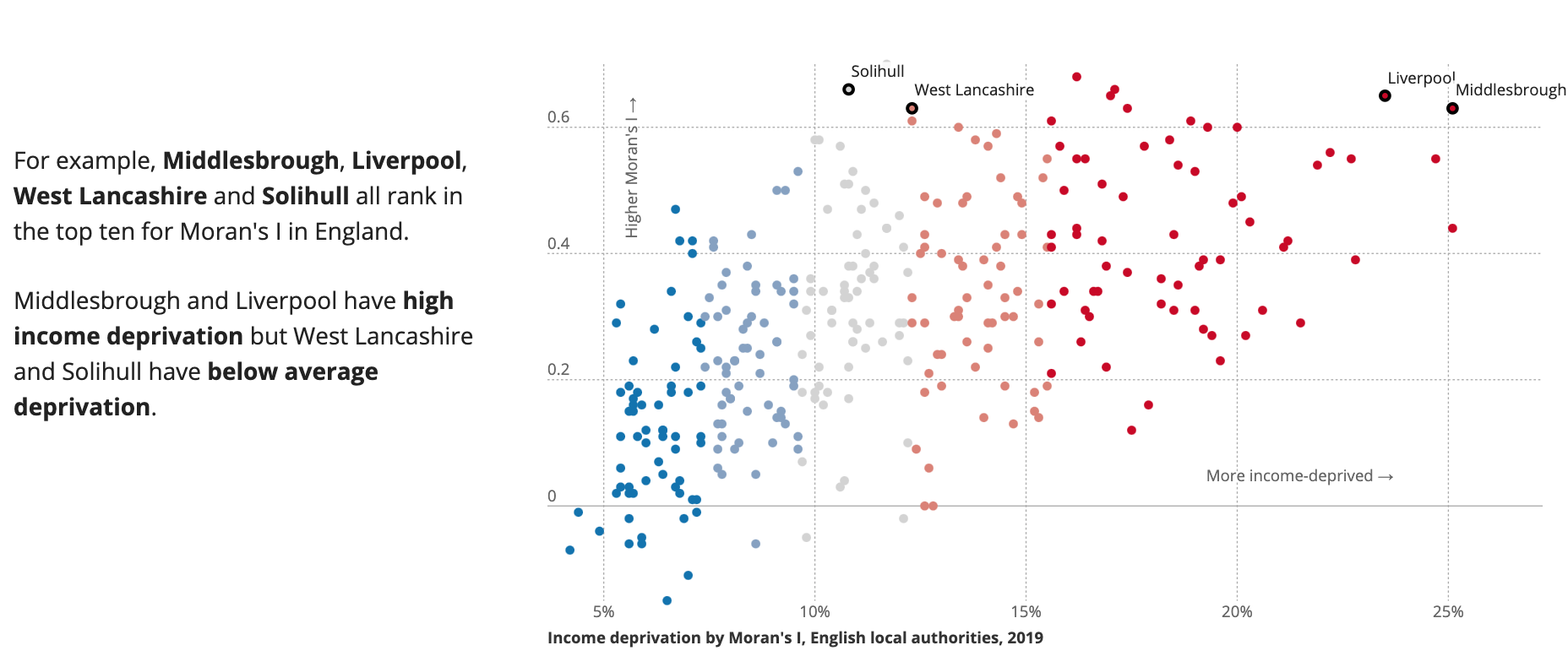
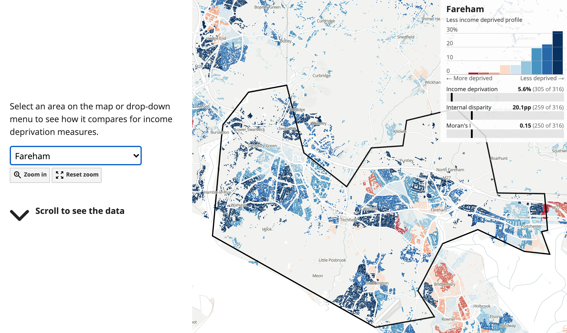
A great example of how this works is in the publication ‘Exploring disparities in local income deprivation‘, which uses Moran’s I to demonstrate how income deprivation is clustered. The reader is introduced to the concept and then scrolling on, is presented with a map that demonstrates this with example areas, before a detailed walk-through using a scatter graph. Finally, you can choose your own local authority; funnelling the information down from the initial, hard to grasp concept, to the details of your local authority through a combination of explainer text and graphics.
Personalised storytelling
Another way in which these publications make good scrollytelling articles is how the reader interacts with the data; some of which is customisable by local authority. The scrollytelling format is especially effective in this case, as you can layer several aspects of personalised data over a full map of the UK, showing the reader how they compare to other local authorities. The data becomes more personal, meaningful and hopefully better retained by the reader.
Future development
Scrollytelling is one of a few different formats we are developing in the lead up to Census. Our aim is to improve on these initial prototypes through user research and later publish them as polished Census outputs.
If you would like to provide feedback that will help shape the future of Census outputs, please fill in our survey here.
If you are interested in our other digital content publications, you can view the catalogue of our work here.