Semi-automation and Census 2021: how we told 331 local stories in one go
Our semi-automated articles on “how your area has changed in 10 years” quite literally brought Census 2021 home.
This built on our previous automation on local health by taking the “robo-journalism” out of an embedded tool within an article, to making it the whole of the article.
Combining analysis in Python, front end development in Svelte, data visualisation in d3.js and old-fashioned journalism, Theo Jolliffe and Tim Kershaw created 331 individual pages – one for each local authority area of England and Wales – on how life had changed between the 2011 and 2021 censuses.
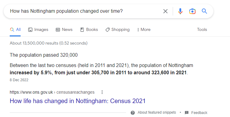
Every version generated its own URL, with the GSS code of the chosen local authority. This meant the headline and the abstract (the summary paragraph at the top of the article) changed to include its name and facts about it. For users coming in via a Google search about Nottingham, they would be taken straight to Nottingham’s page with no need to select it.
Giving people’s data back to them
In March 2021, millions of people filled in their census forms. While the data will help an enormous variety of users to plan public services and more, these articles were there to tell everyone the story of where they live.
We tested the concept with different users who really valued being able to read all about the place they call home in a journalistic style. It was something they didn’t expect from the Office for National Statistics (ONS) and they meant that in a good way. This was important because the very people we were trying to serve were citizen users, those without a background in statistics, who might know they can trust the ONS when they hear it quoted in the news, but might not normally think to come to us directly.
Interactive maps, charts and dashboard are all wonderful ways of communicating data, but we need to pull out the narrative and the story to help guide our users through the numbers.
Each article was different according to what the data told us. This was no “fill in the blanks” exercise. The story would highlight notable differences in the area compared with others.
So, if you were reading the article about County Durham, you’d see the story about it having the second-largest percentage-point decrease in the North East for couples with dependent children. Whereas if you were interested in Chichester, you’d read about it seeing one of the largest percentage-point rises in the South East in people who were divorced or had dissolved a civil partnership. For readers in Cornwall, our section on national identity highlighted the percentage of people who recorded their national identity as Cornish.
Every chart was accompanied by an automated and downloadable spreadsheet of data. And each chart had its own unique embed code. The story was taken up by dozens of local news titles, who produced articles on how their areas had changed using the text and the charts.
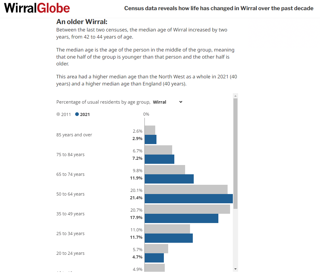
Whether it was the Wirral Globe, the Warrington Guardian, the Wrexham Leader or other news titles that didn’t begin with a W, they all had a local story to tell because we’d helped them to find it with these articles.
Within a few days of publication in December 2022, every individual area’s page had been read. We continued to refine the product post publication, adding meta tags and other tweaks “under the hood” to help the pages reach more users through search engines.
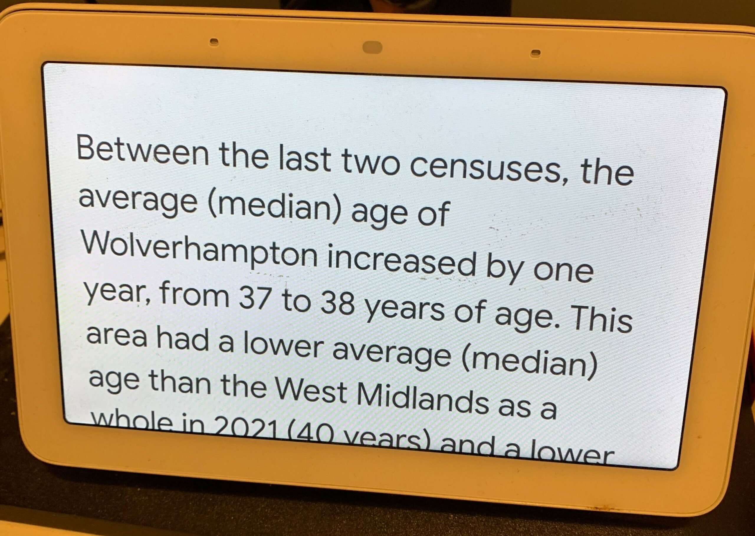
And if you ask your Google Assistant for the average age in Wolverhampton, it will answer using the local article as its source.
The future of automated content
We don’t want this to be a unique, one-off piece of innovation. Our aim now is to help our readers get more access to ONS data and analysis by making it personalised and relevant. This is no easy task. Semi-automation is not a labour-saving tool. It doesn’t mean we can do things more quickly. It means we can do things we never could before.
Checking the articles took time and care from the Census Outputs team and our content designers. We’re working to make that easier and simpler. Given that the Census data go even more local, down to small neighbourhoods, the potential to produce even thousands of articles is there.
The team has developed a greater understanding on the content automation process and will continue to look for opportunities to improve ONS digital content and develop new formats. While our semi-automated reporting has so far focused on localised reporting, we can see huge potential in giving our users specific reports related to their profession, their age band, or any other group they may be interested in.
We are committed to continuing to innovate and looking for more opportunities to help our users see themselves in the story.