Commuting: a case study on collaborating
Commuting: most people do it, most people hate it. We know men do more of the longer commutes, and our newest analysis published at the beginning of September showed that women are more likely to leave their job over a long commute.
Our article was picked up by the Telegraph, Reuters and the Evening Standard. Reporters from the BBC, analysts from the IFS and Ipsos MORI, and other statisticians commented on social media about our findings. Most notably, the then Minister for Women and Equalities, Amber Rudd said:
“Women across the country struggle to find a balance between being a parent and their job.
“These statistics show how women are likely sacrificing a larger paypacket, and career growth, because they are doing the bulk of childcare and unpaid work – like taking care of elderly relatives and their home.”
It felt like the success was down to this being our most collaborative project yet.
The idea
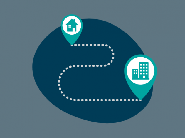
In January, I was trying to get an idea off the ground around who does the same commute as you. As a member of the Digital Content team, I’m responsible for communicating our data to a broad audience of inquiring citizens. Our users are interested in how they fit into our statistics, hence I thought we could show how their commute compared with others like them.
I started by emailing some people in our policy team, which led to another meeting with our Labour Market team. The meeting notes got circulated round to even more people.
Separately, Vahé in our Methodology division had been working on some analysis of gender differences in commute time, having found a gap in the literature regarding contributors to the gender pay gap. His analysis was aimed at policymakers and expert users, but the underlying data with people’s places of residence and work had links back to my idea.
Fortunately, Tom Williams from the Labour Market team, who had been involved in our initial meeting, was aware of both strands of work. We had worked with Tom before on the previous analysis on commuting so he knew what we do. Tom regularly talks to Phil Leake, a data journalist in our team, and once he had shared plans of Vahé’s work we put those two elements together to form the core of our idea.
Takeaway 1: Putting the right people together takes multiple attempts
We explored a few different avenues of how else we could pull in additional information. I asked people who had worked on admin data whether we could get information about parents but this wasn’t feasible. But we had seen the Data Science Campus talk about another project using a trip planner to calculate travel time.
Takeaway 2: Explore possible avenues early but close down ones that don’t look fruitful
Calculating commuting time
The Data Science Campus project, access to services, looked at how people could travel to different services, for example GPs, and whether there were black spots. For this project, they had created a tool called propeR which runs analysis on batches of locations.
I thought we could use this tool to calculate the commute times instead of using commute distance. We needed a bit of help and the people at the Data Science Campus, especially Michael Hodge, got us up and running with propeR and supplied the necessary public transport timetables. We adapted their open source code to run better for our task, which was throwing a million home-work postcodes pairs at it.
Takeaway 3: Keep your networks wide
Although the trip planner was great, it was very fussy about the starting point – it had to be on a road – but we were using the lat-lon of the centroid of a postcode which isn’t necessarily on a road. I was a bit stuck on how to fix this, so I reached out to the government data science community over Slack and asked for some advice.
Someone from Hackney Council suggested using Open Source Routing Machine which worked.
Takeaway 4: Seek help when needed
It took until April to get to a point where I could start crunching the big datasets, and to speed things up I took over other people’s computers. During this time, Vahé also presented the gender difference of commuting distance at the ONS Economic Forum event to get some feedback.
Bringing it together
Once the dataset of travel times had been pulled together, it was fairly quick to rerun the analysis using time instead of distance. This helped with making our story more credible and more relevant to people.
We had regular catch-ups every few weeks until the publication. The core digital content team was made up of Rachel, our designer, Phil the data journalist, and me from the data visualisation side. We were joined by Roger Smith and Tom Williams from Labour Market and Vahé from Methodology.
Takeaway 5: Bring together the right mix of skills
Takeaway 6: Regular communication is key; have face-to-face meetings when you need them
There was lots of crossover of people’s expertise. I remember Roger commenting on some draft graphs which led to them being lots better. There’s a risk for egos to become involved, but it was really apparent that people were focused on creating something that really worked for the user.
Takeaway 7: Put respect, equality and a common goal at the core of the team
We had hoped to launch the project with a media partner but unfortunately that didn’t work out.