Who wants to be a millionaire?
“Who wants to be a millionaire” is the name of a popular ITV quiz show being reintroduced to our screens in the new year.
The title was mainly an effort to get you to click into this. And now in an effort to keep you reading, I’ve scattered the names of a number of popular tv quiz shows throughout this blog. There will be a small prize (yet to be decided) for the first person to get the number of quiz shows right. One guess per person – leave a comment below.
Still with me? Or was that the tipping point? There is a reason for the quiz theme: this post is about quizzes. We’ve experimented with a number of quiz formats during the life of Visual.ONS, and continue to use them in more recent work. This post will cover why we’ve used them and in what situations they’ve worked best.
As a statistical organisation tasked with improving communication why on earth would we want to test people’s knowledge? Why would we make them waste their time struggling with a quiz when we could deliver these points through bullet points? It’s pointless!?
Many of you reading this will be data nerds (I include myself in this) – the eggheads, or masterminds of the statistical community. You’re almost certainly naturally curious, and you’re already using data in your day-to-day life. Where should I send my child to school – what are their results like? Should I move to that area – what is it like? Aside from the personal interest you’re probably also interested in how the country is doing – what is unemployment like? How is the economy doing?
But there is a whole section of the population that may not have that data curiosity. There has been a lot written recently about fake news, a post truth world and how some sections of society are reluctant to engage with facts and data. Quizzes are one tool we’ve used to encourage people to be curious.
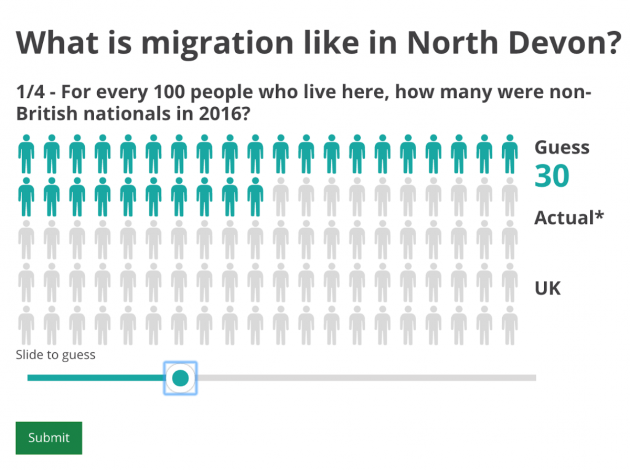
The quiz below was from a piece where we challenged the readers to what they knew about migration levels in their area. It’s not something that we often report as an office; we tend to focus on the national headline figure.
What are the elements that made this quiz work? We could break this down into two parts…
Curiosity
There needs to be a reason why someone would invest their time in completing a quiz – we need to encourage curiosity.
In the example above much of this is down to the subject matter. It’s not difficult to work out why migration is of interest to the country right now (hint: Brexit). So making someone curious about this subject matter will be easier.
It’s also data about their area so it’s likely to interest them on a personal level.
Reward
We need to reward people for their curiosity. We’d like to encourage an emotional response, like, “I was awesome at this quiz” or, on the flip-side, “I really sucked at this”. Or emotion attached to the data – “that really surprised me about ________!” or some other catchphrase.
How did we achieve this here?
We gave people a completely blank canvas: on the question above they’re able to guess from 1 vs. 100 people. People aren’t given choices so they are more likely to really consider what they think, rather than evaluate the merits of, say, multiple choice options. This means they have invested in building a hypothesis…before finding out whether it was wrong or right. This will make the ‘reward’ of finding out all the more euphoric or gutting.
It’s also data that people are unlikely to have a good grip on; the results are likely to surprise them. We don’t tend to report on this data at a local-level, most of the focus is on the headline national figures. Their understanding of the data may also be driven by the frequency of the coverage of the topic and any fears they may have. A quote from the IPSOS MORIs Perils of Perception survey sums this up nicely: “We are often most incorrect on factors that are widely discussed in the media, such as the murder rate and the number of people who die from terrorist attacks each year. We know from previous studies that this is partly because we over-estimate what we worry about.”
Given the subject matter, it’s also likely to evoke a migration-related emotional response. People have strong feeling about about the topic and the quiz is designed to connect some data to those emotions.
We’re not the only ones…
We’re not the only ones to use these types of quiz formats. Our work has been heavily inspired by others, including the brilliant draw your own chart series from the New York Times, a benchmark for this type of format. We wrote a blog post on the development process for this recently, but essentially the example below follows the same formula: topicality, encouraging curiosity and a blank canvas.
What’s changed since the brexit vote?
Did the quizzes work?
Yes – we’ve encouraged curiosity for a wider audience than we’d normally achieve. It can be difficult to break through the inevitable coverage wipeout that the headline migration figures will generate, but the migration quiz was widely picked up and reused by the media – both national and local media.
Because of the syndication it reached many many more users in the 24 hours following publication than might normally engage with ONS content – that’s people directly engaging and getting curious with ONS data (without really realising it).
What are we planning to improve?
We’re interested in looking at ways to reward the reader further. Possible options here are to look at giving the users a score, or a summation of how they’ve done. As well as it being a reward it would also make it more tweetable/sharable.
We’d also really like to extend this to show the reader how they’ve done compared to others – in real time – but there are many challenges here, not least data privacy.
If we’re able to overcome these challenges there is also scope to collect new types of data through these interfaces. There would be additional challenges of how to interpret the data, but there is the potential for this to be a useful data source for understanding the public understanding of UK statistics.
You might be interested to read further on this subject – here’s a couple of good starting points:
Embracing curiosity – by Lisa Charlotte Rost (whose blog heavily inspired the description of the techniques used)
Thinking Fast and Slow – Daniel Kahneman