Reusable visualisation
You may have seen in June last year we asked people to draw the rest of the line, for several charts, a year on from the Brexit vote. And then in October we collaborated with the BBC Radio 4 Today programme to show changes in society during its 60 years of broadcast.
The “You Draw It” was inspired by the New York Times, who over the years have consistently created some of the best data visualisations. They’ve used a similar visualisation tool to invite users to draw their own for: How Family Income Predicts Children’s College Chances, What Got Better or Worse During Obama’s Presidency, and Just How Bad Is the Drug Overdose Epidemic?
For some time here in Data Vis we have had our eyes on this concept as it draws the user in by making them think rather than just being shown. This method is not only a bit of fun but actually helps people remember the trend. So here are some of the technical challenges I faced when I recreated this for ONS.
Understanding code
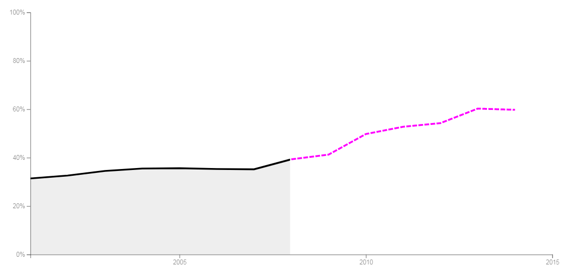
The basic code for this project was placed on GitHub by Adam Pearce, who states at the start of the GitHub repository, “Early/simplified version of You Draw It’” and this is what you get:
So I cloned his repository from GitHub to my hard drive and got on with exploring his code and the techniques used. In short, it was written in such a lean way with every bit of code doing so much work, the most concise I’d seen. In places some code routines seemed almost unfathomable, performing several processes at once. Here are some of the high level challenges I faced:
- work out his super quick routine for creating chart area with axes then rewrite it using our own standard code
- learn to use clipPaths – this is the bit that uses a rectangle to mask all or part of the actual line until you shrink its width to reveal the true trend line – that’s the clever part, it’s already drawn
- learn to use the drag() function – this will be responsive to your mouse or finger for mobiles and feeds back your on-screen location
- learn about clamps – this little function checks the mouse or finger is in the right area to start the drawing of the line and its continuation so we don’t have users drawing all over the screen
- get it working for all time formats not just whole years as with all the examples
I realised the code used shorthand methods from Adam’s bespoke library, so initially I set about rewriting for use without it. We and many other data visualisers use a library called d3, which is very complex but enables a wealth of functionality relating to visualising data. In fact most of our charts and interactive tools including the “You Draw It” rely on this library. For those not in the know there are many open source libraries for most languages and some experienced coders write their own. They are useful because part of their role is to take the donkey work out of writing code by storing blocks of code that provide functionality.
One of the toughest challenges was as my last bullet point above, which states the code only catered for data using whole years; makes the maths easy you see. I won’t go into detail but this took some time to get right and it’s used throughout the code to deal with dynamically displaying the data and testing your drag location.
All in all this took me quite some time to rewrite to an understandable level that gave me the flexibility to further adapt it for our needs. So where next?
Making charts responsive
Okay, so once decoded and rewritten in a manner that was intelligible to your average javascript coder, it was time to wrap it in our template which, in a way, is a checklist. It deals with browser compatibility and ensures your code is set up and tagged correctly. It will call up your libraries and adds Google analytics so we can count hits and other online measures. It will load CSS files used for styling all manner of objects and fonts providing sizing, colours and formatting used throughout the visualisation.
Most importantly, the template allows for responsiveness, which means providing an optimal viewing experience for reading and navigation across a range of devices from desktops and tablets to mobile phones. The code within the template detects users’ screen size and adjusts items like the chart height and width, the intervals for the tick marks on axes and whether direct annotations are used. For instance, for a mobile these items could change, get removed or be placed elsewhere.
…job done then, well no.
Configuring the visualisation
Configuration files set up the visualisation for individual pieces of work to tailor specific requirements such as:
- date format used in the data so it knows what’s being read in: Jan 12, Jan 2012, 1998, Monday 17…
- number of axis ticks to be used for mobile, tablet or desktop
- axis labels
- annotations
- source and its URL if available
- what pixel width to break for mobile, tablet or desktop and their respective aspect ratios
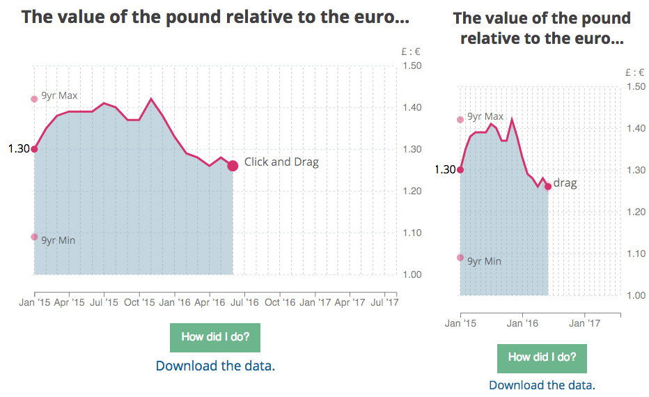
And for this particular interactive I needed to add a start, end and cut-off dates for the line. Adding this flexibility to the configuration as opposed to coding it in the main program means I can use any portion of the time series provided and show as much or little of the trend before you draw. For the BBC the cut off was the same as the end date, so none of the true line was shown. And you have to draw it back to a point in time; now that’s adding flexibility.
The rest of the visualisation is driven by the data. That’s the main code working out all the maximums, minimums, length, mean, median…whatever it can and needs from the data provided. So for a given chart area the axes or visualisation are always drawn and scaled to the shape and size of the data fed in. One example from the “You Draw It” would be the y-axis taking account of the range of values and the x-axis the time range specified. This means I can format datasets and then create a new “You Draw It” relatively quickly.
Last but definitely not least
It’s all working, you can give it data with almost any known timeline format, it’s responsive, styled with the right colours, fonts, axis line thickness…basically everything is set across the board. We now need to make it as easy as possible for the user to work with the product and in truth it’s a process of iteration. Here are some of the items we deliberated over.
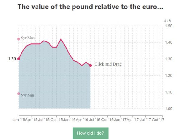
- We put the axis on the side where you’re drawing to because that’s where we believe you will be looking.
- We added maximum and minimum values of the data to help the user since we may only show a portion of the time series.
- We have grid lines going vertically as well as the more common horizontal to aid the drawing.
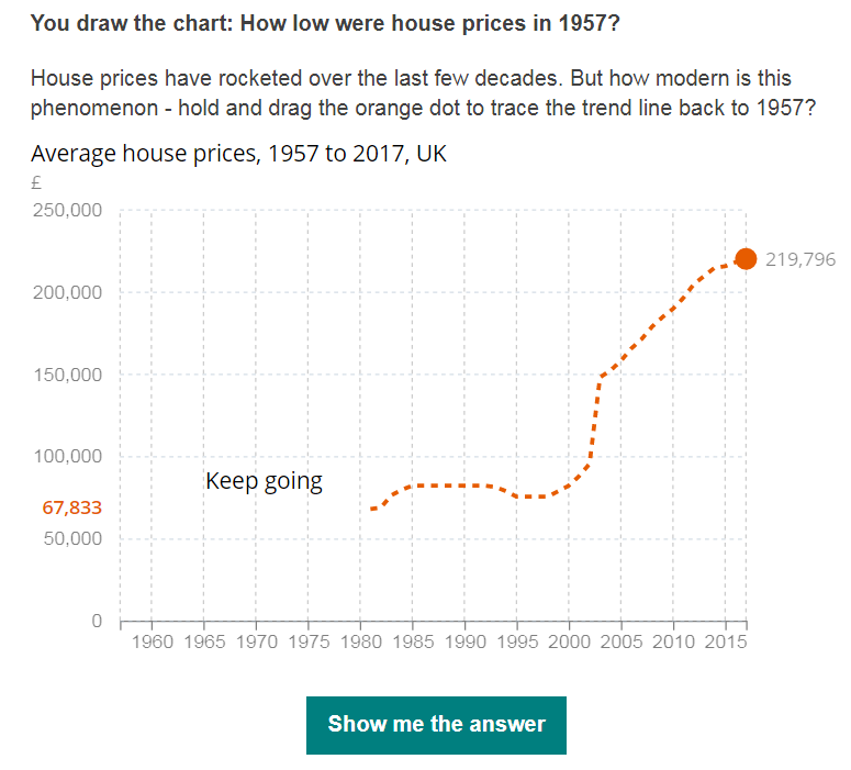
- For the BBC version we added the text “keep going”, which followed your mouse or finger to encourage the user to continue to the end. We noticed some users not finishing their line. This meant the button didn’t light up to allow you to see the actual trend line.
- Also, second time around we created a demo gif to further strengthen the usability.
There’s more than meets the eye to creating a reusable visualisation, especially if you wish it to be used on many devices and across different browsers to reach as many users as possible. And for it to provide consistency within your site and be easy to use again and hopefully again.
If your business area have data you think will suit “You draw it”, contact the Digital Content team.