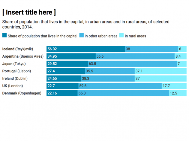
Say what you see – the way we write chart titles is changing
What’s the idea?
Currently, most of the chart titles used across the ONS are purely statistical, signposting the data within the chart and nothing more. When looking at the research relating to the titles that successful news organisations give to charts, it’s clear our approach could be better.
Good titles have been shown to make messages in charts more memorable, so going forward, we want our chart titles to be more descriptive. We want to communicate with clarity and speed.
Main message in 10 words or less
We should be aiming to have chart titles that sum up the main message shown in the chart in 10 words or less. This approach primes the reader to observe the trends we intended to illustrate in the first place, speeding up reading and potentially avoiding misinterpretation.
This doesn’t mean we want to lose the statistical information, this approach still includes a short subtitle outlining the data, geography and time period.
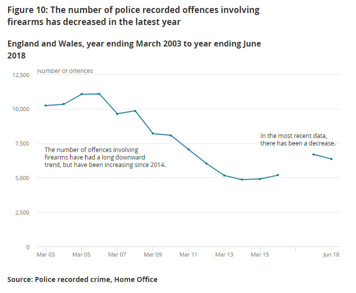
To give you an idea of what we mean, albeit with a slightly long title, here’s an example from a recent crime bulletin. When the annotations and descriptive title are viewed together, the messages in the chart are unavoidably clear and easy to digest.
What’s the evidence?
There is compelling evidence to suggest describing charts in this way can help memorability and recall of the messages contained within them.
We know from substantial amounts of web analytics and user testing that skim-reading is a very common practice for people viewing statistical content. On average, bulletins on the Office for National Statistics website take 9.5 times longer to read than people are spend on the page. This tells us that most people skim through and don’t read bulletins in full. Certain users might just be looking for a particular chart or value.
What’s in it for writers of statistical content?
Shorter publications
In some cases, the addition of a descriptive title and some insightful annotation can achieve the same goals as the paragraph or two above it with the bonus of shortening publications.
Makes you think
Titling charts in this way creates a need to sum up a chart with a short and meaningful title. This can help you think twice about the chart messages and where it will be placed it in your publications. It may even lead you to question whether you need the chart at all.
Across the ONS we see the same or similar charts used in release after release, but if that chart is no longer saying much or doesn’t address the priority messages in the data, we should change or remove it.
Standalone charts are more reusable
Meaningful chart titles will also help our charts standalone, helping to increase their reuse on social media and by news organisations. This means we can reach a wider audience.
Possible issues
We know from experience that the thought process behind writing these titles isn’t always straightforward. Here are the kinds of pitfalls and questions that we have encountered:
“A chart can, and often does, have more than one message.”
This is true, but it’s a matter of prioritising those messages we believe are the most crucial. We’ve done this already by choosing certain variables or chunks of our data to show, and by selecting a particular chart type to illustrate it. These are all reasonable decisions we make to give priority to particular aspects of data and choosing a meaningful title is just one more helpful step further.
It should never mean hiding certain messages away either. Perhaps annotation or the surrounding text can help deliver secondary messages? If not, don’t rule out another separate chart to show alternative messages if you believe it’s important enough.
“What about the important statistical information?”
As we’ve already mentioned, we don’t want to drop the important statistical information associated with our charts like geography, time periods and specific variable names and so on. We’ll keep these as nice, short subtitles below our main descriptive title.
“I’m nervous about introducing bias by titling my charts in this way.”
We are certainly not advocating anything emotive or opinion driven and you shouldn’t need to resort to language you wouldn’t use anywhere else in your content. Stating that something has gone up, down or remained the same as well as bringing in context is our responsibility as statistical producers and should be encouraged.
It has also been argued that the act of homing in on a particular aspect of some data and not others could be seen as bias. Again, it is our job to be aware of the particular information people want quickly and to design our content with this in mind. Meaningful chart titles will not mean hiding other messages away. Again, thoughtful annotation, the surrounding text or even other charts can help deliver secondary messages.
“A few of my charts are exploratory or interactive in nature. Won’t this be harder to apply in these cases?”
The vast majority of the charts we produce every day are explanatory, and writing short, descriptive titles shouldn’t be too challenging in these cases. Some charts will be more exploratory or interactive in nature and for these it could be difficult or even unnatural to title them in this way.
If this is the case, we advise something like “Explore how crime varies by type” or “See how your area compares to the UK average”. This way we’re not pulling out a specific message, but we are still prompting the user to use the chart and make sense of its content.