Sprint Notes – CMD beta – Sprint 9
Sprint 9 notes
And so sprint 9 rumbles to a close. I was typing these on my way to Belfast to attend the wonderful Open Data Camp over the weekend and feeling pleased that I am able to do so armed with a real thing to show interested people. Yes Please
So, how did that happen then?
Well – Sprint 9 was hard and we learnt a lot of things
What We Learnt
- Floating table of contents is not being noticed
- User thought horizontal black bar below page intro was the end of the page
- Chart tooltip content is only available in the tooltip (it’s easy to miss and not very accessible)
- 2 of 3 users preferred larger font size because it didn’t strain their eyesight
- 2 of 3 users expected contact details to be at top of page
- Users confused when asked to add 2nd date range
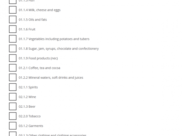
- Users expect long lists to be grouped or structured somehow
- Users expect a link to other similar datasets from dataset landing page
- Users not keen on ow.ly links from social – they don’t know what they are going to get
- If tweets cover difficult topics (e.g. abuse), users prefer no illustration (text alone is fine)
- Reordering content can give massive improvements on click throughs
- Some screen reader users find heading essential for navigation
- Buttons should be marked up as buttons, not p tags
- Labels and headings should follow the pattern of “plain english name, code” for example “Food K02000001”
(as ever, we have listed all of this on the page where we write about what we have learnt)
In terms of how we learnt all of these things;
Firstly – Benjy said this
It is one of the things I am most proud of within the team. We are trying so hard to not just talk about these things, but to live and breathe them
We did some user research in Liverpool and Wrexham. We did research with users with accessibility requirements, we did some research with people in our target user personas in local councils and we used web tooling to test with our existing users of the site. I am especially pleased that we are now routinely a/b testing different interactions on the site. At the moment these tests are focused on what we call product pages (essentially, landing pages for a theme area within the site) but this is a technique we will be using a lot more in the coming weeks and months.
Then Matt said this
Lots of user stories then. This is a sign of the wide scope of work we are undertaking within a sprint
For our Beta this has mean concentrating on creating more of the fundamental APIs that holds the system together. This time the big push has been on something we call the ‘hierarchy api’. This, at a basic level, is to ensure we don’t just have flat lists of concepts in stats, but instead have structure with our datasets that make it easier to understand them. Currently we are creating a generic hierarchy for each dataset and then working through the complexity of sparsity as a second step.
It will also stop some of our screens looking like (just) long lists
The interface for the project continues to develop. We have been spending some time looking at our time selection interface. It currently looks like this.
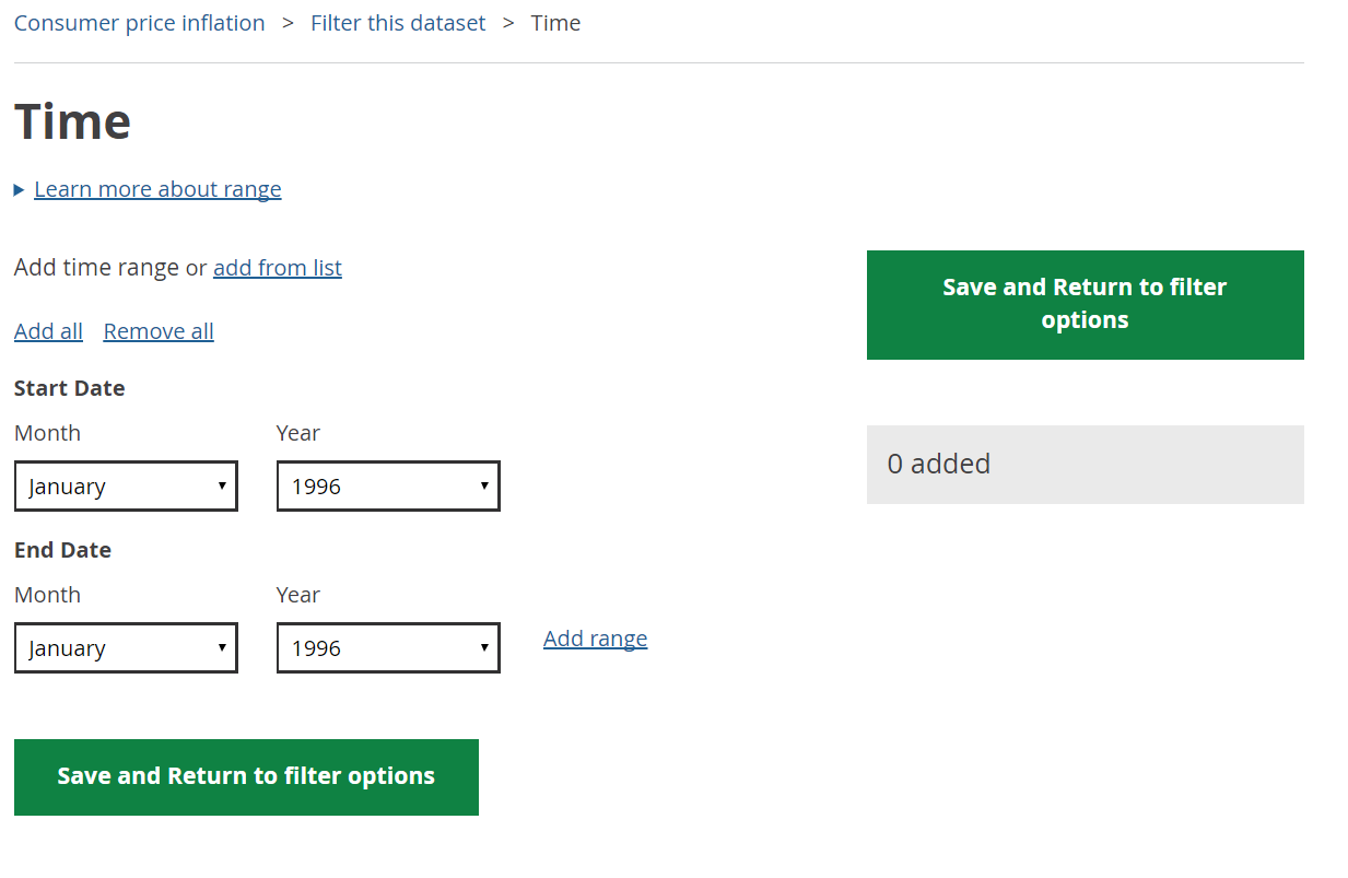
It works ok, but this is it in use on a CPI dataset, which is pretty simple. For more complex ones, we will need to look at something with more features and the team have been busy pulling together the next iteration.
Alongside this, we have been continuing to build out the CMS part of the project. We have been working with our internal users to ensure we are developing something that will fit in as easily as possible to the existing workflow. It is something that I am keen to ensure we focus on. Our internal users are just as important as our external ones and we need to get the balance right here.
Finally, the databases that sit in the middle of this system are getting more and more stable. Within this project we have looked at using relational, content stores and graph databases. We have settled on using Mongo for holding the metadata around datasets (the elements that drive a lot of the user interfaces) and a graph database for the holding of the actual datasets themselves. We have spent a long time benchmarking performance for ingest, processing, indexing and querying and this combination seems to offer us the most flexibility. As with every part of the system, we will keep investigating and iterating this as the project develops.
We are always looking for more people to undertake user research with, so if you are interested in joining in, please do get in contact.
An update on this and more will be here in a couple of weeks.