Three years of Visual.ONS – what we’ve learned
Three years ago, the Office for National Statistics (ONS) decided to start an experiment.
The objective: communicate statistics to a broader audience. The method: use statistics to tell stories. The result: three years of Visual.ONS.
As Visual.ONS closes and moves to the ONS website this week, we’re reflecting on our three years in Beta. In this post, we’re going to focus on the method. How did we go about telling stories for a wide audience? Most importantly, what have we learned?
In the beginning, there was data…and lots of it
We began with good intentions. Using plain English and simple charts, we tried to make our statistics more accessible as part of the ONS’ Better Statistics, Better Decisions strategy (pdf).
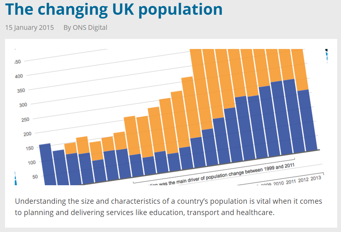
This article on the UK population is typical of the early stuff we used to publish. We’d take a topic and try to explain it in simple terms. We’d examine headline trends, without delving into much detail.
This was all well and good, but we struggled to get engagement. The stuff we published wasn’t topical and the point-chart-point-chart structure made it feel and look quite academic.
Making our content more consumable
Language
We wanted to tell stories with an editorial focus, get straight into the heart of a story and engage readers in their own language, bearing in mind that the average reading age of the UK population is nine.
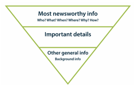
The inverted pyramid is probably the best-known way of illustrating how information should be structured and prioritised in a news article. The article is front-loaded with all the stuff that’s important to the user and descends in order of importance.
The story should answer the who, what, when, where, why and how of the topic. It’s not a one-size-fits-all approach, but it is a useful guide to get anyone started.
Topicality
We’ve sought to frame our statistics in ongoing debates, which we see as important for engaging a wide audience. But being topical has brought challenges. Ongoing debates are often politically sensitive, and, as a non-ministerial government department, we tread a fine line between informing the debate and impartiality. This makes ONS understandably cautious about publishing stories linked to political debates.
The cautious nature of the ONS sometimes makes it difficult to react at speed to a breaking news story. Working quickly to get our statistics into the public consciousness remains a challenge.
That’s not to say that progress hasn’t been made. For example, we initially faced challenges in using words such as “election” and “Brexit”, but have since agreed on the importance of using everyday language to communicate effectively.
What else has changed?
We hired more staff from the outside world. We have a team of data journalists who’ve worked for the likes of the BBC, the Guardian and Trinity Mirror. We’ve got a team of data visualisation experts, who create new and innovative ways of telling stories with data. We also work closely with social media and design, so we’re now a fully-fledged, multi-disciplinary digital content team.
This sea change has brought a focus on news values, topical content, simpler language, and much more varied imagery to promote the content.
We also talked to our statisticians. We need their support and expertise to do what we do. We recognised that a journalistic approach can’t always work unaltered in a statistical organisation. There are sometimes crucial caveats to our data.
We didn’t always agree and still don’t, but we’re much more aligned now than we were three years ago.
To strike the right balance between providing engaging content for a wide audience and statistical accuracy, we set up an Editorial and Communications Group (ECG).
This body, made up of representatives from all parts of the ONS, is responsible for commissioning our content and dedicating the statistical resource to help make it happen.
Our process from idea, to commissioning, to publishing is defined by user need. Here are some of the questions we ask ourselves before submitting an idea to ECG:
- Is the idea topical or related to an ongoing political debate? If so, will our data help resolve unanswered questions?
- Are we seeing related questions on social media or coming through our Customer Contact Centre?
- Is the idea tied to ECG priority areas? These priority areas (which are reviewed every three months) are designed to reflect user need – at the moment they are migration, trade and social inequality.
- Has this topic area has proved valuable to users in the past? What evidence do we have?
- Does the idea have a long-term re-usable quality?
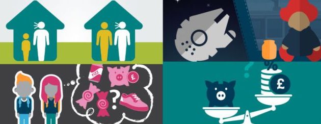
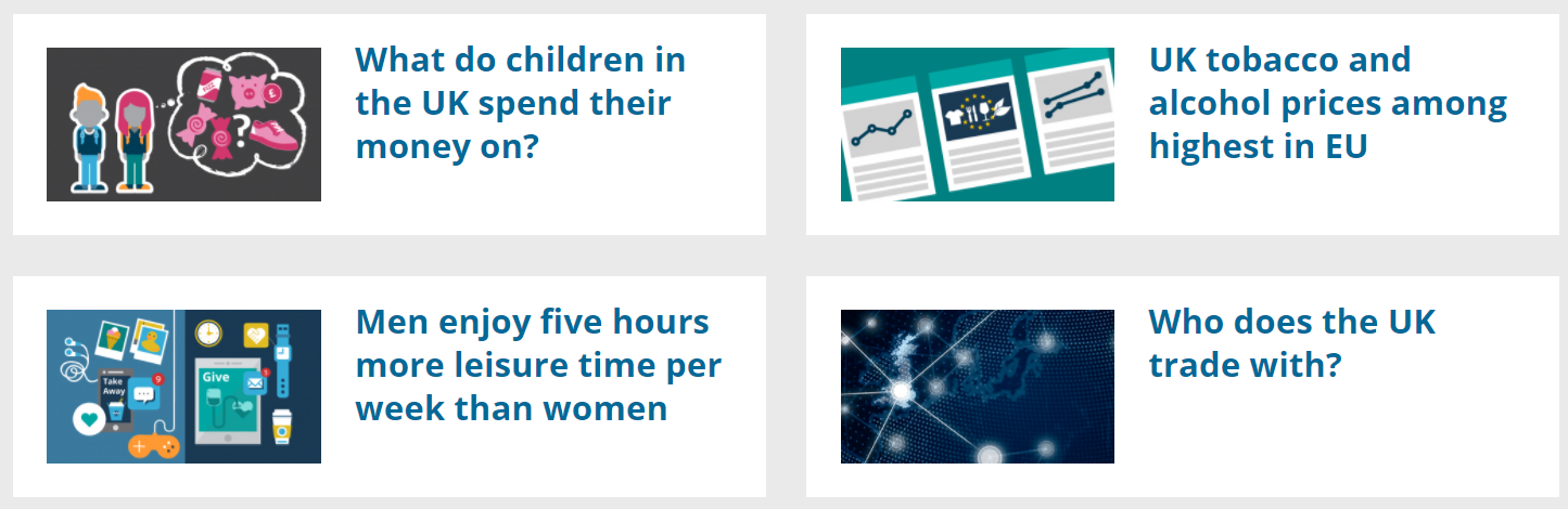
As a result of expanding the team, engaging with statisticians and aligning ourselves with user need, we’ve successfully published lots of topical articles written in a news story style. Take a look at this piece on UK trade with the EU and the rest of the world. Read this article about the gender pay gap in different UK regions, or find out about EU migrant workers in the UK.
None of these articles would have been possible three years ago. But we persisted and continue to persist. If there’s one thing we’ve learned, it’s that success breeds success. When something goes well, people will want to work with you.
Making cool stuff
Throughout our three years, we’ve experimented with ways to communicate our statistics, other than the classic news story structure.
We’ve built interactive content such as charts, maps, quizzes and calculators. These put the user at the heart of the story and are often more effective than telling them about it.
So instead of telling people that inflation is rising faster than wages on average, we gave people a calculator, so they could see how inflation affected them in their wallets.
Our crime calculator gave users the opportunity to gauge their risk of becoming a victim of crime, based on their characteristics.
We also enabled users to guess what changes had taken place in the UK since the Brexit referendum, by drawing their own charts.
Learning to say no
With power (to create this cool stuff) comes great responsibility.
We’re so happy that an increasing number of people in the ONS have been working with us to create interactive content. But sometimes we have to manage expectations because our interactives work best when they suit the story we’re trying to tell.
Our challenge is knowing when to say no and when to suggest an alternative to the interactive content we’ve been asked to produce. We use analytics and retrospective discussions to measure success and inform how we do things in future.
Creating an identity
Honing the content on Visual has enabled us to really understand our users and create a cohesive identity.
We use a consistent palette of colour and iconography in our content. Much like the rock band Status Quo has a consistent guitar arrangement that makes them recognisable, we have a style which is definable. When you see a Visual story, you’ll recognise another one.
We continue to evolve
While we’ve made a lot of progress in three years, we recognise we’ve still got a way to go.
We continue to try and get the balance right between editorial, data visualisation and design.
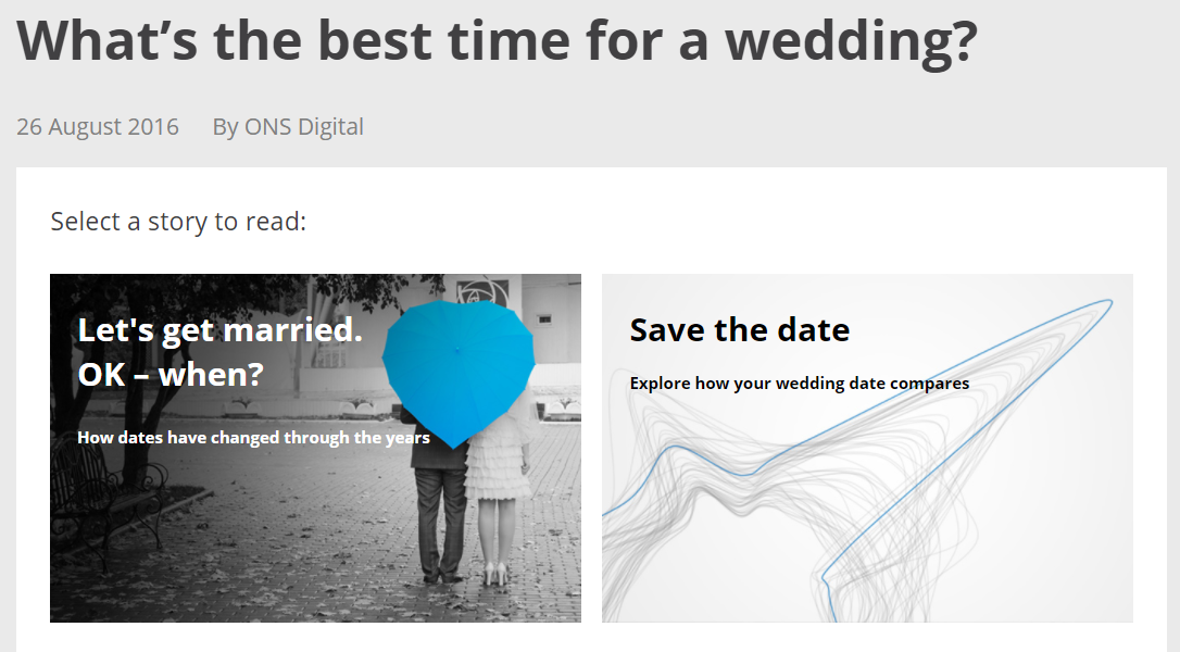
For example, the respective disciplines in our wider team could not agree on whether illustrating a piece of analysis on wedding dates would be best achieved through design or data visualisation.
One approach used photographs to tell a human story, some of which are from the albums of ONS staff.
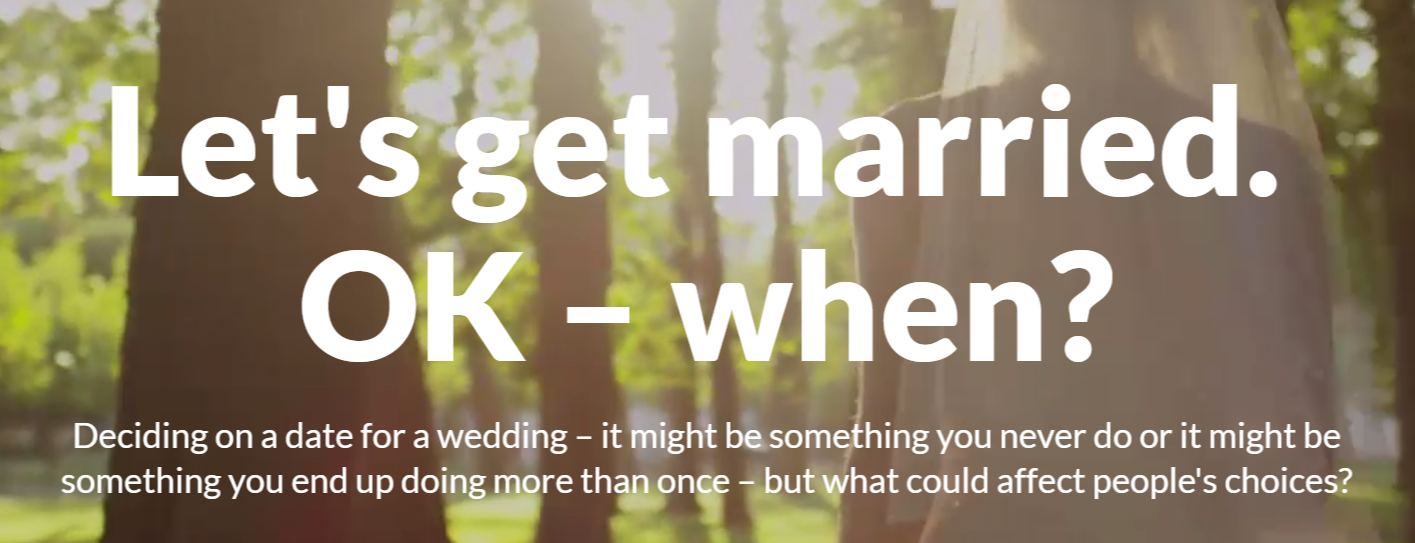
The other approach was a piece of cutting-edge data visualisation.
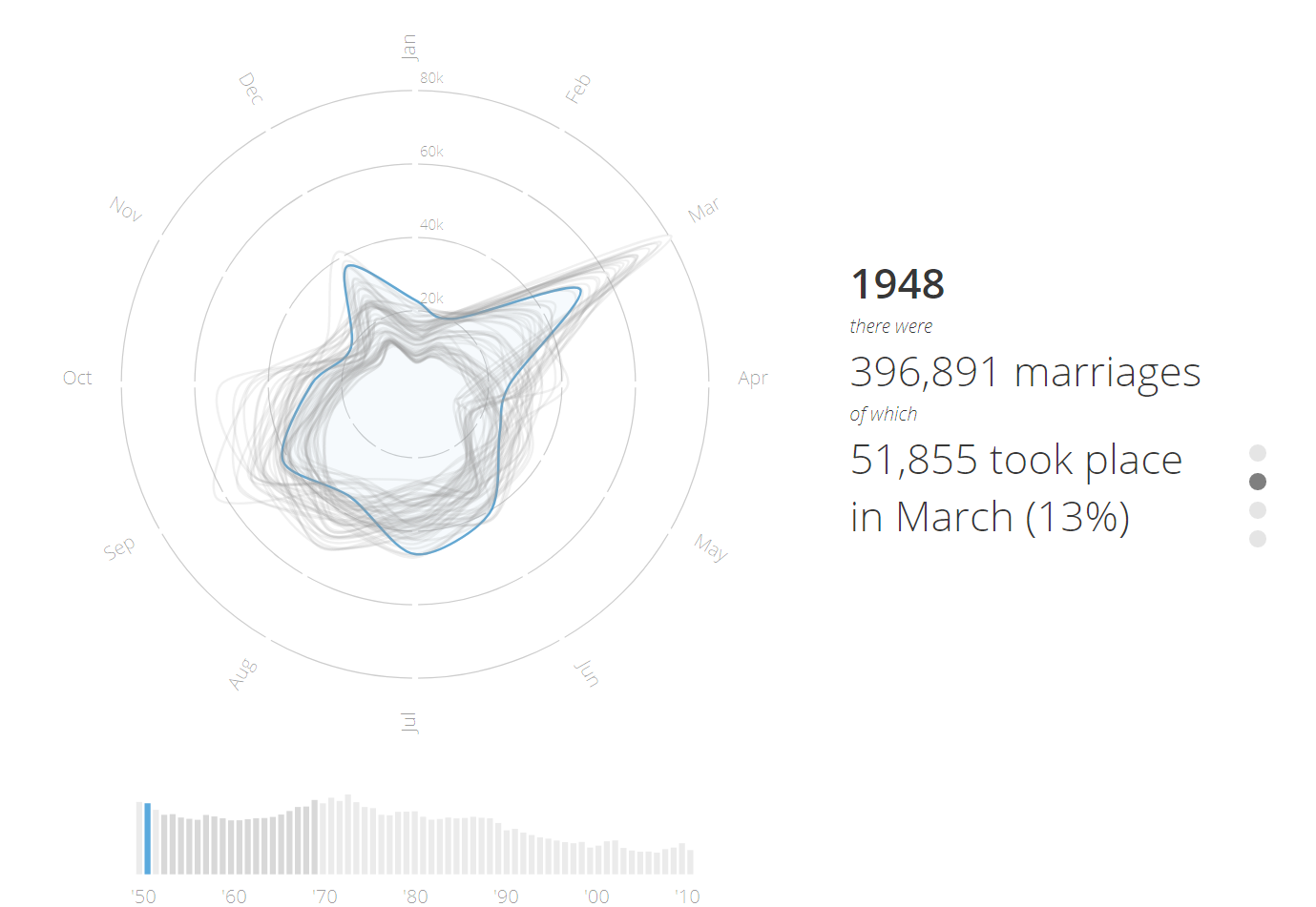
So we built a gateway to both versions to give the users a choice.
And now the end is near…
Paraphrasing Old Blue Eyes or not, the experiment may be officially over, but our work on transforming the way the ONS communicates has only just begun.
We’ll continue to push boundaries on the main ons.gov.uk website, improve the way we do things and develop cool ways of presenting data to the wider world.
See you on the flip side.
By Lisa Jones and Phil Leake, Data Journalists, Digital Publishing