Writing about statistics: why is shorter, better?
Here at ONS, we’re doing a lot of work on our statistical bulletins – the pages we publish alongside new data to explain what the statistics show.
We’ve made a lot of progress, and our designs are testing well. One of the principles behind the new design is that there should be fewer words on the page. “Can we say that more succinctly” could be most content designers’ mantra, catchphrase and epitaph. But I was asked recently why it’s better to get to the point. Why is shorter, better?
Well, there’s the obvious:
- the more text there is on a page, the harder it is to find the bits you want
- unnecessary text makes everyone work harder to understand what you’re trying to say
- it takes longer to check, proof and publish long documents than short ones
All excellent points I have made countless times. It’s always better to be able to point to evidence, though. So I spent some time looking into it.
ONS user research and analytics
Our own usability research has consistently shown that users come to the website with clear tasks in mind, rarely to browse everything about a broad topic. Even users with specialist subject knowledge can find our bulletins too long, as an analyst told us earlier this year:
“It’s so long, I have to confess I don’t read the whole thing now. I look for pictures, graphs, and interactives.”
Analytics show that more than 8 in 10 visits to the ONS website come from search engines. Search data shows that most users have a specific topic in mind before they reach our website, usually more granular than the focus of our bulletins (more users search for “knife crime” and “domestic violence” than “crime in the UK”, for example).
Analytics on a recent Retail Sales bulletin show that more users jumped to the “online sales” section than any other topic (discounting “summary” sections), despite that content being further down the page than any other commentary.
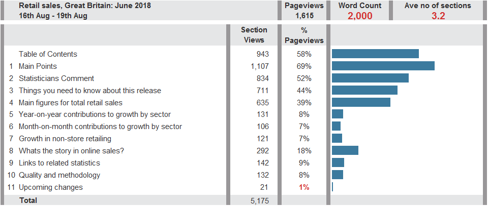
This table shows how many times each section of the Retail Sales bulletin was viewed – setting aside the summary-type sections, there is clearly more interest in online sales than other topics.
There are other bulletins which show similar patterns of skipping sections. This isn’t a bad thing in and of itself; we have a table of contents on every bulletin to help users get to the section they need. Yet just 11% of bulletin visitors use the table of contents. So it’s likely that a significant number of people are not able to complete their tasks because they don’t read enough of the content on the page to find the answer they are looking for.
There’s also clear evidence that adding more content to a bulletin doesn’t result in any more engagement – on average, users read between two and three sections of our bulletins. This is the case whether there are 6 or 16 sections; having more content available doesn’t encourage users to read more.
We’re often asked whether this is necessarily a problem: if only a tiny number of people are reading a large proportion of what we publish, but they are important or influential people, is that OK? Well, our research so far shows that users who work in government, business and finance are no more likely to view more of a bulletin than people connecting from home.
Other research
People scan text for useful information
Nielsen Norman Group (NN/g) found that “people tend to minimize interaction cost and maximize the benefit they get from the work they do.”
Users scan the text, taking the information they need whilst looking at the fewest words possible.
F-shaped reading patterns, observed in three eye-tracking studies. Image courtesy of Nielsen Norman Group
“In some cases, people will get bored or fatigued as they scan text. Other times, the words they read offer only a weak information scent, which may be enough gratification to continue scanning, but not enough to read more of the text.”
Here are a few of the approaches NN/g suggest to help users find important information on web pages:
- use headings and subheadings – ensure they look more important, and are more visible, than normal text so users may distinguish them quickly
- start headings and subheadings with the words carrying most information: if users see only the first two words, they should still get the gist of the following section
- visually group small amounts of related content — for instance, by surrounding them with a border or using a different background
- cut unnecessary content
In testing, NN/g found that these techniques improved usability by 124%.
People visually perceive things in groups
First by layout, then colour, then shape, so “visual weight on the page acts like a magnet for attention long before meaning is involved”. This means that short chunks of text, divided by clear headings and each with a specific focus are easier for users to scan.
People like short updates, or in-depth, insightful articles
New website Quartz found that their readers like:
“Short, sharp creative takes on news stories that are creative and say something new”
or
“Long, in-depth articles providing strong detailed narrative or insightful analysis”
In fact, they found that “the place between 500 and 800 words is the place you don’t want to be because it’s not short and fast and focused and shareable, but it’s not long enough to be a real pay-off for readers.”
Clearly, this is specific to their users, using their content in a media context. Specific word counts may not apply to our users or context in the same way – we’re doing our own research to determine what works for our users. Yet the principles – short and new, or long and insightful – chime with our own research.
More text is more mentally taxing
People have poor short-term memory. “Serial-position effect” is people’s tendency to recall the first and last items in a series better than the things in the middle. The more things we write about (or even list in our table of contents), the harder we make it for people to digest and remember information because we’re adding “extraneous cognitive load”.
When people have to dedicate more mental effort to try to understand something, they have less capacity to commit it to memory.
Devices like footnotes are another good example of introducing cognitive load. A footnote requires someone to remember the number of the footnote, find the footnote, read it, relate it back to the text they just read, then find their way back to the right place on the page. All whilst trying to understand and remember something new.
Longer sentences hinder people’s understanding
The UK Government Digital Service once wrote “why 25 words is our limit” when it comes to sentence length.
Among the evidence given, was “when average sentence length is 14 words, readers understand more than 90% of what they’re reading. At 43 words, comprehension drops to less than 10%.”
Incidentally, this GDS blog also references my all-time favourite study about writing, which found that “the more educated a person is, and the more specialist their knowledge, the more they want it in plain English.”
That’s that, then
Clearly, there’s evidence out there to suggest that, for most types of content, shorter is better. We’re still going to keep running our own testing and iteration to find out what level of detail is right for the different types of people who use our bulletins.
Further reading
This blog calls on lots of brilliant people’s work, especially this excellent presentation on “Cognitive Psychology and Content Design” by Chris Atherton.
I’d also highly recommend checking out the work of the BBC R&D team, who’ve been doing their own exploration into new, short-format news content.
If you’re feeling more thoughtful, this piece from the Guardian – “Skim reading is the new normal. The effect on society is profound” – talks about the impact of skim reading on comprehension and learning.