How can we use explorers to make better statistics, better decisions?
It’s tempting to think that if only we allow users to explore our data, they’ll understand it better. Build an interface for people to access our data and this will help
- Improve decision making
- Support democratic debate
- Improve communication
- Challenge misuse of statistics.
But this isn’t going to help our enquiring citizens. The digital content team tried out several explorers on Visual.ons and I’d like to share my thoughts about what we think has worked to communicate better statistics.
ONS explorables
Gender Pay Gap Explorer
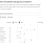 In 2016 we launched two articles on the gender pay gap. One was an article with a quiz and explorer and the other was simply an explorer. With a third of the words of the article, people spent an average of 30 seconds more on the explorer.
The explorer allows people to see the gender pay gap for their occupation. It puts themselves into the explorer with relevant data that’s personal to them. It also allows people to ask questions – who has the highest gap, who has the lowest, what changes with full-time/part-time? The article talks about and taps into the thirst for news about gender equalities.
Who does the UK trade with?
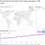 Another successful explorer with over 60,000 views over the past year explores UK trade. People often refer to it on Twitter often in arguments about trade with the EU. This is a good sign that people want statistics that are relevant, trusted, understandable and something they can talk about it.
It allows people to select countries answering who we trade with and how much. But it also gives people an idea of how it compares to other countries and how trade in that country has changed over time. This is becoming more policy relevant with Brexit and trade deals being in the news nearly every week.
UK contributions to the EU Budget
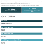 In this example, we walk through UK contribution to the EU budget in a step by step basis. At the end we show a calculator for a per week figure. There are some preselected options but also allows people to change numbers to figures they’ve heard in the news.
Transparency
Gregor Aisch, a data visualiser who worked for the New York Times, points out that explorers allow the most invested users to delve into the depth of the data. Many people might skim past the explorer and that’s OK – the most important message should be there on the default view without interaction. In allowing people to explore the data, it makes the data transparent and from that trust is gained.
Lessons
Here’s what we feel worked for our explorers.
- Personalisation: Allow the user to put themselves in the data. This could be location based or based on their identity (e.g their profession).
- Think about the questions people will want to ask: Don’t just give them all the data and expect them to come up with questions.
- Start simple and walk through the complicated bits: Break down complex ideas and slowly guide to ask questions of the data.
- Tap into Topicality: People are interested in what’s in the news.
We’re always trying to experiment and learn more with what we do. Let us know what do you think of our explorers in the comments.