ONS website updates: 14 May 2019
It has been a little while since one of these, but I wanted to do any update on some of the changes made to the ONS website recently. The biggest changes have followed a review of the typography we use on the site but we have also made some smaller changes to give our publishers a better ability to meet some emerging user needs.
Typography
The ONS website typography was previously not great – especially when benchmarked against similar sites such as GOV.UK, BBC and NHS. Poor typography hinders users’ ability to navigate our content, understand the meaning of our content and understand the relationships between our content. This is particularly problematic as our content is very long and complex – meaning typography is especially important to get right.
How do we know this is a real problem?
- Users get overwhelmed when presented with content on our website
- Users find it difficult to scan pages and pick out information
- Users squint, lean in and complain about small font sizes
- Multiple rounds of usability testing on new article templates and bulletins prototypes have proven that the new typography system is an improvement
- Bold headings, clear and generous spacing and larger text was proven to be as effective (if not more so) than using accordions when asking users to pick out answers to questions
What did we change?
- Increased font size
- Adjusted line heights and spacing
- Reduced margin between columns
- Removed indented body content after a heading
- Changed all links to be underlined
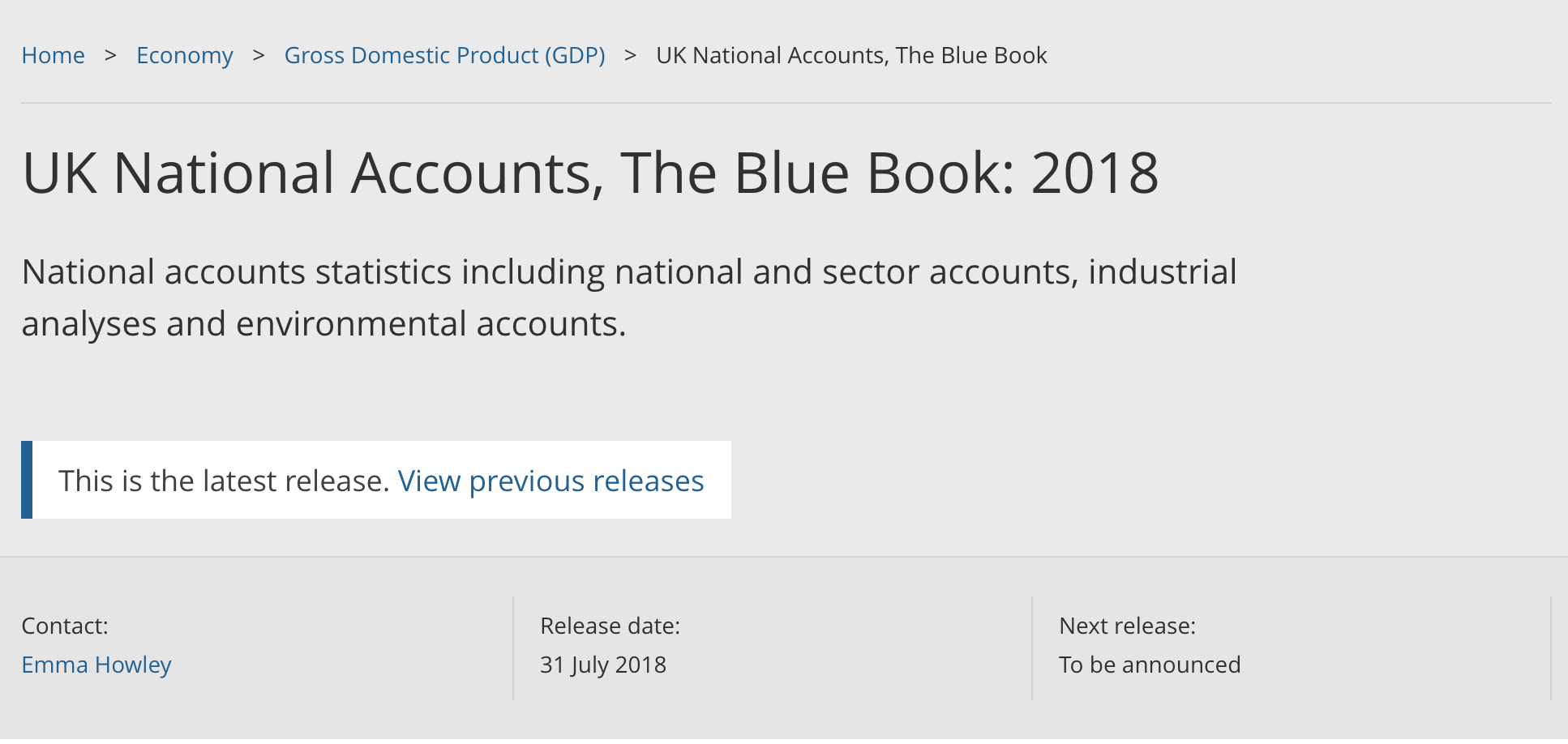
Release Banner added to the compendium pages
We recently launched an update to make it clearer when a bulletin or article is the latest and provide a clear link to previous editions of these. This functionality has now been extended to compendia publications such as The Blue Book, giving an easier route to the latest edition.

More flexible content field on the release calendar
We have been doing a bit more explorative user research recently, trying to challenge some of the previous assumptions we have had. One of the things that has come out from this work is a need to know more about the specifics of upcoming releases, in particular if there are things that a user may need to prepare for, e.g methodology or classification changes.
Our ability to convey this information has been limited by the fact the summary field on a release was only designed for a couple of sentences of plain text. We have updated this to a rich text field allowing our content teams to make more use of this which gives us the opportunity to iterate on the content we include and decide what the best longer term approach to meet this need might be.
Make release date on some articles optional for publishers
As we have started to try more different content types and approaches there are certain mandatory elements in our templates that don’t really fit. The biggest example of this has been the release date. This is normally a really important part of a page and comes up regularly in testing. However for some newer content that automatically updates to show the latest data having this set once at publication time doesn’t work well and can be misleading.
If you have any thoughts or comments let me know on twitter @robchamberspfc or comment on this blog.