Getting hands-on with content design

Last week we were lucky to have Content Design London lead a training course tailored to ONS content and our challenges. The bespoke training focused on producing user-centred, evidence-based content.
Given the importance of content for all ONS users, we invited a variety of people from across the organisation who work on public-facing content. This content includes survey user journeys, census, the ONS website, social media, the GSS website and the Data Science Campus.

What is content design?
Content design is a discipline set up by the Government Digital Service (GDS). It recognises the need for a shift in government from push publishing (where government “pushes” out information based on its needs) to pull publishing (where government publishes the information that users want). We need to find out what users want and match that to what we have to offer. Asking “how am I going to get this across to the audience in the best way possible?” instead of “what would I like to tell the audience?” encourages us to use data and evidence to give an audience what they need, at the time they need it, in the way that they expect.
Here are some of the things we covered on the training.
What is the user need?
Before approaching a piece of content, you should start with a discovery. A discovery asks, “what is the problem or task I am trying to solve?”. Content design is not limited to words. It is answering a user need in the best way possible. We should always be asking “what is the user need?” with our content, and it should be obvious what the main user need is for every page.
It can be easy to fall into solutionising when writing user needs. Solutionising brings you to a solution before users have had a chance to let you know what solution works best for them. Avoiding “web” language such as filter, navigation, click or guide helps to prevent this.
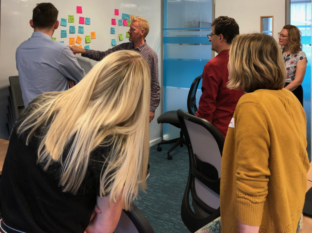
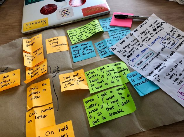
We approached our content starting with the user needs; we each brought a real-life topic and piece of content design relevant to our work. We then mapped the user journey and started sketching content that met those user needs.

How users speak
Using Google Trends, we were able to challenge our assumptions and see what people search for related to our topic. This gave us a picture of the things people are interested in around it and showed the language people use.
Keyword research is a great way to ensure we are using the right terms that are familiar to users, as often internal language or jargon can slip out. We looked at how to find and use the vocabulary our audience uses, and how to better understand their thoughts and beliefs (known as “mental models”).
Search is changing … just ask Alexa
The way people search online is changing. Voice technology is on the rise, and users are reading less and scrolling more than ever. Technology leads the way with content design, and our habits around how we consume content are changing.
It’s important to stay up to date with the latest research on digital user behaviour as content is no longer just an important thing, it’s everything. In a fast-paced digital world, we need to get to the point. We have a very small window to get people’s attention, so every content choice we make matters.
How people read
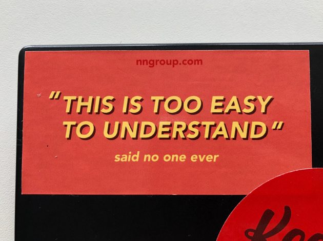
Jargon slows us down. One of my favourite content mantras is also my favourite sticker on my laptop: “This is too easy to understand” said no one ever.

High frequency words, or words we use a lot, are important. They make up plain English. When we are writing content, using familiar words and creating context makes it relevant and relatable.
By understanding what our user’s mental models are and where they are coming from, we create something they can easily identify with. What are they most worried about? What are they most interested in? First impression on a web page is everything. A page that can breathe, is clearly structured and that follows a logical path minimises the cognitive load and makes the content more easily digestible.
Show me the data
Content design is very reflective. We do not move without data and evidence.
What does successful content look like? Sometimes we can get lost in analytics so it’s important to keep it simple and have clear goals. Traffic is great, but there is a difference between usage and user intention. Traffic is only valuable if it matches the top user and business needs. We should look at not only how many people are going to a page, but also ask is that the page they are looking for?
When looking at user journeys across your site, look at which pages people came from and where they go next. If you see patterns of similar content, it might mean people did not find what they needed on the previous page. This also helps with merging pages and related links to help create a meaningful user journey, focusing on the pages that matter.
Think about what the user needs are and how to surface them in the right order. Once you have an idea of an ideal user journey, you can see if that matches up with what you see in the analytics.
High usage + meeting user needs = successful content.
There is no silver bullet when it comes to content design. It is a long-term investment that is often about behavioural change. You need to be patient and track things over time to identify patterns.
Channelling our inner Meryl Streep
We finished off with some good old role play. We took turns being the subject matter experts and the content designers for different scenarios. This was really effective for seeing where different disciplines are coming from in content situations and recognising everyone did the best job they could with the information they had at the time.
For the final session we ran some content crits (the “crit” is for critique, not criticism!). We learned tools and techniques to work collaboratively with others, and by bringing real-life examples we could implement changes as soon as we got back to the desk.
Overall, it was a really interesting two days. The course covered both the design element of content design and offered opportunities for hands-on content writing, using activities to review and improve our content. A mix of leading, sharing and real-world examples meant we got a well-rounded course that I would highly recommend!
If you want to find out more about how we are using content design at the ONS, follow our digital blog or get in touch.
Lauren Bradford, Senior Content Designer