How to format your work with accessibility and style in mind
Practical design tips you can follow to improve the readability of documents and presentations
Introduction to accessibility
There’s a lot of discussion about accessibility and making work accessible, but also a lot of confusion about what that actually means. In this post we can define accessibility as:
‘Making something easy to find, use and understand for everyone.’
The importance of empathy
When you begin to create a piece of work, it is important to practice empathy.

Picture this. You’re having a bad day, you have a deadline which needs you to find something from a report you wrote and published. You’re stressed out and time poor. You have a killer migraine because you lost your glasses. And to top it off, your hypothetical cat knocked a hot mug of coffee over both you and your laptop, so you’re relying on your tab keys and on-screen keyboard a lot, and your hands hurt.
Pretty rough day huh. Now imagine you’re writing that report for your future self, what might you do differently?
All of us will at some point find ourselves in a position in life; through poor health, injury or just bad luck; where we have a reduction in our mobility, sight, hearing or speech. In any of these situations, imagine how much more challenging it would be to find, use and understand the thing you are creating right now. In the UK there are millions of people registered disabled. Many disabled people have to face these extra challenges every day.
With that in mind, let’s think about what practical steps we can take to create clearer content, in more accessible formats.
Publishing on the web in HTML
The web was created with accessibility in mind. Hyper text markup language (HTML), is designed to be a simple set of instructions for displaying content that’s very easy to read and navigate. Browsers like Google Chrome enable people to access that content on their computers and smartphones. Importantly they also have built-in tools, which enable assistive technology. This lets the content be delivered to a person in many different ways, such as screen readers which read all of the content on a website out loud.
So, all you need to do is write simply, structure your text clearly and publish to your website. Don’t worry about the technicalities, your website editor should handle the conversion to HTML. This publishing route should be the first choice for any public facing communication. It could be a blog post, article, bulletin, or news story. Whatever option is available to you, by publishing on the Web you’re making content accessible.
Publishing in other formats
You might have noticed I’ve not included PDFs in the list. That’s because they have their limitations – which can make them more difficult to access for a lot of people. Read this article from GDS if you’re interested in learning why publishing in HTML is better. If a PDF is your only option, or you have user research telling you it is the right option, try to follow guidance for making accessible PDFs.
If publishing on the Web is simply not possible, there’s still a lot you can do to improve the readability and usability of every piece of communication you work on, whatever the format.
Practical design tips
Write simply

If you write simply, it is better for everybody. Even if you’re explaining something complicated. This is known as writing in Plain English. The UK’s average reading age is nine years, you can use apps such as Hemmingway to check how your work compares to this, and make simple edits to make the text clearer and more understandable.
Use a heading structure

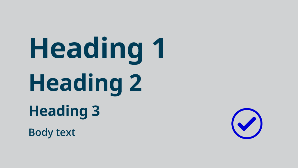
All content should have hierarchy and follow a logical heading structure. Try working with three or four levels of heading in order as a good rule of thumb. Using in-built styles can be a helpful starting point. Styles improve the accessibility of documents because they allow the text to be easily navigated. When used, styles also help to build your table of contents for you.
Consider the reading order

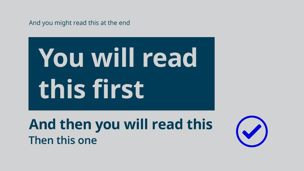
The reading order of any design should be the same as the visual hierarchy. It should flow naturally from one area of content to another – test this by asking someone to read what you’ve written in order. Consider prioritising the information on the page using scale, contrast or space.
Design with contrast

There are millions of people in the UK living with sight loss. Using greater contrast between the text and its background will help people to read it. So when choosing colours, check the contrast levels of the text on its background using a color contrast checker. The minimum contrast value required to meet the basic standard of acceptable accessibility (AA) is 3.00 – so you’re looking for a number above this.
Another quick tip is to use the squint test, sit back and squint your eyes, can you still distinguish the letters from their background? Does the most important information on the page draw your eyes the most?
It’s important to say this doesn’t mean you always need to write everything in bold. But avoid using light coloured text on light backgrounds, and dark coloured text on dark backgrounds.
Don’t rely on colour alone
Millions of people in Britain have some form of colour vision deficiency (color blindness). So try not to rely on colour alone to differentiate something in your work. Green and red are a classic case, many people cannot tell these colours apart (hence why traffic lights in the UK also follow a sequence). And if you do use colour to help explain something – check it with colour blindness software.
Limit the use of CAPITAL LETTERS
Overuse of capital letters can make text difficult to read. Words may be incorrectly processed by screen readers resulting in every individual letter being spoken. It also looks like you are SHOUTING if you write whole sentences in capital letters. Use ALL CAPS sparingly.
Use adequate font sizes
Minimum font size can vary based on the use, and font choice, but for a general A4 document set in Arial, 12 point should be the minimum. If you need to inform users in ‘large print’ then set the text at 16 point or more. For posters or presentations use 18 point or more. If in doubt, consider the space in which the work will be shown, and adjust the sizes to best suit the reading distance. These sizes come from UKAAF Clear and Large Print Guidelines and are meant as a guide. Doing your own user research with your products is always recommended.
When publishing on the web, your website should (hopefully) already be designed to publish at adequate type sizes for the different displays it will appear on. If not, it is usually possible for users to control text sizes using their browser.
Try not to make lines of text too long
Try not to make lines of text too long. 75-120 characters per line is a comfortable reading width for most. One way to get a basic measure of a good line length is to do an alphabet test. Run two to three alphabets of your typeface (as shown below). You can use this as a very rough guide to set a comfortable width of a column of text:
Abcdefghijklmnopqrstuvwxyzabcdefghijklmnopqrstuvwxyzabcdefghijklmnopqrstu
(2.8 in desktop view)
Adjust line spacing to suit the font size and line length
Line spacing or ‘leading’ is the space between lines of text. A good measure is 120% – 145% of the font size – typically start with the ‘auto’ setting, then adjust by very small increments. The longer the line length, the more space may be needed between lines. Larger text sizes over 18pt may require a slight line spacing reduction, but if in doubt use the ‘auto’ setting. Try to avoid double line spacing, it adds too much space, 1.5 is better.
One single column of text is easier to read than multiple columns
If accessibility is your priority, then set your text in a single column as this is easier to read than two columns for a lot of readers. If you need to use multiple columns on some occasions that’s ok, just make sure the reading order is clear.
Left aligned non-justified text is easiest to read
Paragraphs of centred, right-aligned and justified text are harder to read. Be mindful, and left-align whenever you are given the choice.
White space is helpful
You don’t need to fill every bit of space with information. White space can be used to separate information, or create a pause in reading (just like when you reach the end of a chapter in a book). White space can even be used…
….to create emphasis
So instead of defaulting to the bold button or SHOUTING in capital letters, perhaps try adding a bit of space.
Clearly define links in text and make sure they describe themselves well
Differentiate links in the body of the text with both underlines and a high contrast colour, blue is the standard. Avoid generic phrases such as “Click Here” in link text. Other ambiguous links, such as “More” or “Continue“, can also be confusing because a screen reader might read them out loud. Instead, refer to the thing which you are linking to within your text, so for example:
‘Read GDSs helpful blog post about giving clear presentations.’
Pictures are worth a thousand words (sometimes)
Pictures can certainly be helpful when visualising a point, drawing attention or adding richness and emotion to content. However they should never be a replacement for a clear description. If like many people, a reader can’t see the image, the point could be missed altogether. If you can’t say or write your point clearly in text, you really shouldn’t use a picture instead.
Don’t forget to add alt text
Alt text is text used to describe what an image is in case the image doesn’t load. It is also helpful as context for screen reading tools used by people who are visually impaired. To add alt text you will need to follow some basic instructions; in Microsoft Office you need to format the image; in Google Docs; select the image and press Ctrl+Alt+Y, then write a title and description of the image.
Tables and charts should be well described and constructed
When creating tables or charts, think carefully about where they are going to be displayed. If a highly complex table or chart is going in a slide presentation for example, think about providing it to your audience separately. You should also write a clear and explanatory title and describe what the data is showing. For more help, follow the data visualisation guidance on Style.ons and table guidance on gov.uk.
Use in-built accessibility checkers
Common software such as Microsoft Word usually has accessibility checkers built-in. You just need to find it, run it and follow the instructions. If you aren’t sure how to use the software, there are lots of resources like this Microsoft accessibility video training series to help you learn.
Takeaways
Try to make small changes to how you create and publish work. We are all individually responsible for making our work more accessible. Use the tools, and learn to craft your documents and presentations well, where possible publish your work on the web in HTML. By following these steps everyone will get the full benefit of whatever you produce, and you will be doing your future self a huge service.
There are loads of fantastic resources for further reading if you are interested in learning more…
Style.ons Guide to Writing About Statistics
GDS Accessibility Blog
UK Association for Accessible Formats (UKAAF)
UKAAF Clear and Large Print Guidelines
W3C Web Accessibility Initiative
SCULPT Accessibility Guide
Practical Typography by Matthew Butterick
Visual Hierarchy by Balsamiq
Colour Contrast Checker by Webaim
MS Office Accessibility Training
Google Docs Editors Help
Accessibility Checklist by Benjy Stanton