A story of two content designers in 2020
Content design is a relatively new discipline, so we’re often asked exactly what it is we do. As user-centred design has grown as a community in the Office for National Statistics (ONS), we’ve seen a real increase in interest. The ONS has another content design team that works on the content for publishing statistics, and we’re a small team of two focused on the data collection side. We work across multiple teams and products in that area. We’ve had a big impact on the quality of content over the last year, particularly the 2021 census. These are our weeknotes (times 52) of what we got up to in 2020.
Why content design matters
What content design is and why it’s needed is an entire blog post in itself. Jen Staves, Head of Content Design at the Department for Education, recently wrote a great blog post explaining why content design is so much more than words.
Content design is as much about the way you approach content as the actual words. It’s about a user-centred mindset, starting by understanding the users we’re designing content for. Poor or unnecessary content can radically change a user’s experience. If it’s not adding value, why create it?
How we work
Because we want to understand the user need for content, if you come to us to “work our word magic”, we’ll reply with a load of questions. Who are the users of this content? How does it fit into the user journey? Content can completely change direction after a discussion with us.
We always look end-to-end – where users come from, what they need to do, and where they go next. What are all the touch points they have with us along their journey to do something (like fill in their census)?
We work on anything from guidance, to a few words or a line, to buttons that may have just one or two words. Every word in a service matters. Design without good content is just decoration.
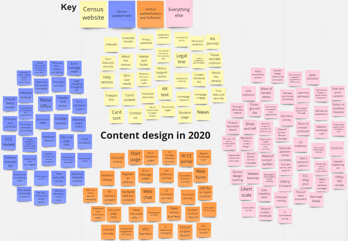
Content design in 2020
2020 was a year like no other. The bulk of our work last year was in preparation for the upcoming census. When COVID-19 hit, we had to adapt to the “new normal” in our naturally collaborative roles. We love post-it notes and walls, so we now save trees by doing everything virtually.
As we work across so many areas, we put together a Miro board of everything we’ve worked on throughout the year. We were amazed by what the two of us managed to achieve.
Census rehearsal evaluation
After the census rehearsal in 2019, there was plenty to learn from to make sure we delivered the best service in 2021. We held workshops and usability sessions, and carried out pair writing and content critiques across census teams. One of the main content-led activities at the beginning of the year was a prioritisation matrix to identify pain points from the rehearsal and areas to focus on.
We each led on content for different parts of the user journey, from receiving a census invitation letter, to authentication and the census website, right through to census completion. We looked at every touch point, online and offline, to make sure the right content was in the right place at the right time.
Designing for different user journeys
When you’re essentially designing a service for the whole of England and Wales, meeting the needs of all the different users is challenging. If a user hasn’t got everything they need to do their census, it’s our job to help them find it easily.
We also had to consider specific scenarios with different journeys for many different types of users, while not distracting the majority. Some of the scenarios included students, hotel managers, and people without a fixed address such as boaters. They all have different needs so the content and journeys need to reflect those needs.
COVID-19 content
The census questionnaire was near-final towards the end of last year. But then we needed to make changes on some questions to guide users on how to answer if they are in certain coronavirus-related situations, such as working from home, in quarantine or on furlough. That involved six rounds of user testing with frequent updates based on user feedback.
We also worked on the content for a new fast-moving ONS coronavirus survey, which changed fortnightly depending on changes in policy and statistical demand.
Accessibility regulations
We’ve always been digital accessibility champions. This became a whole stream of work for us when we took on the responsibility for guidance and training so that census content met the new accessibility regulations. We created a content accessibility best practice document and checklist, and delivered tailored training to different areas of the business.
Usability testing the census website
Towards the end of the year we focused on testing census website content to see if it was where users expected to find it. We created a central Miro board of user needs for the entire website to inform what the top tasks were. We wanted to test against these user needs with as many real users as possible.
Our user researchers carried out remote usability testing sessions, telephone interviews for more detailed research, and a card sort and treejack test in which almost 600 people took part. Research tasks focused around the core user needs, as well as more specific scenarios. We iterated the content and structure every few days, with a success rate of 70% at our last iteration (that means that 70% of people found the right content easily).
A hectic year
This is just a snapshot of our year in content design. And through all this and various lockdowns, Lauren also tried to get married. You’ll be pleased to know that it was third-time lucky!
We are passionate about content design and everything user-centred, and we’re always happy to chat if you want to find out more.
Laura Churchill and Lauren Stewart, Senior Content Designers