Why less interactivity can be more
When writing publications for our website, our analysis teams are often keen to show as much of our data as possible. One way to do this is through interactive charts – charts that let the reader choose the data they want to see. But is this approach always helpful? We’ve just published new guidance on why old-fashioned static charts are often better.
Let’s take the example of an article we published last month on the impact of Brexit and coronavirus on trade in goods. This used data on trends in imports and exports across countries and different types of goods.
So, how best to visualise this rich data? The first idea we had was to use an interactive chart with dropdown menus, which would allow the reader to filter by country and sector. They could choose to focus in on, say, imports of cars from Germany, then exports of food to the EU.
This sounds great in theory and I’m sure if you’re reading this blog, you might be keen to play around with the trends in this way.
But it does not reflect how visitors to our website behave. Readers will often skim through an article trying to find the key points. Our research shows they tend to only spend a few minutes on any given page: in the last month, the average time on a page has been 2 mins 52 seconds for bulletins and 3 mins 38 seconds for articles. This doesn’t leave much time to play with an interactive chart and find the relevant trends. So in practice, we see that interactive features often are not interacted with.
So what did we do instead?
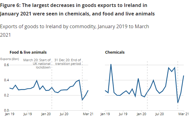
The trade analysis team had already done a lot of work to identify the key trends in the data. These included stockpiling in the run-up to the Brexit deadline, and the rise of China to become our top trading partner.
Rather than making the users work to find the trends, we focused on showing the key messages up front. We mostly used simple time-series charts. They included small side-by-side line charts – known as small multiples – to show trends for key countries and goods. These are a good alternative to interactive charts or to line charts packed with too many lines. We also added concise annotations to highlight the important dates, and clear chart titles to sum up the key messages.
An example of a small multiples chart from the release:
The approach we took seems to have paid off, at least in terms of media pick-up. Many newspapers covered the story, with some, like the Guardian, reproducing our charts. While this was largely down to the compelling trends in the data, visualising it in a clear and accessible way likely helped too.
Of course, there will be experts who will want to dig into the numbers in more detail. But these users are likely to download the data themselves, to manipulate and explore in their own way. This article, in contrast, was aimed at a broader, less statistically-minded audience (what we call the inquiring citizen in the user personas that shape our content).
Does this mean we are about to stop making interactive charts for the ONS website altogether? Fortunately not. While they were not the best option in this case, in others they will be. For example, charts that allow the user to get information that is personalised or local to them, like calculators or maps, tend to get more interaction. A recent example of this is our article on excess deaths in your neighbourhood during the pandemic. These kinds of visualisations will also be important in sharing the findings from the Census. But we’ll also be looking at how we can reduce the demands we put on users to explore this data, by helping to guide them where possible.
If you’re wondering if interactive charts are right for your project, have a look at the style guidance. For ONS analytical teams, we’re always happy to chat through what charts would work best for any upcoming publications. And if you have any feedback on the guidance or there’s anything we missed please let us know in the comments.