Transformed consumer price inflation preview launches
Today we are publishing the next in our series of transformed web content with a new-look Consumer price inflation (CPI) preview. This is the next step in the website transformation work and follows the publication of the Retail Sales preview that began last November.
A team from Digital publishing including Paul McGarvey from Content design, Dominic Gilbert from Data journalism, and Sam Bennett and Sam Watson from Data visualisation, worked to transform the CPI release over several weeks. We shared ideas and drafts with the very receptive and helpful Prices team, who as subject matter experts offered invaluable insights and feedback. The ONS Digital Services team also enabled some crucial features we were able to deploy for this preview.
We chose CPI as it is the most viewed release on the ONS website by a significant margin, accounting for 25% of all bulletin page views. Six out of the top 10 search terms over last year that brought users to the ONS website were inflation related.
Our remit was to build on the techniques we tested with Retail sales while developing the article template using strands from other transformation work.
By doing so we were able to make advances in both design and content which were wholly user-led and evidence based.
Evidence gathering
Using a combination of Google Analytics, heatmaps tracking user behaviour and user research, we found the following:
- users need more context on data and trends early in the release
- most users access only the first two sections before leaving the page
- a good proportion of users use the table of contents to navigate the bulletin
- low engagement with tables other than the main CPI annual time series
- only 3.3% of users scrolled all the way through to the end of the Data sources and quality section, which covers methodology and strengths and limitations of the statistics
Changes we made
The most prominent change we made in drafting the preview was to provide high-level information and content more prominently. This included a narrative title that told a clear story about the data, and reintroducing statisticians’ comments.
We replaced the main points with headline facts and figures, highlighting the most important changes, followed by an overview section that gives them important context, telling users the “why”.
Other changes were:
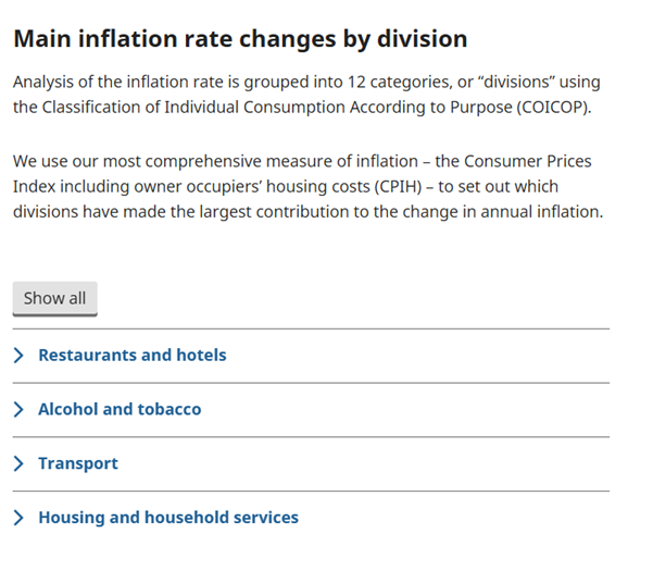
- the use of collapsible “accordion” sections to reduce scroll depth
- restructuring content for lay vs expert users
- removal or replacement under-used tables
- linking to a separate source for quality and methodology rather than repeating content that does not change from month to month
The use of accordions allowed us to include important definitions and detailed commentary on individual divisions while achieving a shorter scroll depth.
These are particularly useful to allow specific users to scan lists of sub-categories or definitions, while recognising not all users will need this content.
While the headline facts and figures and accordions are new features we are testing, there were many changes we made using our existing content style guide that made a significant difference.
We managed to reduce the word count by nearly half simply by:
- turning lists into bullet points
- removing repetition and descriptions of charts
- simplifying language where possible and appropriate
- reorganising content with new headings
This also reduced the reading age of the article from grade 12 to grade 8 on the Flesh-Kincaid scale.
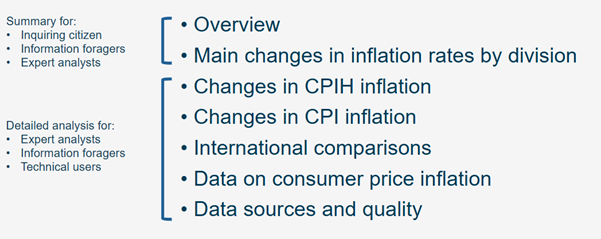
The general approach to organising our content had to match our user’s behaviour. With this in mind it was useful to group sections for our user personas. High-level content is frontloaded for general users, followed by more detailed commentary for experts.
Data visualisation
In the current Florence content management system (CMS), we use the inbuilt chart builder to create our charts for the CPI release.
We used the transformation of this article as an opportunity to redesign these charts without the constraints of the current chart builder, with the aim of designing charts that first and foremost improve understanding of these statistics and communicate important findings. While the Wagtail CMS chart builder may not be able to immediately produce all the charts in this preview, we wanted to illustrate its anticipated future capacity and the importance of charts designed around user need.
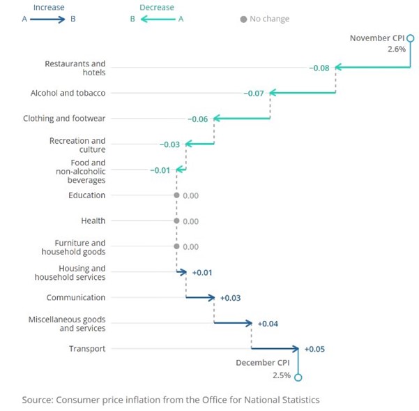
An example of this was the inclusion of “waterfall” charts showing the impacts of individual categories of inflation on the two main inflation measures. Research on these charts showed that while users were unlikely to seen charts like this before, they were intuitively understood and helped to communicate complex findings to an audience with little exposure to inflation statistics in the past.
Tell us your thoughts
Have a look at the Consumer prices inflation preview and let us know your thoughts by responding to the in-page prompts, sharing your thoughts in the comments section, or both. All feedback is really useful and will inform our future iterations and further work in the website transformation space.