The humble pie chart: part2
The principles and guidelines from part1 showed what data best suited a pie chart, solutions for labelling and using colour. This blog will focus on alternatives to the pie chart and conclusions from a research paper on how we read pie charts: is it arc, angle or area we use to judge or guesstimate and whether the variations on pie charts, like the donut and exploding segments really work?
Comparing simple part-to-whole data sets
Let’s start with this visualisation from a recent visual.ons post:
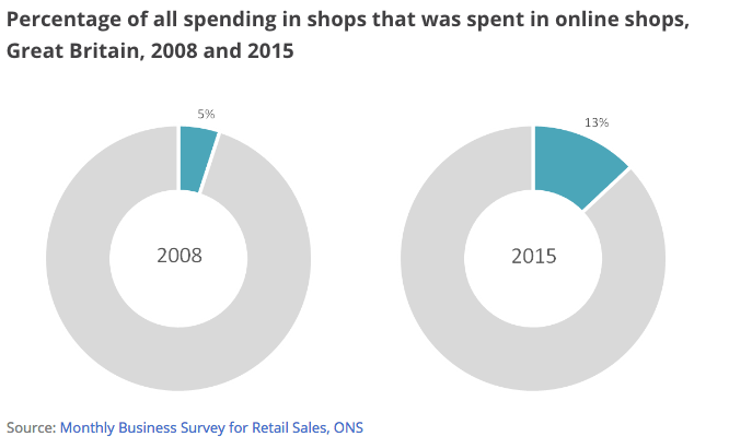
Here we have pie charts being used for comparison and I said to avoid, but it does give a good visual ratio of the values involved in telling the story so it’s okay for us to use these to compare. A known alternative would be a bar chart with 4 bars that use 2 colours, one for each year. But with such a large difference, as said in part1, this would look unbalanced and be no better for comparing.
If just 2 categories like above are used then you could have a couple more side by side, though there are better ways to display which we’ll cover in a minute. But, if the charts had 3 or 4 categories you might be lucky to compare two side-by-side because you’re back in that cross-referencing mental memory thing I discussed in part1. So keep it very simple if you use pie or donut charts to compare.
Another reason why pie charts for comparing isn’t a good choice is because they don’t share a common axis or reference point. So what if you’ve data of this type and don’t want to see a load of pies? Use part-to-whole bar charts.
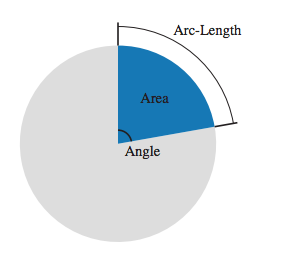
Note: a pie chart does actually have an axis, a y-axis and it’s on its circumference, where each category’s arc length is the magnitude.
This is certainly better than a group of pies and importantly this allows better visual comparison. I wouldn’t recommend using too many categories in each bar as the middle categories don’t have that common reference point so it makes it harder to compare them.
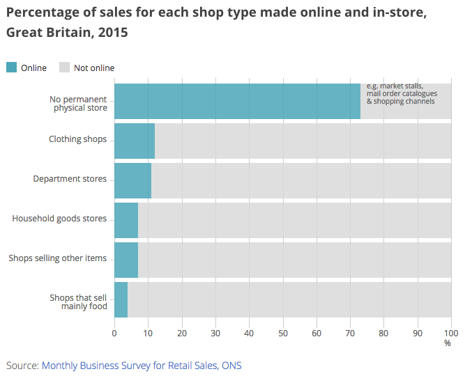
Here’s one with just 3 categories using grey for those who were unsure. As a load of pie or donut charts this would have looked cluttered and as a result harder to interpret.
Let’s say I want to show several sets of basic part to whole data and it’s not a necessity to compare them; then a single bar can be an accurate alternative, especially with the help from its axis. The bar below is from a previous visual.ons post where you will see 4 or 5 of these, neither one is to be directly compared, they just show the breakdown for the different energy types.
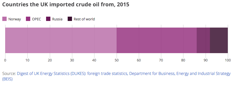
Don’t get me wrong, the article would have worked with separate donut or pie charts. And let’s face it, it’s only a donut stretched back out to a bar. Should I say that given pie and donut charts use angles to display the categories; hold that thought for the last section on reading pie charts.
Using part-to-whole data but you’re in the upper limit of categories
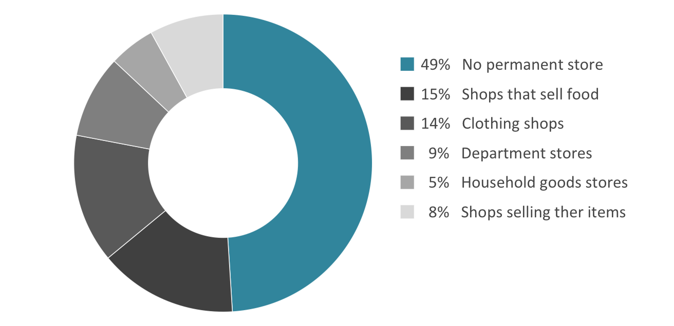
This example, from the same online shopping post, uses the upper limit of categories however it’s showing us how nearly half spending online is to shops that have no high street stores and the breakdown of the shop types is secondary, hence the use of grey. So primarily it’s a donut chart of 2 halves showing the main message.
It required a key because the labels are long and whilst I know the values are orbiting the chart (I said to best avoid it in part1, but they were guidelines) though they are in order of size with the exception of “Other” which should go last.
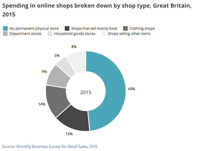
A potential solution would be to place the values in an aligned horizontal key so as to display the data in right aligned table format. These could list the actual values too.
If you have too many categories with your part-to-whole one alternative is the Treemap. These charts display part-to-whole relationships and are often used to show data that is hierarchical. Here’s 2 simple treemaps used on visual.ons for comparing the most common cancers for males and females.
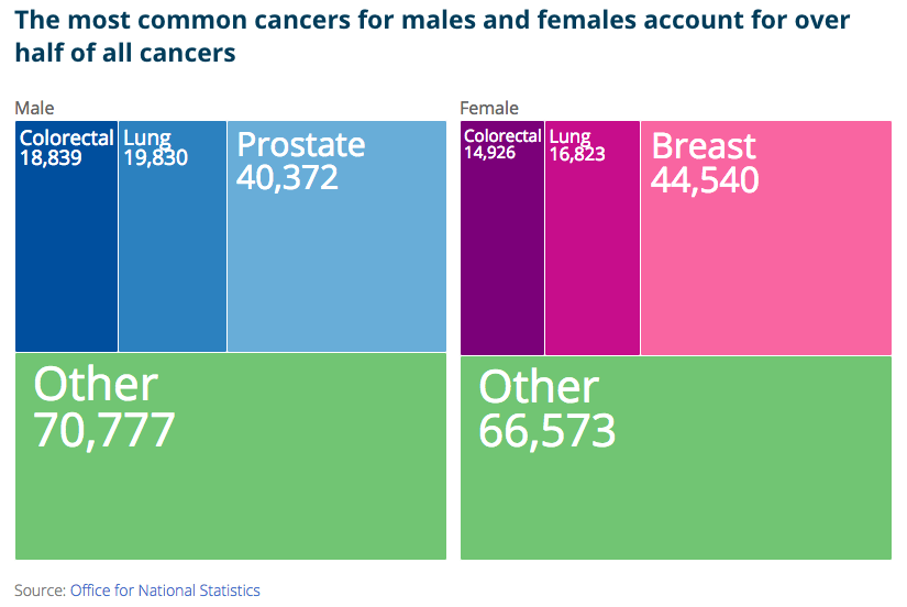
Don’t get me wrong a pie or donut chart in this instance would have done the job just as well visually speaking, but additionally this catered for the large figures involved.
Naturally these can get much bigger and can cater for many categories. Hierarchical treemaps like this these two showing UK imports and exports on visual.ons can get quite complex. Admittedly this is way beyond any part-to-whole that any mass use of pie charts could be used for, but simple treemaps showing 7 or 8 to 20-odd would possibly be better than some of the colourful multi segment pie charts out there in the wild.
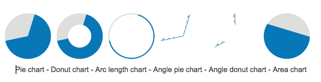
Types of pies and how do we really read them
So, do we really know how we read the different types of pie charts? It turns out there was no research to back up whether it was angle, area or a combination of things. So Drew Skau and Robert Kosara went about this task and wrote 2 papers.
The first paper ‘Arcs, Angles, or Areas: Individual Data Encodings in Pie and Donut Charts’ uncovers reading accuracy of the different types of pie charts, as shown below and how we encode them.
So extracting the main points we have:
“The complete pie and donut charts do the best, while the angle-only conditions are the worst. People were surprisingly good with the area-only condition (far right), which was completely unexpected. Arc-only is virtually identical with area-only.”
“The results show that all three visual cues are important, but that arc length in particular seems to provide important information. (there’s that point I said to hold) Angle is clearly not a significant bearer of information in pie charts, and in particular the central meeting point of the circle segments does not appear to be crucial. Donut charts thus appear to be no worse than pie charts.”
They also wanted to see if there was an effect from the inner diameter in donut charts.
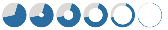
“There is no difference between them, other than the thinnest donut being worse than the rest (we’re not sure exactly why). Donut charts no worse than pie charts!” There you go people.
The second paper Judgement Error in Pie Chart Variations tests some of the pie variations popular in infographics.

Left to right, there’s a basic pie chart, a pie chart with a larger slice (often used for emphasis), an exploded pie chart, and 2 pies with unusual shapes. These shapes are designed to mimic the human figure, a house or some object in question and are usually used in infographics.
The conclusion shows: “The results are quite surprising, certainly if you still think that central angle is how we read pie charts. The larger slice and exploded pie chart don’t distort the angle, so we should be able to read them just as accurately as the base pie chart. And yet, they both led to more error. The larger slice in particular led to a clear and systematic overestimation of the value. The distorted charts, unsurprisingly, did even worse.”
“All performed worse than the base pie with the slice leading to overestimation” Never.
Well there you have it, empirical evidence at last from 2 excellent papers.
To wrap up the humble pie
Stick with pie or donut charts, both are equally as good, don’t get all fancy with emphasising slices. For ordinal data use one hue with steps in luminance, whereas nominal data can use different hues, but often is just as representative with one hue. Labelling is a nightmare, keep it as simple as possible and remember a table in a key is an option.
Keep in mind the other options particularly if you’re comparing simple data sets or have too many categories, but it’s part-to-whole and you want to ensure your audience sees this.
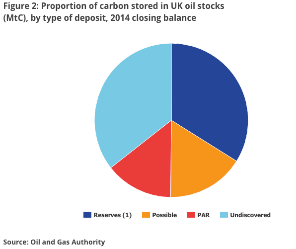
I will leave you with my favourite ONS pie chart from the bulletin, UK Natural Capital: Experimental carbon stock accounts, preliminary estimates. This pie chart has a good amount of segments, they’re ordered with “Undiscovered” last, as it should and I do like the outcome of the peace symbol.