Homepage Hell
The words “Office for National Statistics” and “Homepage” have a dramatic effect on me in much the same way that Chief Inspector Dreyfus was left an eye-twitching wreck at the mere mention of Inspector Clouseau in the original (and best) Pink Panther films.
Why? This simple task (build a homepage) has driven me to despair on multiple occasions over the course of the Alpha project and long before that in-fact. If nothing else, I hope this post serves as a blueprint for how not to do a homepage project and hopefully contains some pointers as to what to do if yours has gone off the rails.
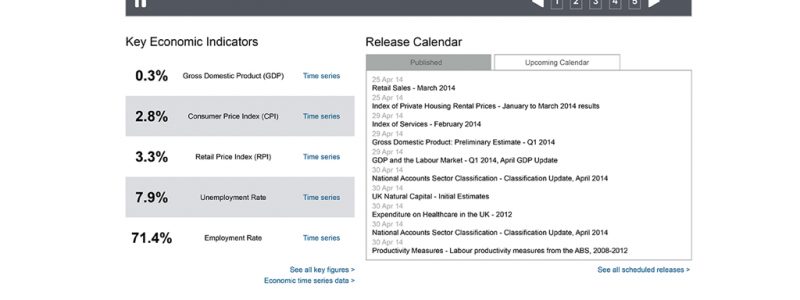
It all started out as you’d expect. We’d done the requirements gathering, reviewed analytics, conducted stakeholder interviews and held workshops where a multitude of ideas and sketches appeared. We’d even reviewed previous usability sessions of the existing homepage. We knew what we wanted on the page and the list was laminated – no additions allowed.
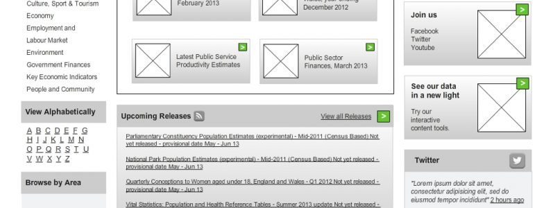
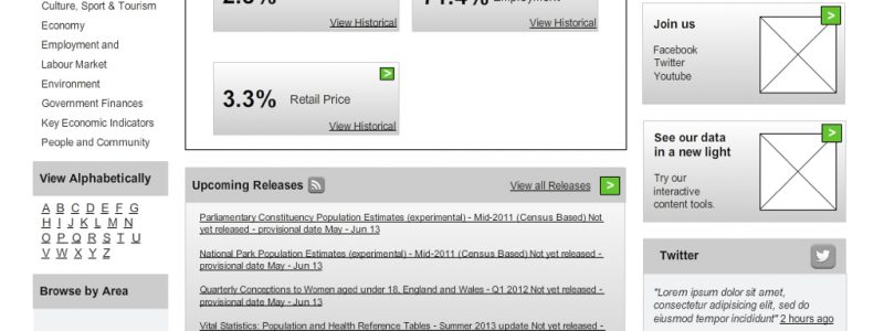
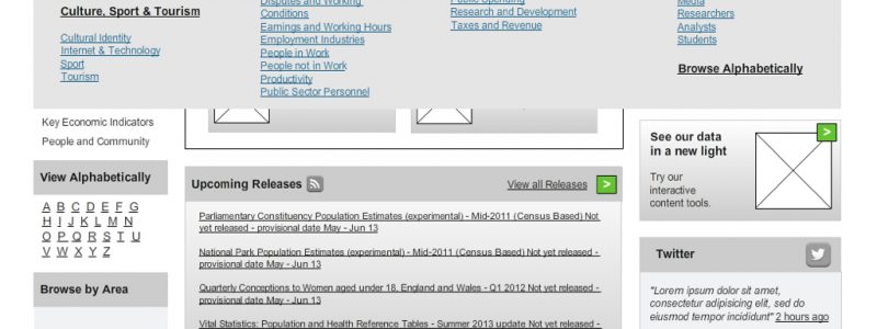
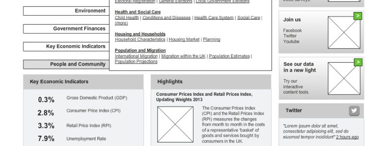
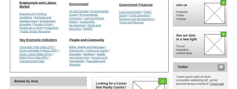
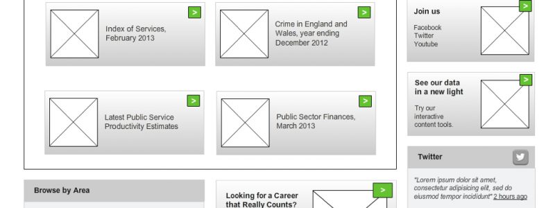
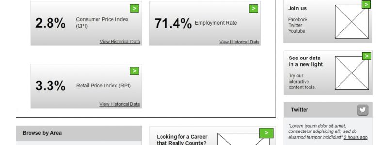
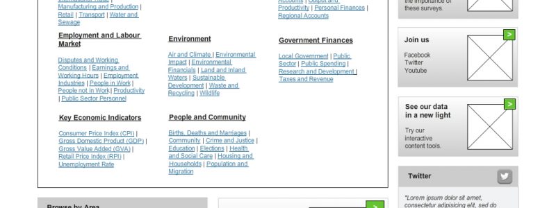
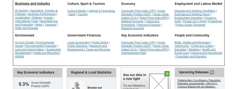
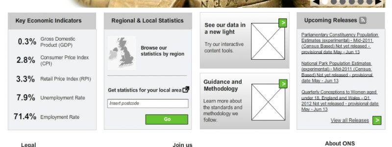
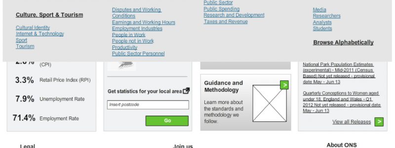
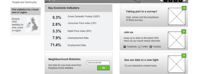
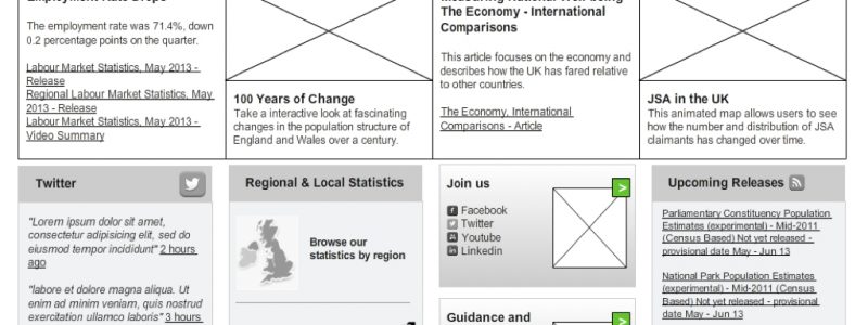
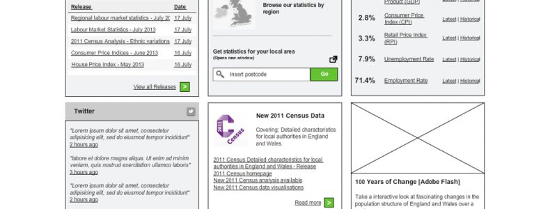
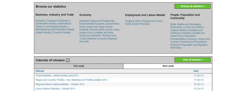
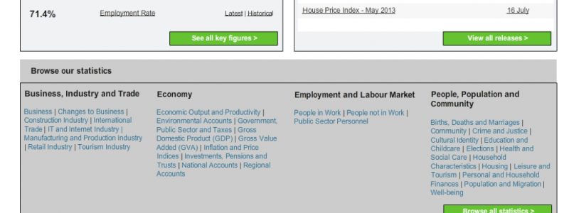
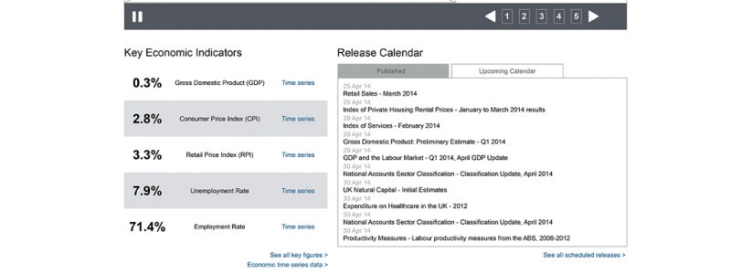
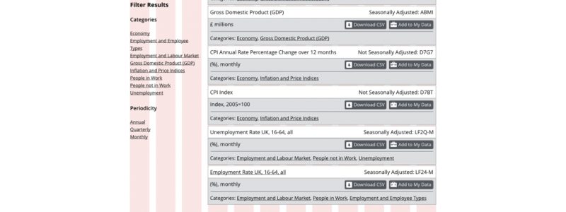
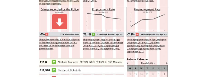
With all that information I then set about creating wireframes which we reviewed internally, re-worked, reviewed some more, re-worked, took out for testing, re-worked, tested, re-worked, changed goals, tested…you get the idea. The following slideshow gives you an idea of the sheer volume of versions created. I can personally put my name to 90% of the ones shown here. The rest we’re by other poor souls dragged into the madness along the way.


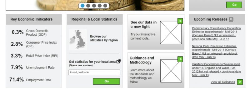
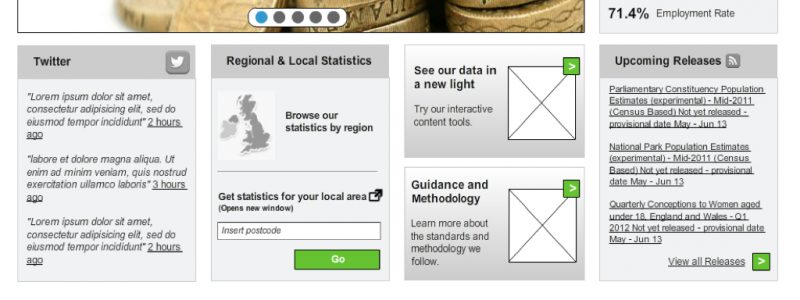
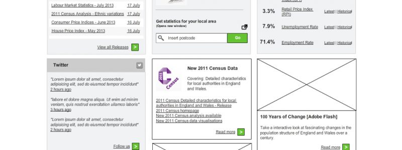

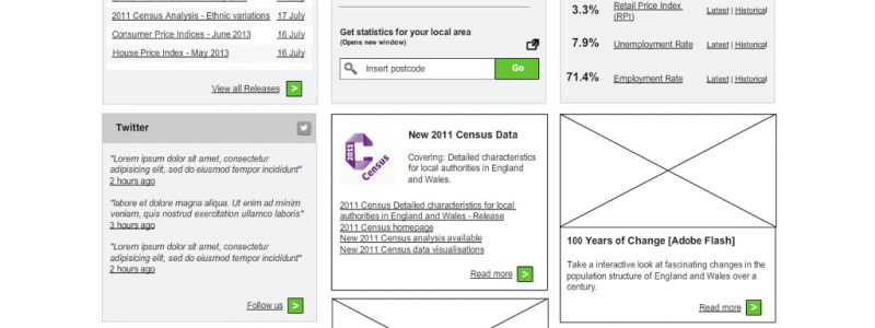


Whilst putting this slide show together I can see the journey we took, why things changed and how we came to these conclusions. It feels like we sort of came full circle to be honest and, if nothing else, proves our original thinking was fairly sound.
As I write this now and try to make sense of it all I’ve come to the following conclusions:
Don’t take too long – the work spanned such a long period of time that things constantly changed. We had to react to business goals changing, more usability testing, more analytics findings and new people came in with new ideas. When the top level nav changed it meant the on-page content changed. When on-page content changed you had to think about navigation again. Get it done, get it live and then adapt and improve.
Don’t doubt yourself – too much time spent reviewing meant we as a team lost confidence in our work and started to second guess our decisions and re-worked when we probably didn’t need to.
Don’t lose sight of the page goals and objectives – We had a blueprint for what success looked like but somewhere along the line it got filed. It was only dusted off at the end of the project and ultimately helped us refocus our efforts.
Remember who it’s for? – as business goals changed so did the audience we were designing for. We started out trying to be all things to all people which, to be fair, is what a lot of homepage designs try to do. The problem is that everything on that page has to work really hard to meet that objective. “I like that but I wouldn’t use it personally” was a comment that came up in testing so often that we realised we had to focus the design to meet the needs of the target personas only.
Don’t play around forever, build it – sometimes you just can’t convey and idea in a wireframe or Axure prototype. You have to build it in browser and then you’ll know for sure. In this whole process it only came into browser late in the day. We should have done it a lot earlier.
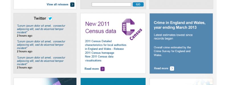
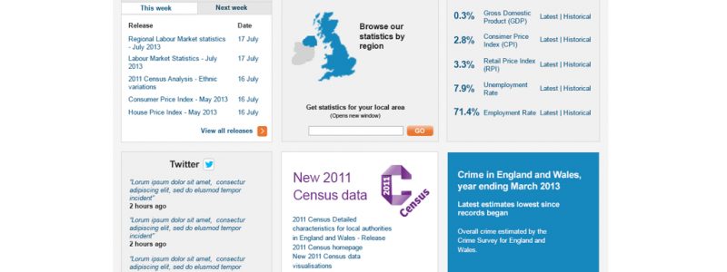
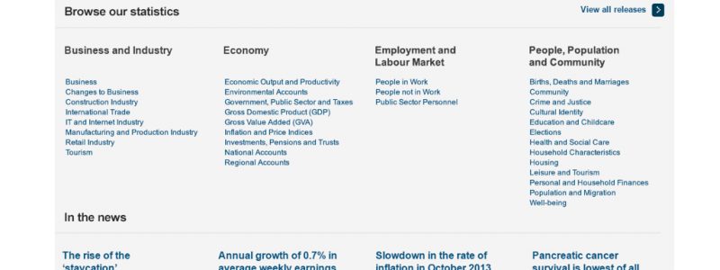
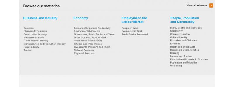
The last slide in the presentation is the page we’ve gone with on the Alpha. I’m fairly happy with it (it’s hard to get enthusiastic about something that’s caused me so much pain). It tested well and generally meets our objectives and those of the ONS (as much as an Alpha can anyway). I can already see things that could be improved and I’m sure if we go to Beta we’ll need to consider content areas not covered by the Alpha. For now I’m happy to forget about it and see what our users make of it…again!
2 comments on “Homepage Hell”
Comments are closed.