Does the axis have to start at zero? (Part 1 – line charts)
At the risk of ruffling a few data vis feathers … no? But there are often occasions when it should.
Let’s take a look at line charts first …
Line charts focus on change, not comparisons of size like bar charts and because of this the data is represented in a different way. Data in a line chart is encoded by position (x, y coordinates), whereas in a bar chart data is represented by length. This subtle difference changes the way a reader uses the chart, meaning that in a line chart it’s ok to start the axis at a value other than zero, despite many claims that they are always misleading. (Bar charts should always start at zero – I’ll explain why in my next post.)


It’s ok to start a line chart at a non-zero value but there are some things you should be aware of before you do so.
Zooming acts like a lens
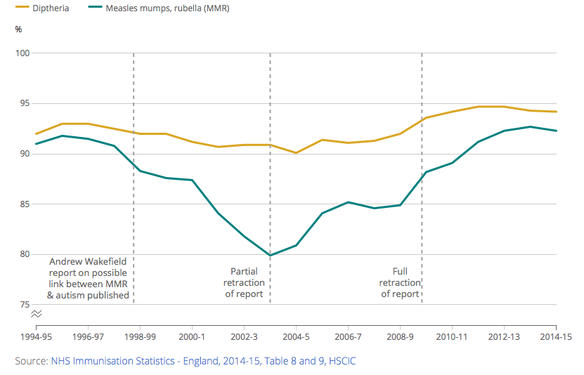
As soon as you truncate your axis you’re making an editorial decision to focus on the data in a different way, so take care not to mislead the reader. Have a look at this chart on the percentage of children vaccinated against measles, mumps and rubella (MMR). It shows that vaccination levels are pretty high and have been consistently high over the last 20 years. So there’s no need to worry about children getting these diseases, right?
Combined MMR vaccination rate, 1994-5 to 2014-15, England

Maybe not … take a look at the data again but this time using a different scale on the y-axis. Notice how I’ve included an optional break symbol that can help draw attention to the fact axis doesn’t start at zero.
Combined MMR vaccination rate, 1994-5 to 2014-15, England

At this zoom level there looks to be a marked decline and subsequent rise in the data. But is this important or not? Some context might be useful to make sense of this trend.
This chart shows the MMR vaccination levels together with those for Diphtheria, a vaccination given to children at a similar time in their life.
Combined MMR and Diphtheria vaccination rate, 1994-5 to 2014-15, England

It looks like something is definitely affecting the MMR vaccination levels and possibly also having an effect on the diphtheria vaccination levels but to a lesser extent.
As you may be aware the reason for this decline in MMR vaccination levels was a report, published in the Lancet in 1998 on the link between the MMR vaccine and autism.
This report has since been retracted (partially in 2004 and fully in 2010) but was in the public domain long enough to influence whether parents vaccinated their child against MMR.
Adding in this context to the chart by means of annotations can really help to “tell the story”.
Combined MMR and Diphtheria vaccination rate, 1994-5 to 2014-15, England
So that’s the complete story? There’s no need to worry … MMR vaccination levels have been on the rise again after the dip due to the article published in the Lancet.
Actually no! We shouldn’t get complacent.
The World Health Organisation recommended that by 2000, 95% of a population or more should be vaccinated against a disease in order to provide herd immunity.
National MMR levels in the UK have never reached the 95% level and illustrating this target by means of another annotation has an impact on the overall message of the chart swapping it from a “don’t worry” version to a “there is still work to be done” version.
Combined MMR and Diphtheria vaccination rate, 1994-5 to 2014-15, England
There are, however, a few other things to be aware of when choosing the range of your axis.
How close to zero is the data?
David Spiegelhalter recently tweeted about a chart we published on conception rates. The chart started at 20, which given that that the data ranged from 22.9 to 54.9 (so not that far away from zero), I agree was inappropriate. It was zooming in on a trend that that wasn’t hidden if the axis extended to zero.
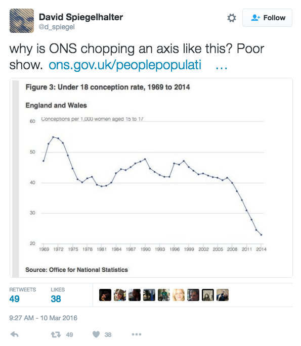
The other reason for including zero in this case is the fact that in recent time conception rates for under 18s have actually been falling and if the trend continues in the future they might one day reach zero. Having a possible target actually within the charting range is useful as it shows the distance left to reach it. We’ve since corrected the chart and the trend is just as clear so there really was no need to start at a non-zero value. Sorry about that.

It’s worth pointing out that automatic chart builders (such as Excel) often default a range they choose to be appropriate, so extra care is needed.
How variable is the data and how large is data being represented?
A blog post by Quartz discusses axes too and one of their examples on GDP highlights how small changes in GDP are concealed if you start at zero. If you look at GDP data over the last 5 (and a bit) years you can see that it looks to be slowly but steadily rising.
GDP: Chained volume measures – seasonally adjusted, Q1 2011 to Q1 2016, UK

Only when you alter the y-axis can you see the fluctuations in mid-2012. These changes may seem trivial but actually because the y-axis is in trillions of pounds what appears to be a small change is monetarily very large. The highlighted period between Quarter 1 and Quarter 2 in 2012 GDP was a decrease of £736 million. Data vis guru Edward Tufte, has an interesting view on this subject. He says “In general, in a time-series, use a baseline that shows the data not the zero point”and “don’t spend a lot of empty vertical space trying to reach down to the zero point at the cost of hiding what is going on in the data line itself.”
GDP: Chained volume measures – seasonally adjusted, Q1 2011 to Q1 2016, UK

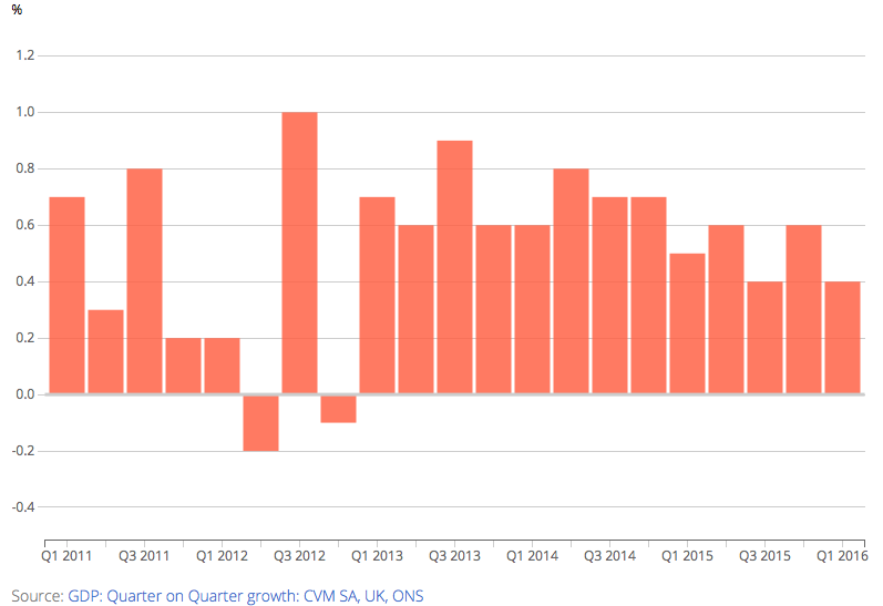
You should also always have a good think about exactly what is you want to illustrate in your data. In this example, if you are actually interested in looking at how the data has changed since the previous time point, rather than the value of the data itself, then it might be more sensible to look at, say, quarter-on-quarter change as in the example below.
GDP: Quarter on quarter growth, chained volume measures – seasonally adjusted, Q1 2011 to Q1 2016, UK
Zooming can be done on both axes.
Think back to the second chart I showed you…
Combined MMR vaccination rate, 1994-5 to 2014-15, England
Not only was a decision made to have a y-axis running from 0 to 100 but also to have an x-axis spanning 20 years. How about if you look at the last 33 years. (I’ve used slightly different data from the OECD instead of HSCIC in order to get data that goes further back in time but it’s similar enough to use in this example).
Combined MMR vaccination rate, 1980 to 2013, England

You get a totally different picture …
So use your axes wisely …
I think the important thing to remember is that deciding what the axis scales should be is an editorial decision and should be chosen to best suit the data and help support the message(s) you wish to convey.
Keep an eye out for my next blog post where I’ll be looking at axes on bar charts …
4 comments on “Does the axis have to start at zero? (Part 1 – line charts)”
Comments are closed.
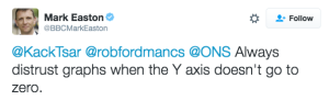
Some very good points here, but I think we do need to underline the dangers of not taking the axis to zero. You said at the start that ‘line charts focus on change’. They do show levels though, so we need to be aware of that. Furthermore, even if change is our focus, as you illustrate, different scales give different impressions – and truncating the axis can give a very different impression of proportionate change. Long ago, we were taught that if we wish to truncate the axis, we should start the axis at zero, but then insert a zig-zag on the axis where it had been truncated.
I suggest that, unless there are good reasons to do otherwise, one should start with the presumption of taking the y-axis to zero and then, if necessary, using a further figure to home in by truncating the axis (with a zig-zag*)
Back in the ’60’s (the 1960’s, that is!) I gained a lot from two books (Penguin, I think) – ‘How to Lie with Statistics’ by Darrell Huff (with a good chapter on ‘The Gee-Whizz Graph) and Use and Abuse of Statistics’ by W. J. Reichmann. Worth resurrecting, I think.
* I have never been able to figure out how to do this in Excel (apart from inserting lines via ‘Shapes’) – any suggestions?