Marriages – when two become one
We’ve published 2 new pieces on Visual.ONS today that push our beta site into new storytelling and data visualisation territory. These 2 pieces are 2 sides of the same coin – 2 approaches to the same data set.
But why 2 pieces? Herein lies the tale…
Visual was set up last year to help cast new light on existing data, to act as a an editorial and data lab to learn lessons about how we can get you engaged in statistics, and make better decisions based on them.
Today we’re experimenting back in the lab with 2 very different approaches to turning a fascinating set of data into (what we hope is) engaging content.
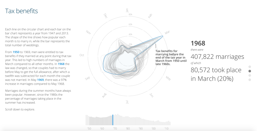
We’ve been looking at trends in England and Wales marriage data over time; essentially, when people choose to get married and how this has changed over the last 60 years.
We noticed a pattern in the data, and felt there was an opportunity to let people explore that data and understand some interesting societal shifts.
Whenever we start a project, we are looking to tell the story in the format that best suits the messages in the data and the intended audience. We want to create an engaging experience, likely to encourage exploration. We like to develop and use formats that can be reused for different sets of data as it’s not possible for us to continuously create bespoke experiences.
Our data visualisation specialist and designer Paul presented an approach that used wedding rings as his design inspiration, he used radar charts and heat maps to give users an elegant overview of all the data, while highlighting certain patterns within the data. We wanted to offer people not just an overview of the data at a distance, but also a personal experience, letting them explore the data for themselves and see themselves, their parents or friends in the data. How do they compare?
Save the data – Scrolling through data
There’s been a surge in the use of vertical scrolling as a simple but effective user interaction model in the last few years. Driven by mobile usage, and by time-poor users, so-called “scrollytelling” can be a great way to move people through an experience with the minimum amount of friction.
The approach was to let users simply scroll through the data, and the various stages of the data-driven storytelling. We felt this was a format that had great re-use potential.
The challenge we faced was how to incorporate a narrative that could tell the story from more of a social history perspective and help pull the users through the interactive.
We appreciate that people are different: some prefer a visual representation of a story and would relish scrolling through the data while others respond best to written text and might prefer the opportunity to have an alternative take on the data, with visual prompts and more emotional storytelling.
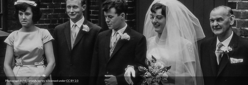
What do you see when you think about marriages through the decades? You might think of black and white photographs with curled edges in shoeboxes, the faded primary colour emulsions of Polaroid shots, and family members with gaudy clothes and questionable haircuts.
How could we capture that emotional history in a data visualisation? And should we even try?
The Office for National Statistics isn’t a natural home for storytelling, but we felt there were lessons for us to learn in how we could make our data more accessible, more relevant to people.
But when we discussed adding more editorial narrative, and even archive photos, to the existing interactive there was a tension between the simplicity and focus of the data visualisation and the potential distraction of adding such detail, background and texture to the story. There was also the not insignificant challenge of responsive design – how do would you fit this all on the same screen?
We didn’t want to undermine the purity of the interactive, but knew there was an additional opportunity too good to miss. In some ways it felt like a tension between showing and telling: if we were showing, did we need to do more telling? If we were telling people, were we also able to show?
There was also a long and involved discussion about the levels of visual literacy in our audience. Our audience is typically very data competent, and used to consuming the types of charts you wouldn’t ordinarily see in some sectors of the media.
But we also have a mission to reach an audience member we call the inquiring citizen. Would they be familiar with our radar charts?
We’d been looking at a tool called Shorthand that helps media organisations create mobile-friendly “scrollytelling” content that combines text, photos, video and interactives. So we decided to create a second piece of content, more focused on narrative and social history, using emotionally-driven story-telling and simpler charts.
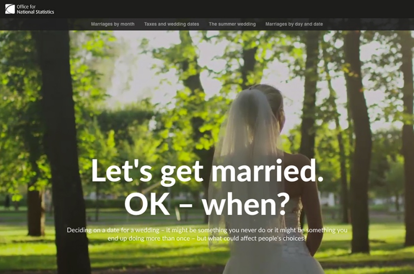
Let’s get married. OK – when? Shorthand experimentation
As we often do at ONS Digital, we turned to user testing to help us hone our approaches.
Some of our users felt the very data-pure approach we had tried in the interactive was not to their taste. It was something they were unfamiliar with. So we’ve incorporated more annotation on the charts, which highlights the key messages, and added navigation aids to move people through the experience.
There was a definite appreciation of the boldness of the design and the simplicity of the user interaction that we felt was worth testing out in the real world.
For our Shorthand experience, the use of images to create an emotional connection and accentuate the social changes over time was clearly appealing, but people wanted more control over the charts which weren’t interactive, and wanted the narrative to be shorter, punchier and more digestible.
We never set up the user testing as pure A/B testing because we weren’t looking to validate or invalidate one approach over the other. What we found was a distinction between audiences who preferred a more narrative and emotional story versus those who appreciated a visualisation that accentuated the story in the data itself.
So that’s why we have 2 stories to present to you. One is an elegant, sophisticated piece of data visualisation that uses simple scrolling interactions to walk you through the data, allow personal exploration and help you find the story. The other is a rich, visual experience that combines archive photographs, simpler line graphs and more of a traditional narrative to engage you in social history through statistics.
We hope there is a huge amount to enjoy, explore, and learn from both pieces. And we want your feedback on them. This isn’t an A/B test, or Pepsi Challenge. We don’t want to know which you prefer, but rather what works and doesn’t work for you in each of the pieces.
What were the key messages you took away?
How engaged were you in the experiences?
How did scrolling work as a mechanism for exploring the data?
What kind of storytelling do you want from data?
Email us at digitalcontent@ons.gov.uk with any considered views, or take our really quick survey: interactive data visualisation survey , storytelling survey.
One comment on “Marriages – when two become one”
Comments are closed.