Reinventing the Wheel
In 2010 the then-Prime Minister David Cameron launched the Measuring National Well-being (MNW) programme to “start measuring our progress as a country, not just by how our economy is growing, but by how our lives are improving; not just by our standard of living, but by our quality of life”.
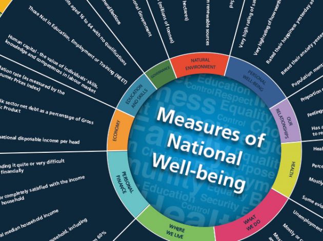
When I joined the organisation in 2013, the well-being release was an infographic that housed the 41 headline indicators.
“The Well-being Wheel perfectly served the brief which was to design something which was of high impact, and could include all 41 measures of wellbeing on one page without any suggestion of hierarchy…it really helped put the UK’s work on well-being on the map”
-
Abbie Self, Assistant Director with responsibility for Sustainable Development Goals.
This A0 sizes poster was well placed around the office, and became a flagship of both design and the business area. The infographics status was further enhanced with an illustrious excellence award.
As well as winning the Excellence award for statistical impact, it had successes in other areas. A blown-up version was displayed in the foyer at the United Nations in New York for some time. Copies of the data files were requested by numerous public bodies in the UK and abroad (Sweden, Germany, France) so that other organisations could produce their own.
“When I was the ONS/Cabinet Office rep at the Open Government Partnership meeting in London I was asked by a member of staff from the Japanese Embassy for the details of the design company we commissioned to design and create the wheel, he was surprised to hear that it was all done in house.”
- Ian Macrory, National Well-being International liaison branch
Fast-forward to 2017 and a lot has changed. The way we present our statistics has evolved. For the well-being release to sit on ons.gov.uk it needed to comply with our standards. Readable text, accessibility and being responsive across platforms meant a new approach would have to be taken in order to publish the latest measures.
So who you gonna call? Ghost Bust… Digital Content, a multi-disciplinary team of which myself and Zoe Hartland are members of. Zoe had recently developed a dashboard on the EU Referendum (commonly referred to as the Brexit Dashboard)
The dashboard housed 18 economic indicators and had been very well received. The products helped users who were interested our data to monitor changes in the economy. Zoe made no secret that during work on economic dashboard she had already began thinking about the well-being wheel.
Within Digital Content we were all aware that the wheel had already surpassed its sell by date in its current form. It failed to meet our standards for publication on both the main site and visual. And a dashboard to replace the wheel seemed like the obvious and correct choice.
We first properly sat down with the business area at the start of the year, 4 months before publication. And after all the success of the wheel you can understand why there was hesitation to move away from it. Thankfully the business area came into the project with an open mind and through our rationale built around user-centered design Matt and Tess both understood that the product needed a redesign and showed great enthusiasm to work with us on the project.
That’s not to say they did not have any justified concerns, many of which we shared. Displaying 41 charts on one page can be a lot even for the hungriest of data digesters. They also acknowledged that there was still a strong alliance with the wheel throughout the business area and could we at least tip the hat to the old guard when developing the predecessor? How would we indicate a change from a previous release? There were many questions that needed exploring before we could provide the answers.
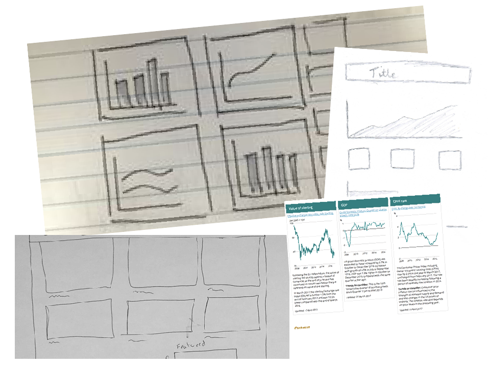
Moving from prototype to development we began to explore those problems, the development of a JavaScript filter allowed the user to show and hide categories within the dashboard rather than be overwhelmed by the amount of data in one hit.
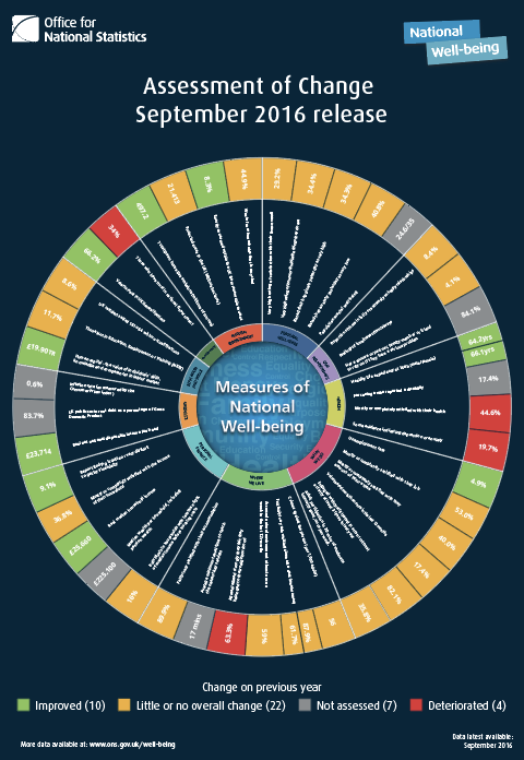
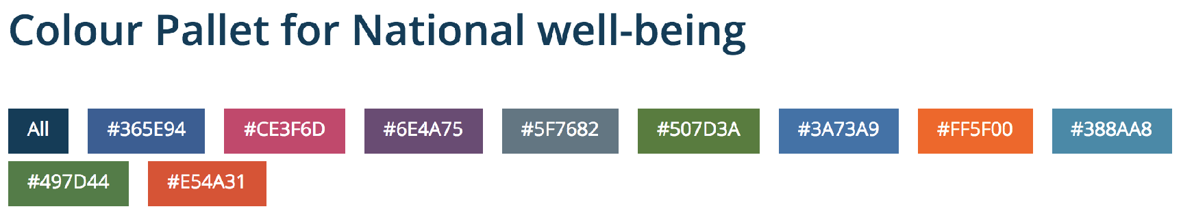
To answer concerns of loyalty for the wheel, we were able to work in some colours from the original. Each colour has subject to accessibility testing, so not all were able to make the cut, but we made a conscious effort to try and get as close as we could.
 Another interesting development was how to visually communicate change with indicators. Traffic light signals automatically come to mind when you’re illustrating positive, negative and no change, yet red, green and amber mean nothing to a user with acquired colour vision defects. With no simple solution we began to experiment with indicators that did not rely on colour alone to express change.
 I also had a unique opportunity to test our product during a training course with GDS, during a design critique. I’m never amazed at what simple problems can be found with fresh eyes. Watching people use the product led to some last minute changes around button behaviours and page anchoring.
Some insightful feedback from gds design training memebers on a project #govdesign @gdsteam pic.twitter.com/8kpwmAMcnB
— Thomas Davy (@tomten2two) April 4, 2017
The dashboard went live on 21 April 2017 was meet with a positive response from stakeholders. Key to the success of the product was the good working relationship we developed with Matt Steel and Tess Carter. Their enthusiasm and trust throughout the project went a long way in allowing us to try new ideas and build a product based on user needs. Thanks guys!
As dashboards are something of a novelty at the moment we’re keen to understand their limitations before rolling them out across the organisation. A third dashboard was embedded in the published this morning, and a fresh approach is being trialled based on feedback from the previous two dashboards. We’ve stripped back the text as much as possible and the whole dashboard is viewable in one window. We kept the indicator showing the direction of change but added an actual figure to give further context. Chart furniture (axis labels, grid lines etc.) was also toned down to allow the data itself to be more easily seen.
Our use of dashboards is currently in the experimental stage and we’re keen to improve and understand them more. If you can spare a few minutes please tell us what you think either by email digitalcontent@ons.gov.uk or this survey. https://www.surveymonkey.co.uk/r/XNW63YK
Note: Thank you to Zoe, who’s name might not appear as the publisher on this blog, but had a huge contribution.