Picking things from a long list
One of the trickiest patterns we’re working on as part of Customise My Data is the geography filter.
You’ll often hear the team saying “geography is hard”. It’s starting to become a catchphrase.
But it’s not geography that’s hard. It’s allowing users to browse a long list, with many subcategories and choose the things they need.
One thing per page
During the alpha, we started with a one thing per page approach. This approach is great because it allows you to learn which bits of a design work and which bits don’t.
Research showed us that sometimes users need to search and sometimes they need to browse from a list. They also need to see confirmation of what they’d picked. It’s a circular journey that users need to go round a few times to find everything they wanted. Having the pattern split across many pages was making it feel more difficult.
Don’t reinvent the wheel
With help from Ed Horsford, a designer at GDS (Government Digital Service) I looked across government at services which have similar patterns. I could see the similarities with what we were trying to do.
I combined all the good stuff I’d learnt from these other services, with all the research we’d already done. Then, I created an improved version of the pattern which combined all these things into “one page”.
Combining search, browse and confirmation
I always advocate starting with the one thing per page approach. But there were two reasons why it was a good idea to move away from this approach for this pattern.
- Users see “picking from a long list” as one thing. To match our users’ mental model, we need to combine all these complex interactions into one page. And make it feel simple.
- Our users are quite high on the digital inclusion scale. They can complete tasks on a computer and their digital skills range from basic to confident.
Meeting users’ needs with the new design
The new design works hard to meet many user needs and we (Alison, Damien, Tom and me) are continuing to research and iterate this pattern throughout the Customise My Data beta.
Here are some interesting user needs we discovered along the way:
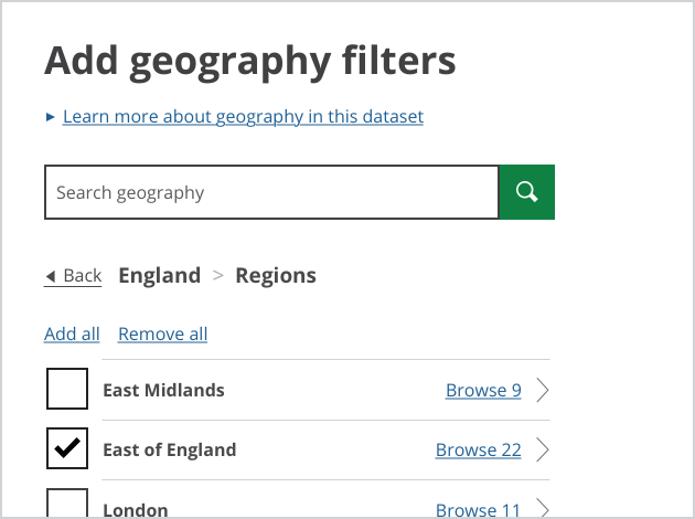
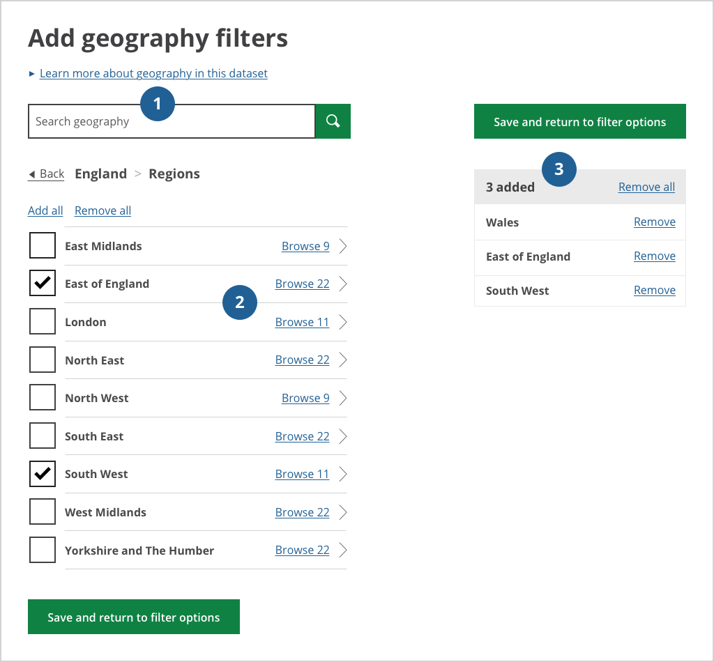
- Having two search boxes confuses users. We’ve decided to hide the global site search from the ONS website header. We’ve also added clear text (“Search geography”) so the scope of the search is obvious.
- Users need to know what exists at the next level down. For example: if I search Swansea, I need to know which areas are available within Swansea. So, each item in the list has a checkbox to select that area and a text link that takes users down to the next level. This helps users to make a vertical selection (country, region, city). It also allows them to make horizontal selections (all cities in this region).
- Users need to know what they have already selected. And feel confident that their choices have been saved. We’ve added a component that updates as users select each checkbox (don’t call it a shopping basket).
Next steps
Having a list in the sidebar that updates with changes relies on having two things:
- a large screen
- a javascript-enabled browser
We need to make sure that the designs work on small screens. Also, if javascript is not available the core functionality must still be available.
If you have any thoughts, or you’re working on something similar, please get in touch. You can leave a comment or follow Benjy on Twitter.