Finding data by location (my first Design Sprint)

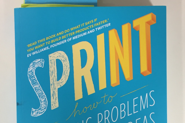
Earlier this year we ran a Design Sprint. It’s a five-day sprint starting on Monday and ending on Friday with a very focused schedule. It was invented by a team at Google Ventures. If you’re interested in learning more, I recommend you read Sprint by Jake Knapp.
Our big problem
The point of a design sprint is to “solve big problems and test new ideas in just five days”. Our big problem was geography. We have a clear user need: “as an information forager, I need to find data by geographic area, so that I can help my colleagues learn about a specific location”. It comes up time and again in all our research.
The issue of geography kept coming up in our retrospectives too. Statistical geography is a particularly complex topic. It isn’t straightforward to align that complexity with the simple user need.
We had an opportunity where the user experience designers on the website team were free for a week. So with just a couple of days to plan it, we began to clear our calendars. The ONS usability lab was empty, so me, Tom, Rob and Damien moved in there for a whole week.
Monday: understanding the problem
The first day was about figuring out what we wanted to achieve. It’s about identifying the biggest risks. Prioritising the problems that we wanted to tackle. Everybody had the opportunity to put forward ideas by writing them down and sticking them up on the wall. Then we grouped the ideas together and voted.
Our priorities were:
- taxonomy navigation (How will users navigate through the site? This is a brand new way to find things.)
- area landing page (We needed a new type of page on the site that could contain information about an area)
Tuesday: explore similar services
The second day is about looking at similar services. What can we learn about other websites that handle geography? We tried to look at services outside of government, and keep an open mind about design approaches.
We looked at:
Wednesday: refining our ideas
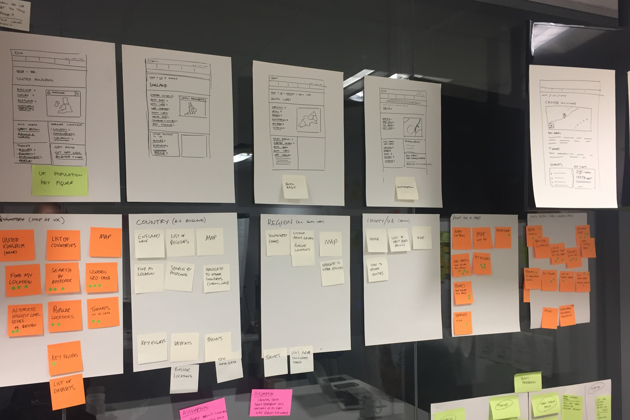
On the third day, we listed out everything we needed on each page for the user to complete their journey. Then we made a detailed sketch for each screen. This gave us a storyboard to build and test against.
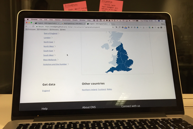
We designed a user journey that allowed people to navigate from a high-level location (for example, United Kingdom). Then navigate down to the area they need (for example, Southampton).
The proposed user journey:
- All locations
- Englands
- South East
- Southampton
- Get the data!

Thursday: making a prototype
On the fourth day, we made the prototype. Having one day was a bit scary. But because we’d spent three days planning, we could have some confidence in our decisions. We didn’t need to debate the details.
We decided to build the prototype in code. It allowed us to build something quickly, by reusing the existing website styles. We could focus on the user journey, not the small details. It gave us a prototype that was easy to test with external users and iterate on in the future.
Friday: testing with users
On the last day, we tested our prototype with users. Due to the short turnaround, we were only able to recruit internal users. This is not ideal, but it allowed it us to iron out any major usability issues.
Alison was able to find us 11 participants. Each with different awareness of statistical geographies. We were hugely thankful for her for organising it all so quickly. Recruiting research participants can take a long time, so next time we’ll make sure we’re more organised.
The prototype
Here is a link to the prototype we created: Prototype 1.
Following our first round of usability testing, we created a second iteration. We tested this follow-up with “real users” in Southampton: Prototype 2.
Warning, this is a simple prototype. It only allows a single journey to find “crime and justice data in Southampton”.

Next steps
- Continue to iterate on the prototype.
- Try little bits of the design sprint in our usual sprints.
- Plan more design sprints, with a more diverse team.