Style.ONS gets new home on ONS Service Manual
For the past eight years, style.ons.gov.uk has been home to the house style and web standards for the Office for National Statistics (ONS) website.
Since we first started tracking website traffic in 2019, the site has had over 390,000 views and become a valuable resource for both internal colleagues and those outside of the Civil Service.
During this time, we’ve made several updates to the style guide. Some of our biggest developments include:
- developing, researching and testing guidance and templates for bulletins, our main product for publishing the latest national statistics
- creating a series of article types and templates for producing in-depth analysis and informative content
- making hundreds of updates to the language and formatting of terms and phrases to keep up with changing best practice
- restructuring the site to better reflect user needs
- becoming one of the first departments to produce detailed style guidance on how to write about climate change
Meet the ONS Service Manual
To align us with other government departments and organisations, the style guide is now moving to a new home. So, we’d like to introduce you to the ONS Service Manual.
From 30 June 2023, all content will be available in the new “Content style guide” section of the ONS Service Manual and the old Style.ONS site will close. There will be some changes to the way content is organised to better reflect our users’ needs.
The ONS Service Manual also contains detailed brand guidelines, with information on colour and iconography, as well design system components, patterns and guidance. This content has been developed and tested over the past few years and ensures we are building consistent and accessible digital products and services at the ONS.
Improvements to the content style guide
As part of the move, we’ve also restructured the content. We’ve used card sorts and tree-jack tests to test the structure with various users and understand how people use the site.
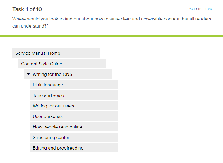
A tree-jack test allows us to test the headings structure of the content with users, by asking them to answer a series of questions by navigating through the tree to the heading they think is most relevant.

Example of the structure used within the tree-jack test for the new content style guide in the ONS Service Manual.
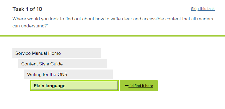
When the user reached the end of the tree and a selectable option, a green highlight would appear. They could select whichever heading they felt was most relevant to the question, as well as provide additional feedback on whether they thought headings were in a logical order or section.

Example of users reaching a selectable option to the question within the tree-jack test for the new content style guide in the ONS Service Manual.
The results from these tests helped us to create a new site structure that better meets our users’ needs.
The next big change will be the introduction of a new and revamped “Presenting data” section (final name to be decided). This will cover all you need to know about how to create and use charts and visualisations in your content.
While we develop this content, there will be a short period where the data visualisation content is not available. We recommend looking at the Government Analysis Function’s data visualisation: charts guidance if you need any support. We will update you with a further blog when our new guidance is available.
Help us improve the ONS Service Manual
We will continue to develop our guidance and improve the new ONS Service Manual over the coming months. This is a new service that’s still in its Beta phase.
We want to ensure our new content style guide meets the needs of our users – so help us to improve it by sharing your feedback.