Working together to improve the Well-being Dashboard
The Content service works alongside statistical teams to create accessible and impactful content. Our recent project to transform the Measures of National Well-being Dashboard is a prime example of how we can design user-focused outputs through cross-office collaboration.
The original dashboard was created in 2018 in response to the government’s desire to measure the nation’s well-being. As its navigation and layout needed modernising, we and the Quality of Life team saw an opportunity to reimagine the dashboard, with a focus on sustainability and user requirements.
Understanding users
Our first step was to identify who the dashboard’s users were and what they needed. We established five user groups, from inquiring citizens to policy influencers and academics. This empowered us to make content decisions based on genuine needs rather than assumptions.
Making user-focused changes
Our approach was to iterate the dashboard over time, learning from users along the way. After each update, we gathered feedback through testing and analytics.
Reducing text
Early feedback indicated that users found the original dashboard’s opening text overwhelming. They described it as a “barrier to the main event”, which would make them likely to exit the page.
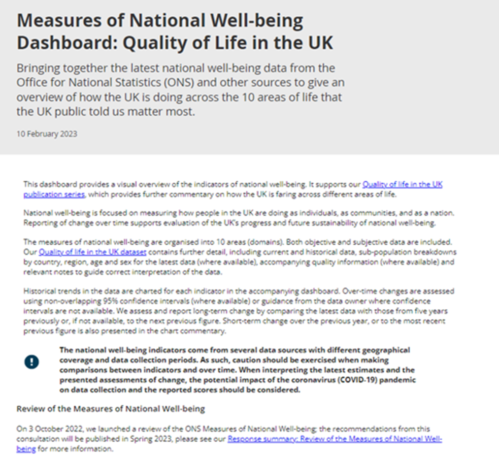
To resolve this, we reduced the summary and introductory text to the most essential information. We worded things more concisely, removed repetition and moved links further down the page. This enabled users to engage with the data more quickly and effectively.
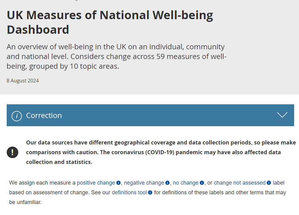
Simplifying language
User testing showed that certain terminology in the original dashboard was confusing. For example, “domain” was used to describe the 10 categories of well-being, but non-expert users didn’t understand what this term meant.
We worked together to find a plain-language alternative, ultimately deciding on “topic area”. This term was more intuitive to inquiring citizens, but still familiar to existing stakeholders.
Improving page navigation
Some terms, such as “Gini coefficient”, had very specific meanings and couldn’t be replaced.
To address this, we added an interactive definitions tool to the bottom of the page. However, user testing revealed that most users didn’t see the tool without being prompted.
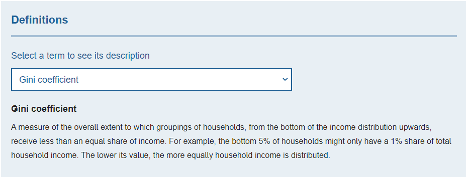
During our next round of improvements, we added accessible “i” icons next to specific terms. Users could click the icon to immediately access the definitions tool, and then click “Go back” to return to their original place on the page.
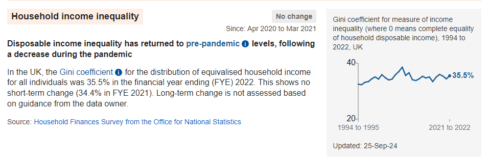
The original dashboard also had a drop-down filtering system at the top of the page to filter by different topic areas of well-being and the direction of trends. However, users found this method of customisation quite limiting.

We improved page navigation by replacing the drop-down filtering system with a checklist filtering system. This way of filtering was more familiar to users and enabled them to tailor the dashboard more easily.

Showing assessment of change clearly
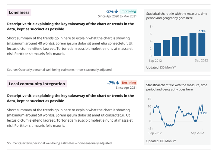
In one of our first iterations of the new dashboard, we used “improved” and “declined” labels alongside arrow symbols to indicate change in well-being measures.
However, this initial approach confused users because:
- the labels and symbols were sometimes interpreted as contradictory – for example, if the percentage of unhappy relationships decreased, we assigned it a downward arrow symbol and an “improved” label
- the “declined” label was interpreted as meaning both “got worse” and “decreased”, which weren’t always the same thing – for example, when anxiety was assigned the “declined” label, users weren’t sure if levels of anxiety had decreased (and hence improved), or if levels of anxiety had gotten worse
We and the Quality of Life team met with Statistics Netherlands to discuss their similar well-being tool and exchange ideas.
We tested potential solutions with users, ultimately deciding to remove the arrow symbols and use “positive change” and “negative change” labels instead. These new labels communicated our assessment of the trend more clearly at a glance, leaving less room for misinterpretation.

Collaboration is key
Close collaboration between content and statistical teams was a key factor in this project’s success. We drew from different pools of expertise to produce a dashboard that not only meets user needs, but also sets a standard for future digital products at the ONS.
The Quality of Life team shared their thoughts on their experience of working with us:
“The Content service went above and beyond to help push change through to make the dashboard truly inclusive for all users. When met with challenge from our side, they engaged with the issues genuinely and took our concerns on board. We took the time to understand each other’s point of view and discuss lots of potential solutions. It has been one of the most rewarding working relationships we’ve had at the ONS.
With the Content service’s help, we persuaded senior leaders that change was needed, implemented improvements in a timely manner, and received excellent feedback from stakeholders.”