Rich Interactive Data Storytelling
Statistician. The sexy profession – according to Google’s Chief Economist. Working in our brown 1970’s pebble dashed offices it doesn’t always feel particularly sexy, but the one thing we statisticians, researchers and economists have got going for us is that we’re really good with numbers. Across this ONS community there is real in-depth knowledge of ONS outputs. There are individuals who have worked on the same set of statistics for decades; they know how they are collected, it’s strengths, it’s weaknesses and have an understanding of why trends have occurred.
However, as an organisation I’m not convinced that we’re always good at communicating this knowledge and the richness of the data to our audience. The beauty of our data is often in its complexity. Previous posts have highlighted the wide range of users the ONS has – from the casual inquiring citizen to the expert user. We also have a wide range of content types. This rough sketch was my 5-minute effort at mapping user types against the range of content ONS currently offers. [Click/touch for interactive version complete with examples of content]
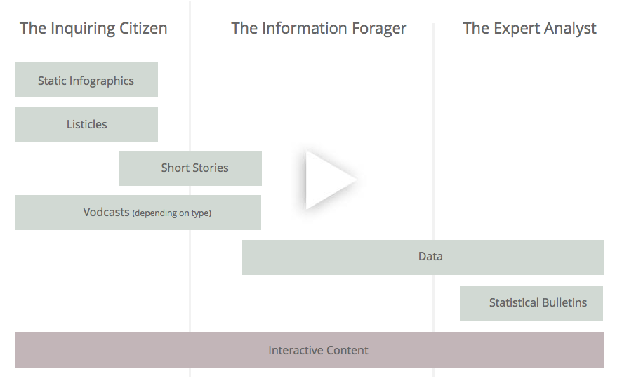
I work in our Data Visualisation team and the bulk of the content we create involves some element of interactivity. You’ll see that I’ve added interactive content along the bottom of the diagram covering all user types. The content can take many forms, but using interactivity allows us to be more flexible with the form of our analysis and/or data. Interactivity can enable rich and imaginative forms of storytelling and data exploration. It doesn’t limit you to flat, linear structures, derived from a print generation and even the biggest datasets can be unlocked from their spreadsheets and transformed into interfaces that are easy and engaging to use. A single interface can allow us to target the broad spectrum of users ONS has.
The best way to illustrate this is to have a brief look at an interactive that we released last week looking at commuting patterns. The whole piece follows an interactive Martini Glass structure. First we feed readers up through the stem of the Martini glass, our predefined analysis, before handing control over to the user to explore. The introductory analysis looks at some of the areas of the country where people are commuting to and from, it highlights the London effect drawing commuters in from across the country. Even during this introduction we’re allowing people to play with data, explore national patterns and to put it into context against their own area. This makes for a more engaging and personal experience compared to a normal written summary. We also use animation to reinforce some of the messages we’re introducing, for example the areas that send the most commuters to London are shaded first and then each area shaded in sequence when we explore the proportion of commuters who commute into London.

When the reader is finished with this analysis (they’re able to exit at any time) they’re presented with a data exploration interface, where they can hover over the map to explore the full richness and complexity of the underlying matrix of commutes from one area to another – over 160,000 values. Subtly we apply intelligence to these flows; the animated lines highlighted in red represent a significant flow of commuters between one area and another significant for the area selection. Each part of the display is doing an important job. The map gives users the geographic context of where people are moving to and from, and the linked bar chart on the right allows users to clearly see the distribution of flows for an area. Importantly, we’ve managed to maintain the full complexity and beauty of the data, but presented in an easy to use interface – it’s the quickest way to get to any value for an area.
Hopefully it’s easy to see how this type of analysis and data exploration could appeal to a wide range of users. For example, the personalised aspect of the interface and easy introduction would appeal to our casual inquiring citizen users. The information forager would appreciate the speed at which they can get to their data (compared to trawling through a spreadsheet), and at the other end of the spectrum the expert analyst will appreciate having a visualisation of the whole dataset together with some statistical interpretation of the individual flows.
This is a content structure we’ve worked with for a while within our team. It’s also a structure you see used a lot in the data journalism community – some of my favourite examples come from the New York Times and the Financial Times. These are powerful rich structures that I’m personally keen to see more of within ONS – watch this space!
4 comments on “Rich Interactive Data Storytelling”
Comments are closed.
Any chance of seeing the interactive element here? The link is dead 🙁