Visual.ONS is coming out of Beta and we’re moving home
In January 2015 we launched a Beta called Visual.ONS – a companion website to help us learn how better to tell stories from our statistics to a broad audience.
Three years and more than 200 stories later we’re ready to take off the training wheels. At the end of March we’ll be moving our existing content to, and publishing all future content on, the main ONS website.
While the Visual site itself will close, we’ll continue to produce the same engaging content but it will be published on the ONS site alongside our statistical bulletins and expert analysis.
So why aren’t we keeping a dedicated site? Simply, it’s the content that matters not the house we keep it in. Visual was never designed to build a specific or standalone audience, but was a convenient home for more experimental content while we made improvements to the main site.
It was never the intention to put content aimed at what we call inquiring citizens in a permanent home removed from the rest of the site. So now that the ONS website has gone through significant changes and we can support many of the formats used by Visual we can finally bring all the content together in one place.
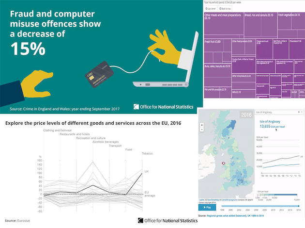
Visual was designed to build a better understanding of the different ways to communicate statistics, and by any measure it has been a success: We’ve pioneered and trialled many new formats – from quizzes, to maps and innovative data explorers – and won plaudits from many users – new and existing, as well as learning lots of lessons along the way.
In case you were wondering what have been the most popular pieces of content on the Visual website since launch they are truly matters of life and death – helping people understand how long their pension will need to last in the context of a society living ever longer and the causes of our death.
We’ve also helped users explore migration, the gender pay gap, the financial contributions we make to the EU, how people understand the risk of crime, the impact of deprivation, our trade with the EU and the rest of the world, and many other topics besides.
Almost 2.5 million people have read Visual articles on the site since launch. But it’s worth noting that fewer than 1 in 5 visitors to Visual come directly – the rest of the traffic comes from Google searches, from social media or links from 3rd party websites.
In fact, more than 6 million people have consumed the maps, tools, interactives and graphics created for Visual because they’ve been embedded on the websites of publishers such as Guardian, the BBC, the Daily Telegraph, the Daily Mail, Business Insider and many others.
We’ve reached a different type of user too – a far higher proportion of people reach Visual content via social media than outputs on the ONS website, for example. Engagement on Visual stories is 40 to 50% higher than on statistical bulletins in terms of dwell time, while the viewership is typically 5 to 7 times greater than articles on the ONS site.
As part of the migration we’ll be making some design changes to parts of the ONS website to better showcase this content. But other than that it’s business as usual.
And that’s the most important fact to focus on – creating brilliant content that broadens understanding of the value of our stats to help people make better decisions has become business as usual in the ONS.
That’s a pretty good conclusion to our Beta.