Making better bulletins – let’s start with what we know
Statistical bulletins are a critical part of what we do at the ONS. They are read by more people than any other part of the website, and have the broadest range of users.
And while they have been at the heart of what we do for many years, so much about them is based on what we’ve done and what has gone before, and not what we need to do now or in the future.
We have been taking a deeper look at bulletins, their role and how they are being consumed by readers.
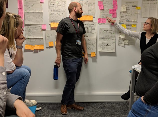
We’ve been helped by the brilliant work done by Awen Jones, our analyst, to build out a better view of the ONS website through Google Analytics and by our senior content designer Kieran Forde, who has taken that data to produce real insight into bulletins’ performance.
I’ll follow up in a new blog post on what we are planning to do but here’s a rundown of some of the headlines so far.
There is no definition of what a bulletin is and its role inside the ONS.
What is a bulletin? Who is it for? When should a release be a bulletin or an article? Internally we don’t have a shared view and that makes for inconsistent products.
Externally, the word “bulletin” means little to users – user research has consistently highlighted a preference for this to change. Does it even matter that we have products called bulletin, article, compendium?
Statistical bulletins are read by the widest group of users but not written for the widest group of users
Analytics show 40% of all visits to a bulletin are on a home broadband connection and 82% of all visits to a bulletin come via a Google Search. Experts are a small proportion of our overall users but a vital group and we have to be sure that the bulletin works for them – they often have specific needs relating to aspects of our data and analysis so we need a product that routes them to where they need to go quickly.
The inquiring citizen often wants a simple question answered, while the media are looking for a story so how do we successfully compartmentalise and signpost so many different needs in one product?
The bulletin has become a multipurpose product attempting to be all things to all users
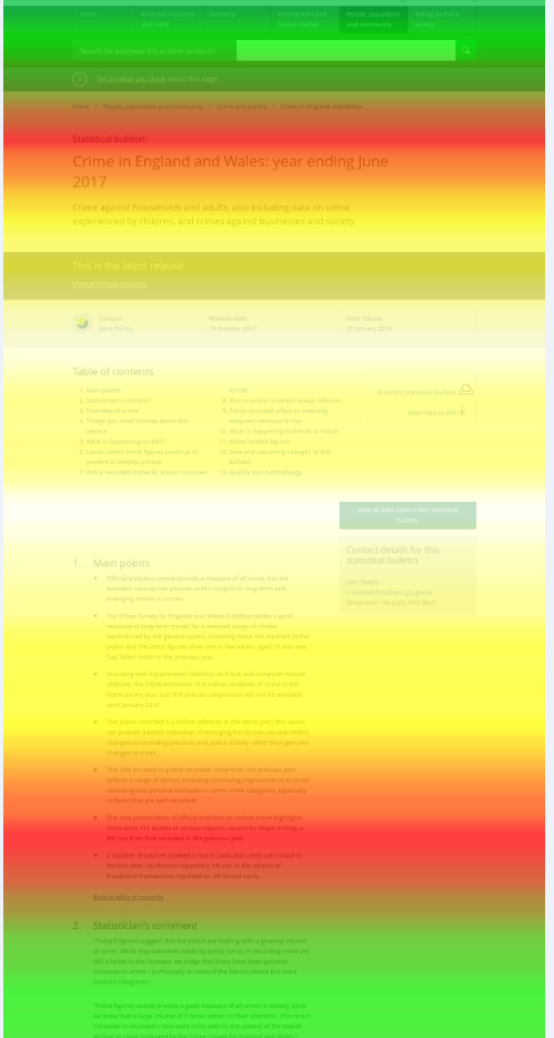
Some of our most important bulletins take a lot longer to read than people spend on the page. And scroll-depth analysis shows more work needs to be done to get people to the parts of the content that matter most to them. When a bulletin is the equivalent of 29 pages of A4 and people are struggling to get to the end, do we simply make it shorter or improve navigation to the parts of value? Or both?
The bulletin as a digital product is still a mirror of print products
One in five visits to the ONS website is on a mobile phone. And half of the ONS audience is a digital native. We need products that work equally well on any device. Being responsive is not enough.
Simple, clear statistical communication is challenging when balancing accuracy and accessibility, and helping users understand quality and methodology
Confidence intervals, estimates, uncertainty, methodological change – the collection and analysis of statistics can be complex but we need to work harder to make what they are saying as clear and simple as possible.
Some of our bulletins contain twice as much methodological information as they do statistical commentary. What’s the right balance of such content in the bulletin?
Our next steps
Over the next few months content designers, UX designers, product leads, developers. statisticians, comms professionals and editorial staff will be working together to better understand what users need from bulletins, and to make recommendations for how we ensure we are meeting those needs.
We’ve built a prototype and are running content sprints with pilot output areas to start to try to answer some of the questions raised.
We’ll be blogging about the journey here. Please share your needs from bulletins.