Using data for content design
 As content designer for the ONS website, I’m responsible for making sure that the content we publish meets the needs of our users. All of the content – that’s over 300,000 pages, growing by 200,000 words every month. And all of the users – about 860,000 users in the past month.
It might seem appropriate that we’d use data to inform content design at the Office for National Statistics. As a content bod, it can feel odd to be reaching for numbers, not words, to tell a story. Especially when you’re showing those statistics to people whose life’s work is to do the same!
Nevertheless, I’ve found that using data to uncover and illuminate user needs to be the best way to take conversations about content forward. So here I am, presenting statistics to statisticians – tiptoeing the credibility tightrope like a Silicon Valley CEO at a data protection summit.
It’s worth mentioning, user research is still an enormous part of the design process here. Data can only tell us so much about user intent, but that’s for a different blog.
Why do we need data in content design?
At ONS, our digital publishing model is a little different to other Civil Service organisations. We have a team of excellent writers and data journalists in Digital Publishing, but the majority of what we publish – the commentary that accompanies statistical releases in our “bulletins” – is written by the experts who gather and analyse our statistics.
As a digital publishing team, our job is to support and guide those experts to write the best content for our users. We’ve already done a lot of work to consolidate standards around our statistical bulletins, and to give clear guidance on the tone and structure we expect. This has been very effective at building a consistent experience across our content.
Our challenge now is how to move beyond this; to get from a place where content is written a certain way because we say it should be, to one where our writers (and we) can see why and how this makes a difference.
So data plays two roles for us; it helps us build a picture of what works or doesn’t for users, but it’s also an effective way to start conversations about content design. In practice:
- data gives us evidence – what works well for our users?
- evidence creates a common starting point – we can all see how this piece of content is performing at the moment
- a common starting point lays the groundwork for a shared vision – we will improve performance by meeting user needs
- a shared vision should lead to shared goals – these are the steps we’ll take
- goals should be measurable – these metrics will show us whether we’re achieving our goals
- measurable success (or failure) creates more evidence – when we do these things, it improves the experience of our users
Essentially, it’s about giving our content creators access to the right data so that they can make informed choices about what they create and how they present it. Or, as someone else put it, “Better statistics, better decisions”.
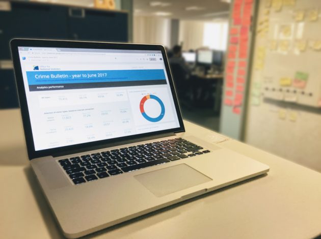
I’ll follow up with another post soon looking at the dashboards we’ve started using for content design.
If any of this resonates with you, or you want to chat about content design, let me know what you think by commenting on this blog post, email me at kieran.forde@ons.gov.uk or I’m on Twitter @kieran_forde.