How we’re using data dashboards for content design at ONS
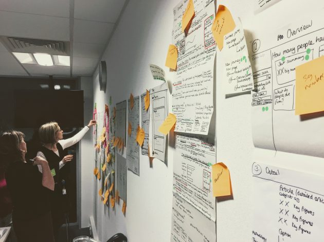 This is the final post in our short series on using data for content design at ONS. My first blog looked at why we’re taking this approach, and the previous post covered the data we’re using and how we’re presenting it using dashboards.
This time I’m going to explore how we’re using this information, and what we’re doing based on what it tells us.
To understand the makeup of page visitors
I’m always fascinated to see what proportion of our traffic comes from where. Awen, our digital analyst, has done outstanding work creating segments based on Internet Service Providers (ISPs) captured in Google Analytics.
For instance, where analytics detects a user’s ISP is a domestic BT or Sky connection, they are counted in our “Home Broadband” segment. This is standard reporting in Google Analytics (and completely anonymised). Using it in segments allows us to get much more value out of that data.
Our segments help us to understand what proportion of our visitors might be looking for different things. There are no absolutes, but people on Home connections are probably going to want the same things as our Enquiring Citizen persona, whilst people connecting from ISP’s belonging to government organisations may be more likely to represent our “Policy Maker” persona.
By comparing number of visits, time on page, and bounce rate, we can build a picture of how engagement varies for different user groups. This helps us think about how well we’re serving their needs, as well as pointing towards how their needs differ.
Using scroll depth (as well as scroll maps, separate to the dashboard) has been a powerful way of illustrating just how important the top few hundred pixels of a page are, and just how few people make it beyond the opening few sentences. It also gives an indication of which sections are used most, which is useful when we think about what topics we should prioritise in future releases.
To understand the language used by our users
Search data is a content designer’s treasure trove. The dashboard tells us the most popular search terms used by people who visited the page. What’s brilliant about this is that it helps us spot the differences between the language we use and the language our users are searching with.
On almost every dashboard, we’ve spotted language gaps. For instance:
- people are searching for “knife crime” and “murder”, but our headings refer to “crime involving weapons” and “homicide”
- we talk about “Labour Market statistics” – many people search for this, but they also search for “UK employment statistics”
- users might want to know how their earnings compare to the national average – to find this they’d need to seek out a page called the “Annual Survey of Hours and Earnings: 2017 provisional and 2016 revised results”
- when users want to know whether the economy has grown so far this year, they could use any of three GDP bulletins, none of which explicitly reference economic growth in their title
Our search data has pointed to some very important user needs already. In general, we’ve learned that users are more likely to visit with a particular question in mind than to get a general overview of a subject.
To look at where traffic comes from
We look at traffic by source – how many people found the bulletin via our website, or landed directly on it from somewhere else? Knowing that a large proportion of users came from somewhere else tells us we shouldn’t assume they are familiar with our site, or what we do.
Of those who come from somewhere else, we know that typically we see around 80% of traffic coming from search. It’s helpful to compare individual pages with this benchmark. Where fewer users come to us via search, generally we see people referred from other websites.
Often we this kind of traffic arrives via news sources who link to us as a source. As a content designer, this gives us a useful steer as to the context a user might have when visiting this page. If a news story is focussing on a particular element of a bulletin, we need to make it easy to find content related to that subject. This can be challenging in long bulletins which contain a lot of detail.
What comes next?
We’re still making our first steps into data-led content design. As a result of this work, we’re now looking at how we might adapt the content and structure of some of our most popular bulletins to better meet user needs. We’ll be doing this through short projects, combining the data from these dashboards with user interviews to build a fuller understanding of what users want.
We’ll also be taking a closer look at the business processes behind the creation of those bulletins to explore how we can better support the teams who create our content. As we learn more about the most useful parts of the dashboard, we plan to roll out access to dashboards to more teams. Longer term, I’d love to see team using these statistics to inform their decision making about content.
We’re monitoring site-wide benchmarks and exploring key performance indicators which reflect how well we’re producing content. The current dashboards measure one publication, but I’d like them to show the performance of many releases over time. Tracking the average reading age of our content, and setting targets to lower it, is high on my to-do list.
Another much more challenging metric I’d like to capture is the effort spent creating a given piece of content – how many hours went into the writing, editing, proofing, sign-off and publishing of a page.
The Holy Grail of quantifying the value of content is measuring the impact of what we publish – the difference it makes. We have a long way to go, but I’m pretty sure that if any organisation should be able to do this, it’s this one.