Accessibility is user experience
I’m Sarah and I work in the Electronic Questionnaire (eQ) team within Survey Data Collection, at Office for National Statistics. We develop a number of business and social online surveys, including the Census.
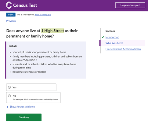
A copy of the online Census Test that ran in March 2017.
We have a duty to make sure anyone can use our service, regardless of their abilities. There are around 25 million households in the UK who will need to complete the 2021 Census, and we’re hoping a large majority of these will be online.
The Government Digital Service (GDS) service manual says:
“In the UK, 1 in 5 people have a disability – this could be visual, hearing, motor or cognitive (affecting memory and thinking).”
Many digital services strive to meet the Web Content Accessibility Guidelines (WCAG), an established set of guidelines for accessible content on the internet. We want to go one step further, ensuring a positive user experience for all our users, regardless of whether they use assistive technologies.
Visiting the Digital Accessibility Centre (DAC)
For those who don’t know, DAC test websites for organisations and report on how accessible they are. We visited the team in Neath, South Wales, and observed as people with various disabilities used our service.
We met people who have sight impairments and use screen readers. We also met with a lady who used voice activation software, and another gentleman who was hindered cognitively.
What we learned
Mutually exclusive answers
The census has a number of questions that are mutually exclusive. This means that It doesn’t make sense for a user to select both “gas” and “no central heating”.
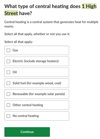
Example of a question on the census that asks about the type of central heating.
The proportion of users selecting “no central heating” would be considerably less than the other options. Therefore, user burden is seen to be reduced by having these options within one question, rather than adding an additional question asking whether they have central heating.
We created some designs to satisfy this. Unfortunately, they failed accessibility because the screen reader user wasn’t notified when options were automatically unchecked after the “no central heating” option was selected.
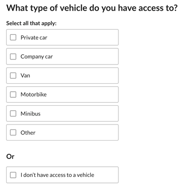
Mutually exclusive question on the census that asks which type of vehicle you have access to. This example allows the user to select from a number of options or they can select “I don’t have access to a vehicle”.
How screen reader users navigate web pages
Screen reader users navigate web pages differently depending on the individual. Someone who doesn’t use a screen reader will probably view a page top to bottom, perhaps picking out headings or keywords to gauge whether the page is of interest.
We watched as one screen reader user navigated the page by first listing all the headings on the page. This highlights the importance of how we semantically structure the page.
This also caused issues with the new design for mutually exclusive checkboxes. The assistive software first read out the question, “What type of vehicle do you have access to?”, followed by “or”. This confused the user because “or” was incorrectly labelled as a heading level 2.
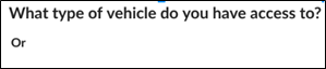
How a screen reader user would visualise the page structure.
We also observed as one user highlighted all of the links on one page. This was problematic when trying to find the feedback link. We called the link “Help us improve it”, which didn’t resonate with the user as he was looking for “feedback”.

Feedback link that appears on the top of an online survey.
Different browsers do different things
Sometimes it’s easy to forget to test our early prototypes using different browsers.
When testing our “Upload a file” feature using Internet Explorer 11 (IE11), we found various issues.
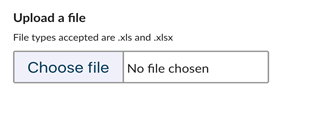
File picker when viewing in Chrome.
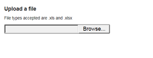
File picker when viewing in Internet Explorer.
The ZoomText user failed to see the “Browse” button on the right-hand side when using IE11.
The user with learning difficulties said:
“The large open space looked like one of your other input fields. I thought I had to enter something in the box when I first saw that.”
Colours matter
When the user with cognitive and learning difficulties saw the “Check your answers page”. They instantly associated the orange colour with an error:
“I thought I’d done something wrong because I saw the bright red or orange colour”.
We normally use an amber colour for soft validation, but we want to endeavour to avoid user anxiety where possible, so we’re going to do some further research into colours and the impact they have.
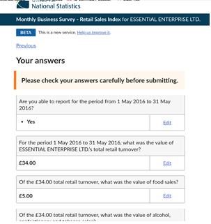
Check your answers page, which has the sentence “Please check your answers carefully before submitting” highlighted orange.
Next steps
Following the visit, we’ve created an accessibility task list on our team Trello board. We’ve given each card a label to identify whether it is single A, AA or AAA. These levels are as defined by the Web Content Accessibility Guidelines (WCAG).
We’ve also added items that we know will improve the user experience, but that don’t fall under the WCAG.
Over the next few months we’ll be pulling as many of these Trello cards onto our backlog as possible, to ensure we’re providing the best user experience for all our users.
We’ll also be seeking users who use assistive technologies, who don’t work for DAC.
Experiencing first-hand how people with different disabilities struggled with certain aspects of our website really gave us the motivation to go away and get things right. Accessibility should be the foundation, not an add on.