Bulletin development – making pages ‘easier to read’
What does this image look like to you?

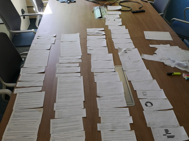
It’s actually the quarterly Crime bulletin from January this year. As part of our work to understand how readers use our products we did some analysis to look in greater detail at the content types in the page.
We colour coded each line by content type and reflected the volume of that content as you read from top to bottom through the page. What do you notice about it?
What struck us is how pattern-less it is – there’s little structure, or consistency to it.
Why does that matter? It matters because it means it’s harder for users to find something specific or to know what they are looking at without having to read large chunks of the text. And given just under half of readers of the last Crime output had never even been to the ONS site before, let alone read the Crime bulletin previously, we need to maximise the ease at which they can understand the page within the shortest period possible.
This is something of a theme we’re seeing across outputs, and when our releases serve very different users simultaneously it’s a real challenge to try and accommodate everyone’s needs appropriately.
Here come the prototypes
In the last few weeks have built 2 new prototypes that we are taking out for early testing. Feel free to take a look, but the prototypes are more the direction of travel so I’d caution against drawing too many conclusions from the look and feel of the page.
What’s more important is that under-pinning the prototypes is a set of principles we are forming out of the user research, analytics and workshops with output areas, with the goal of helping solve the problems that we have identified so far.
In summary, we are aiming to get users to the information they need as quickly as possible and we’re recommending we do this by making our content more modular, and more structured.
So what does this mean?
We can see in our analytics and user research that many of our users have quite straightforward questions they want answered, or want to get something quite specific from outputs.
It could be the current employment figure, a piece of data relating to homicide in a certain police force or the gender pay gap. What’s hard is helping users accomplish these tasks when we have outputs which are multi-purpose, particularly the purposes are not clearly defined or signposted.
Lengthy and/or unstructured bulletins and analysis can make it difficult to find that information – it could be on the page somewhere but we ask a lot of our users to find it. And if it’s not there, then we need to do more to help users find where it does live.
What do we mean by unstructured?
Today we separate out links to data and to other publications, from the statistical commentary and guidance around quality and methodology.
But often that information gets tangled and blurred inside swathes of un-signposted text, and there’s little structure to the order of information.
In the case of the Crime bulletin there is twice the volume of non-statistical content than there is statistical content. Caveats are incredibly important but if they smother the statistical content, or are even harder to read and understand, then we’re working against users not for them.
The image below is the Labour Market bulletin – cut up into sections depending on the type of content.
Here we can see four clear types of content, three of equal size and one slightly longer.
What’s interesting about this is that the column on the left represents links to data provided in the body text of the output.
To put it another way – there is as much text relating to links of where to find data as there is statistical commentary in the output. In fact, there is only slightly more statistical content than non-statistical content in the output as a whole. The bulletin itself is highly-structured, helping users scan through the page but it’s still a very linear document.
That’s not necessarily a bad thing, but what it means is that we have to find better digital product solutions in order to make it easier for users to separate the information they want from the information they don’t.
Which is where modularity come in: the principle we are working towards is that content is more tightly structured and sign-posted both in how pages are laid out and also in how we define the information’s purpose in different parts of the page.
What will this mean in practice?
It means we can break up longer bulletin into separate “pages”, where it makes sense – using modules to unite the most crucial information onto related pages.
Below you can see how the Crime bulletin might work. Instead of one lengthy bulletin, it is broken into separate pages allowing users to more readily find specific information on the topic of most interest to them (Overview, Weapons, Homicide etc), but more importantly the information on each page is “summarised up” a level onto the pages to which they most relate.
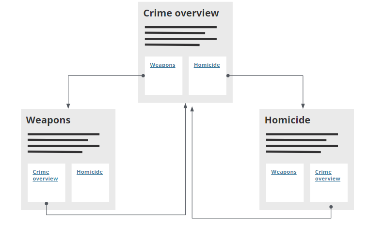
So on the Crime overview page you would also see a summary of the Weapons data/commentary and the Homicide data/commentary and on each of those pages there are summaries of the other parts of the overall Crime picture. The goal is to get users deep into material only if they want it, while satisfying the desire of the majority of users to only see as much information as they need.
The challenges are not to be underestimated – we need to develop a set of guidelines which govern how information is summarised and build a digital product which is flexible enough to accommodate a diversity of summary types.
And that’s even before we think about better ways to highlight and manage quality and methodology information which provides crucial context to the statistics we publish.
It’s clear then that this is much more than just putting a fresh coat of pain on our pages. We have to think about some clear rules of engagement around how bulletins need to be structured.
So what happens next?
Nothing is going to happen without much more consultation internally, testing externally and discussion with senior management within the ONS.
The plan is to test a prototype of this new bulletin approach alongside the new monthly GDP bulletin in July. This will give us some real data from real users that will inform future direction.
We’re continuing to work closely with the Crime, Labour Market, Trade, GDP and soon the Migration teams, and will start to come round to talk to more output areas once we’ve got the results from the latest round of user research.
Please do leave your comments below and contact me directly to discuss any specific aspects of the work at darren.waters@ons.gov.uk