What’s French for data visualisation?
Conferences are a great way to learn and view the wider field of your profession. Often in data visualisation, you feel you’re working in an area so specialised that no one else does anything similar to you. Imagine my surprise when 350 other data visualisation experts and practitioners turned up in Paris for the OpenVis 2018 conference.
To quote Lynn Cherry, OpenVisConf programme co-chair, “OpenVis is a top-tier conference about ‘open source data visualization’ tools and techniques (“openvis”)”.
The conference was inspiring, full of high-quality talks from people leading the field and from a mixture of academics, journalists and industry types. I also got to ride up and down the Seine in a party boat in the Parisian drizzle.
My takeaways can be grouped into the following four areas.
Inspiring
There was so much inspiration. There were technical showcases of web technology to visualise dinosaurs in 3D or how to handle drawing a billion stars. There were explanations of the analytical side of things using machine learning to train neural nets or classify drawings. And also breakdown of design processes.
One idea that I thought could be applied to visualising ONS data is t-SNE clustering. t-SNE is a machine learning algorithm for visualising data with lots of dimensions. Ian Johnson showed what this technique could do on the quick draw dataset (a dataset of people drawing objects). Previous attempts at characterising this dataset focused on the average (How long does it take to draw a cat?) but there is an argument that it’s more interesting to show the distribution rather than focus on summary statistics.
The t-SNE algorithm visualises groups that are similar but doesn’t specify what attribute it is matching them on. It could be any feature (eyes, ears, shapes, strokes) or a combination. This method could be applied to a number of our statistics where we create groupings, census being the most obvious one but also well-being, households, earnings and other surveys.
Changing the way you think
There were talks that forced me to consider how we do things. Can we bring aspects of gaming into data visualisation? How can we learn not to fall for fallacies, and how does the brain process information?
Steven Franconeri looked at the how the brain can process visual information either quickly or slowly. The quick part works for shape recognition or feature distribution (mean, outliers, trends or clusters), but works slowly for comparing properties of objects.
Try spotting the odd ones out in this pictures.
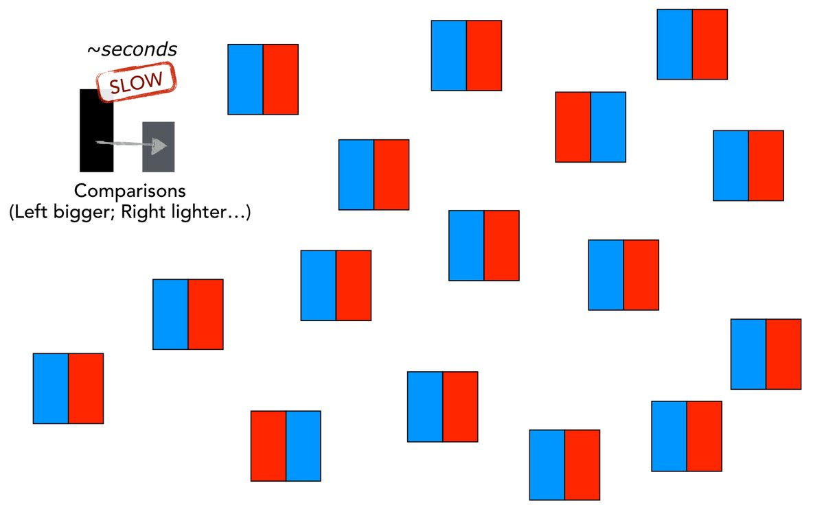
Source: Steve Franconeri on Twitter
We can apply these insights to make our visualisations more understandable.
Reinforcement that you’re doing the right thing
Sometimes it’s good to know, the best people out there are also doing what you do. We have put user-centered design at the heart of what we do, as do many others.
One talk was about disagreements from two of the top data vis editors at the New York Times, Amanda Cox and Kevin Quealy. It was great to see the honest conversations that go on behind making visualisations. Disagreements are part of the process as there will be design choices to be made and these are subjective but even the best disagree.
New connections
There was lots to take-away from the diverse presentations and range of other attendees. From talking to people from design agencies, big tech companies to freelancers, we had common challenges and we would discuss how we overcome them.
I’ll be sharing more of what I’ve learnt with the data visualisation team and from there into our work in the future.