Redesigning bulletins (my first, and Benjy’s second, Design Sprint)
As you may have seen from Darren’s blog post, we are focussing on redesigning our statistical bulletins. To kick-start this work, we held a design sprint at the end of April. This was my first design sprint, having been at ONS for nearly a month, and Benjy’s second.
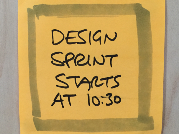
Prior to the sprint, I spent time familiarising myself with the bulletins themselves; trying (only somewhat succeeding) to understand what purpose they serve, who they are aimed at and where they fit in to the wider website. We condensed the usual five-day sprint into four, and at the end of the week spent in a small, windowless room (the dungeon) with a sizeable group, we came out with our first prototype.
Tuesday: understanding the problem
Day one began with introductions. We covered various functions: UX design, content design, editorial, graphic design, website product owner, data vis, good practice, performance analytics, along with experts from the business areas, namely crime and trade.
We started to frame the problem and ended up having a lengthy discussion about what actually makes a bulletin. It surprised me to learn that everyone had a different grasp, and it wasn’t just me being a newbie that I didn’t fully understand. Benjy somehow managed to harness all the views into:
Long-term goals
- Flexible content that meets user needs.
- Understanding of different users and their needs over time.
- Ability to answer questions off-site, for example, Google search.
- Better understanding of what a bulletin is.
- Clearer design where content is easier to find.
…and potential risks
- Big product change – is the problem too big?
- The organisation is large and takes time to adjust.
- Bigger picture to consider – we are a trusted organisation.
- Lots of users: different and changing needs and varied topics.
- How do we measure success?
Mapping the user journey
Thankfully in the afternoon we found another meeting room with actual fresh air. Benjy mapped out the user journey, working backwards from how an inquiring citizen might interact with the crime bulletin, and documenting the steps to get there. It was complicated.
By the end of the first day, through the “how might we” exercise, we decided the focus of the sprint should be on improving the design and navigation of the bulletin.
Wednesday: taking inspiration
We were back in the box room with a slightly different line-up and went over the results of the day before. I think cabin fever set in quickly because the suggestion to revive Microsoft’s Clippy to answer users’ questions was bandied about and started to take on a life of its own. It went in the icebox.
Lightning demos
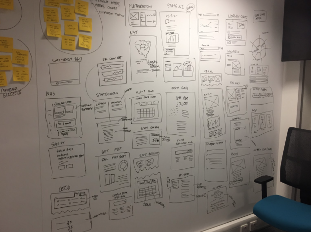
We researched other websites and services to find ideas to draw from. We didn’t just look at other statistics websites, but also took elements from more journalistic ones, other government pages, and even music streaming and shopping sites.
I had already done some research on other countries’ statistics websites and by far my favourite is New Zealand’s Stats.nz. This was something others picked up on too. They have one of the closest equivalents to our bulletins (information releases) and have done great work recently to produce really clean, user-friendly releases.
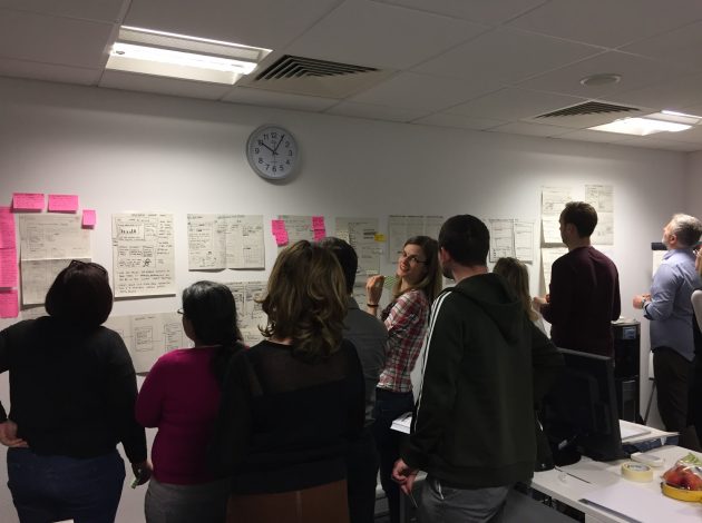
As we presented potential solutions to the group, the elements were sketched onto the wall, which ended up looking pretty cool.
The Digital Publishing team hosted a lunchtime talk by Dan Barrett from the Parliamentary Digital Service, which faces similar challenges to us. He joined us in the design sprint for the afternoon, which we spent sketching out possible solutions based on the earlier research and refining them into one single idea each.
Thursday: finding a solution
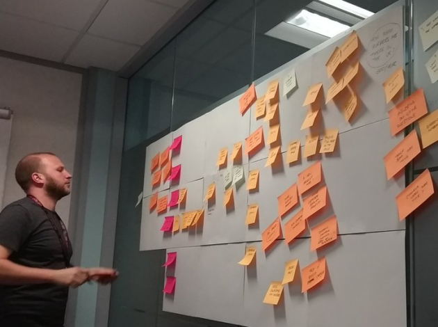
By the morning, we had all anonymously pinned up our three-step sketches of our most promising solutions and it was time for the art museum exercise. It was no surprise that Clippy made a couple of appearances amongst the ideas.
We used dot stickers to highlight parts that we liked, then speed critiqued each one in turn. Again, this was anonymous and I found it hard not to speak up when the group was discussing my version. Being the graphic designer in the group, I felt some (self-imposed) pressure to produce a decent sketch!
We have a winner
There was a clear favourite in the group from which we could create a prototype, while the other ideas were put into a maybe pile to look at later. We opted for using a modular system to segment the content and summarise and link related pages. You can read more here.
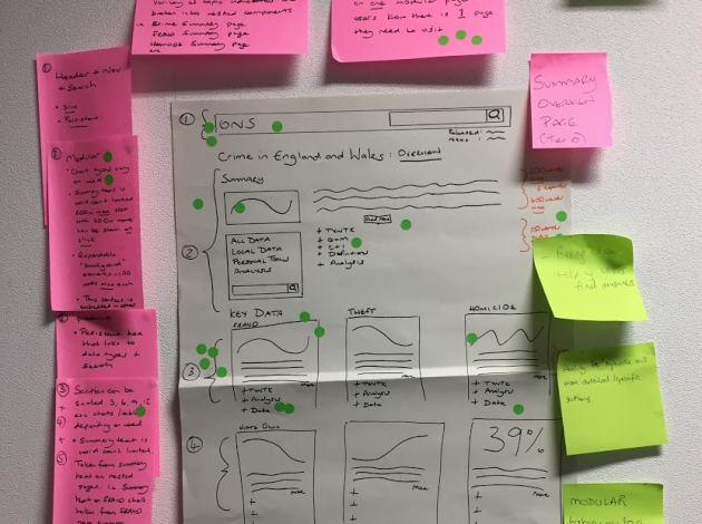 The afternoon was spent making a storyboard for the prototype, which was a lot harder than I thought it would be. It was tricky to get away from the temptation to set it up in a way to immediately answer the potential user question we had decided on (What is knife crime like in my area?).
Friday: building the prototype
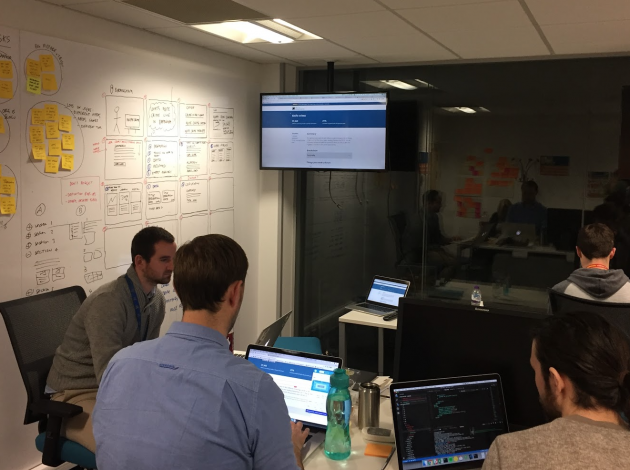
This day was reserved for actually making the prototype. I wasn’t there as I was at my first cross-government meet up, but at the end of it the team came out with a pretty decent first solution to a complicated problem.
All in all I enjoyed my first design sprint and was happy to see such great collaboration across various functions at ONS, even if we did go off on a few tangents and spent several days feeling like we were locked in a basement with only Haribo to survive on.
Next steps
We have since tested the first version of the prototype and iterated based on the user feedback. With another user research session coming up soon and the deadline for the new GDP monthly bulletin looming, we’re busy pushing the prototypes forward and trying to fill in any gaps from the first iterations. More progress to come soon!