50 years on: are our digital releases more user-friendly than their print predecessors?
As an English literature graduate, I have always associated old, leather-bound books with great works of fiction. But when I stumbled across the Newport office’s very own ONS library, I found grand volumes instead packed with statistics.
My job as a content designer is to make ONS publications more user-friendly and easier to understand. With each release we publish, I ask “what is the user need, and how can we meet it?”. As I explored the shelves of old ONS print publications, I wondered – just how far have we come in making our releases more useable over the years?
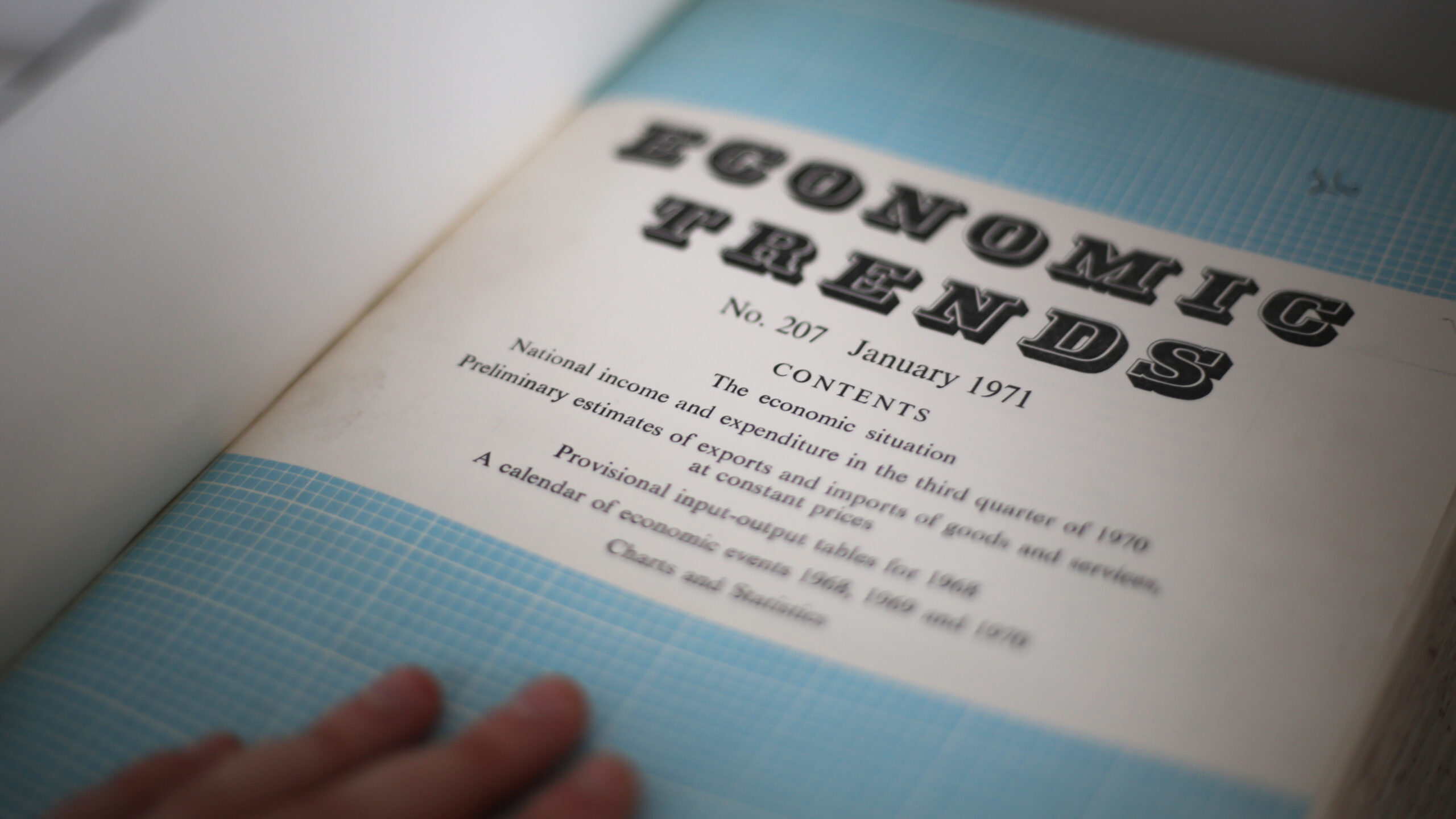
By comparing our digital economic releases with their print predecessor, a weighty tome published in 1971 called Economic Trends, I decided to find out.
Moving from print to digital
Economic Trends would have been far more time-consuming to get hold of than today’s digital equivalent. Rather than visit a public library, the general public would have most likely relied on interpretations of the data from politicians and the media.
In comparison, in the last 12 months, over 60% of our web traffic has come from “inquiring citizens” using mobile phones. We’ve massively expanded the general public’s access to an unbiased source of statistics.
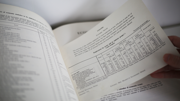
Economic Trends’ physical format would have also presented logistical issues to its publishers. When flicking through, I noticed a slip of paper added in post-publication to correct some inaccurate employment figures. This manually-added correction note would have cost extra money, time, and labour.
In comparison, if we discover an error post-publication today, we add a correction notice to the webpage with ease.
Making content accessible
Through screen readers, adaptive keyboards, and other digital assistive technologies, online content is now far more accessible to people with additional needs. But in 1971, we knew very little about writing for people with disabilities.
For example, Economic Trends contains italicised headings; we now avoid italicised text, because it can be harder to read for people with dyslexia.

It also uses plus (+) and minus (-) symbols for positive and negative numbers, and hyphens to connect number sequences (for example, 200-300 rather than 200 to 300). We write these out in full today because some symbols are not accessible to screen readers. They can also make a page look cluttered and cause a disruptive reading experience.
With each printed page incurring extra publication costs, Economic Trends also uses every inch of space efficiently by wrapping paragraphs and minimising space between lines of text.

However, people with visual impairments find small text that is close together difficult to read. In digital releases today, we avoid overwhelming users with “walls of text” and instead:
- use bullet points for lists
- use headings and subheadings to separate content
- keep paragraphs short
Writing in plain English
The language we use also affects the readability of our content. I found certain sections of Economic Trends difficult to understand. For example:
“As the estimate of personal savings is obtained as the difference between two large aggregates it is subject to a wide margin of error, but over the first three quarters of 1970 as a whole the ratio of savings to personal disposable income was over ½ per cent greater than in the corresponding period of 1969.”
This sentence requires several re-reads to untangle its meaning. The Hemmingway tool assesses its readability score as “post-graduate”. This is much higher than the average UK reading age of nine years that we aim for in ONS releases today. We now try to write in plain English that can be understood by all users. For example:
“The household saving ratio decreased to 8.6% in Quarter 3 (July to Sept) 2021 compared with 10.7% in Quarter 2 2021.”
This similar quote from our Quarterly sector accounts bulletin uses clearer language and has a readability score of “grade eight” (age 13 years) . This is not “dumbing down” information; it is opening it up to everyone, such as those with English as a second language.
Making navigation intuitive
Economic Trends’ contents page accurately describes to readers what each section is about. For example, a reader wanting a broad economic overview would feel confident visiting a section labelled “The economic situation”.
Descriptive section headings are still prioritised in content design today. The more descriptive the heading, the easier users can find their required information.
However, Economic Trends’ contents page does not include page numbers to tell readers where to find each section – making its descriptive headings less useful.
Today, we help users navigate our releases through intuitive user journeys. When users visit the economy page, they’ll find a series of content tiles, each home to an economic topic; clicking a tile takes users straight to the relevant releases. That’s to say nothing of search engine optimisation (SEO), where a quick google search lands users directly on a publication.

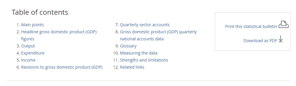
Straightforward navigation should not stop when the user reaches their desired page either. That’s why each release we publish has its own table of contents. These contain jump links, meaning users can “jump” straight to a specific section with a click.
Presenting information in the correct format
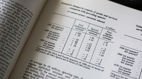
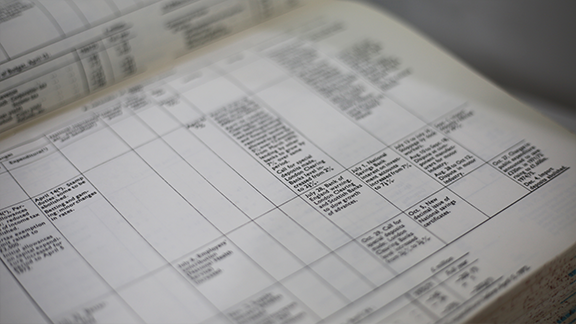
Visualising data helps users to understand complex content. But several tables in Economic Trends are complicated and inaccessible.
The text-only tables are dense and overwhelming. Our accessible tables guidance now states that tables should only be used for presenting data. This content would now be written out using clear subheadings and/or simplified bullet points.
In half a century, we’ve come a long way in making our content more user-friendly. That is not to criticise the print publications of the past; without the old, we could not create the new, and we are continually striving to improve our users’ experiences.
In another 50 years, I have no doubt we’ll look back on today’s digital releases and see yet again how far we’ve come.