The humble pie chart: part2

The principles and guidelines from part1 showed what data best suited a pie chart, solutions for labelling and using colour….
Read more on The humble pie chart: part2
The principles and guidelines from part1 showed what data best suited a pie chart, solutions for labelling and using colour….
Read more on The humble pie chart: part2
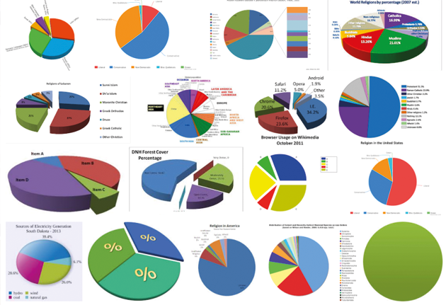
A blog on pie charts? surely everyone knows how to use them. Just googling “pie charts” and hitting the “images tab” in a browser gives us a fair indication… people in general don’t, and the results are worryingly bad.
Read more on The humble pie chartWe’ve published 2 new pieces on Visual.ONS today that push our beta site into new storytelling and data visualisation territory….
Read more on Marriages – when two become one(By Rachel Lewis, Editorial Team) I’ve been thinking about data journalism recently and at the Editorial team in Digital Publishing…
Read more on What’s in a name? Apparently Game of Thrones, Breaking Bad, Marvel and moreOver the last few months we have been working with Richard Campbell (@Rjtcampbell_ONS) and his CPI production team to investigate…
Read more on Inflation ‘Mythbusters’The ONS Digital Content team is looking forward to hosting this year’s edition of The Graphical Web at the University of…
Read more on The Graphical Web: Where Standards Meet PracticeHead of Digital Content Alan Smith discusses a new approach to visualising ONS data with a personal touch. Today (21 July)…
Read more on So how well do you know your area?One of the first things that struck me when I joined the ONS back in May was the organisational obsession…
Read more on The Infographic Superhighway